The Switch OLED is a strong contender for most gorgeous handheld ever
Nintendo makes good hardware, but I don’t know if I’d ever personally describe any of it as “beautiful.” The GameCube was cute, I loved the clamshell design of the Game Boy Advance SP and I still have fond memories of the SNES’s dogbone controller. But the Switch… I’m just sort of “okay” with it. It’s never been a piece of a hardware that screamed “touch me” until now, with the upcoming OLED model.
Kris Naudus / Engadget
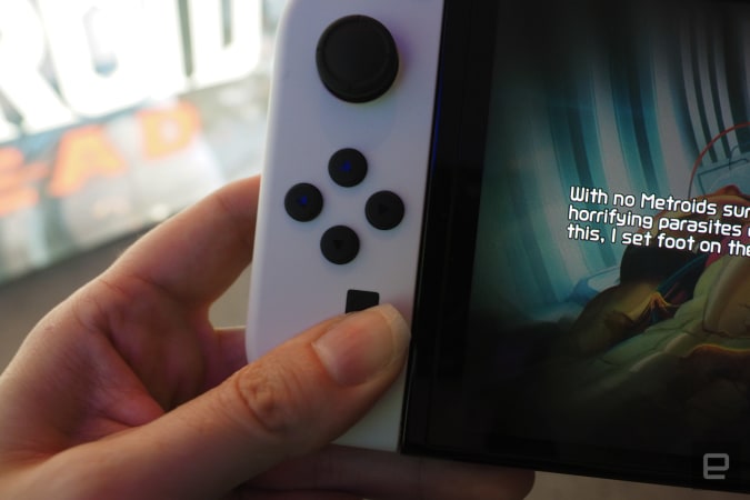
Set to come out October 8th, the big marquee feature of the new Switch is its larger, sharper screen. It’s been bumped up to a 7-inch OLED from the 6.2-inch LCD of the original. I got to spend about an hour and a half with it and, though I couldn’t compare the two systems side-by-side, I certainly noticed the difference when I got home. I fumbled for the brightness settings on my OG Switch only to sadly realize they were at max. The OLED is bright, crisp and gosh darn beautiful. The original Switch display still looks good, but the new screen is genuinely great.

Kris Naudus / Engadget
The game on offer was the upcoming Metroid Dread, which comes out the same day as basically a “launch title” for the refreshed system. It’s a good choice given the dark, sometimes claustrophobic settings of the Metroid series. It’s easy enough to see every passage and to distinguish the impassable bricks from the ones you’re supposed to blow up. The game will still be playable on a regular Switch or Switch Lite, but it feels like the game was meant to be seen on the new hardware.

Kris Naudus / Engadget
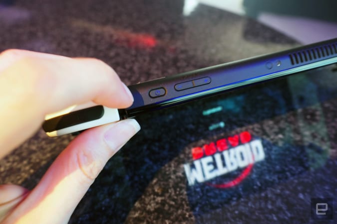
And it’s more than just that larger display. It’s still the same basic shape and size but somehow feels more svelte, despite being heavier than the original. The volume and power buttons along the top are narrower, a design choice I’m not crazy about even though I didn’t find them particularly hard to press. (I think I just prefer the feel of a circular button over an oval-shaped one.)

Kris Naudus / Engadget
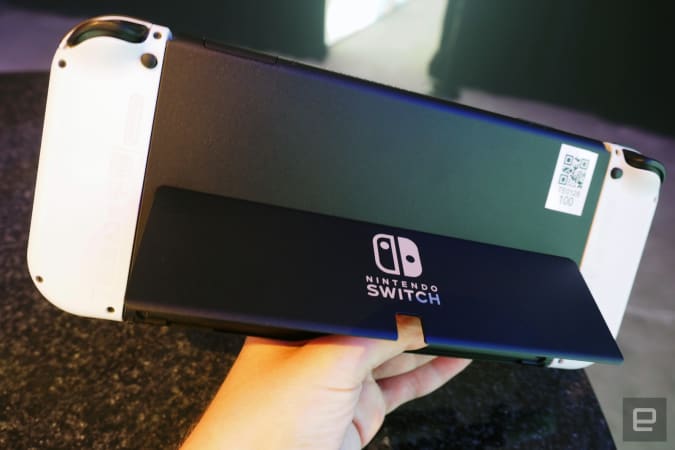
The new kickstand is pretty great, stretching all the way across the back of the system instead of the original’s flimsy vertical strip that fell off if you looked at it funny. Sure, the new one takes a little more effort to pull it out but it’s worth it for the extra sturdiness and reliability. And be still my heart, it’s actually adjustable, though I didn’t make use of this much since I preferred to play the system in handheld mode. It just felt… good. And the new black and white color scheme looks great in person. I’ve always been a sucker for the panda look, and would have preferred this to the all-gray system I started with back in 2017.
All that said, I didn’t have enough time to test the battery life with the new screen, or see how many games I can cram onto the 64 GB of storage. Until I know how long it’ll last in the wild I’m not sure if this is a must-upgrade, but just looking at a Switch OLED in person, I found it hard to resist.
All products recommended by Engadget are selected by our editorial team, independent of our parent company. Some of our stories include affiliate links. If you buy something through one of these links, we may earn an affiliate commission.
For all the latest Technology News Click Here
For the latest news and updates, follow us on Google News.
