Ninox for Mac review: Easy, simple, yet powerful database software
Expert’s Rating
Pros
- Full-featured relational database
- Supremely easy (for the genre)
- Drag and drop creation of tables and forms
- Online and local macOS/iOS clients
- Excellent starter templates
Cons
- Needs more bulk field editing in forms and reports
- No Windows client
Our Verdict
The Ninox relational database is modern in appearance and easy to use, yet delivers all the power and features that most users will ever need. Even better, it does so for a remarkably low price.
It’s not very often that I run across software that is truly impressive. Ninox for Mac (and its other iterations) wowed me. Not because it’s a powerful relational database–been there, done that. But it’s so darn pretty, easy to use, and flexible. The kicker is, Ninox for Mac is only $35; the $540 FileMaker Pro is very powerful but appreciably more high-maintenance.
If you do want to spend more–or more likely, service a small, medium, or large business–Ninox has an identical $10 monthly online version that Ninox for Mac interfaces with, as well as iOS and Android clients. Ninos also has a server version for larger businesses.
Ninox features
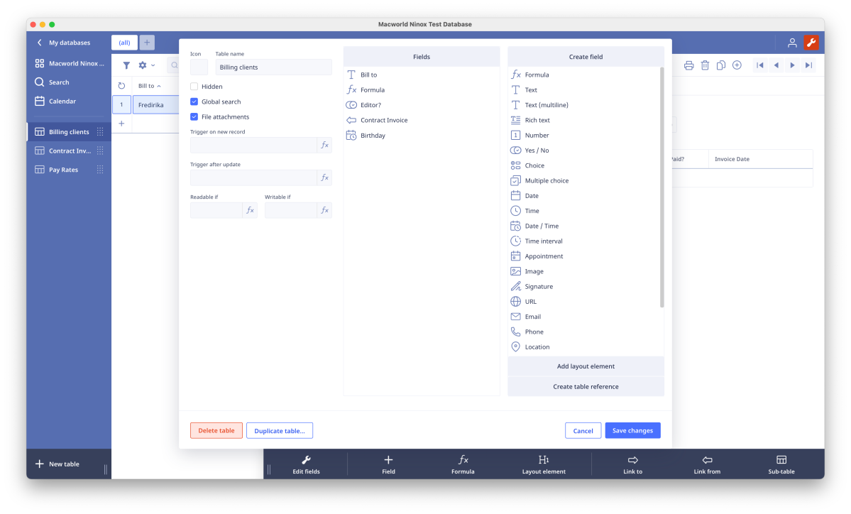
Ninox is a relational database, so tables (sets of records, like rows in a spreadsheet) may access the data in other tables for display and calculations. These are linked via “table references” in Ninox. For instance, if you want choose from a list of clients to insert their address, etc. in your invoice table, you create a company table, add the company records, then reference them in your invoice table.
Ninox provides a wide variety of field types: number, text, date, image, calendar, URL, phone number, color, icon, multiple-choice, yes/no, etc. Additionally, there are formula fields that can perform a number of calculations on the data in said fields. For instance, summing the cost of items on an invoice or concatenating first and last names.
Formula fields may also utilize simple logic functions such as “and,” “or,” “greater than,” “less than,” and even “if-then-else.” For example, you can use if/then/else to hide a total if there are no numbers to add up.
Fields are rife with options such as display formatting, default values, conditional format/style and writability, and even events triggered after data entry. You can use drag and drop in the visual editor to create formulas or spell them out in the text editor once you know the format.
Switching from back and forth from visual to text can also help you learn Ninox’s syntax.
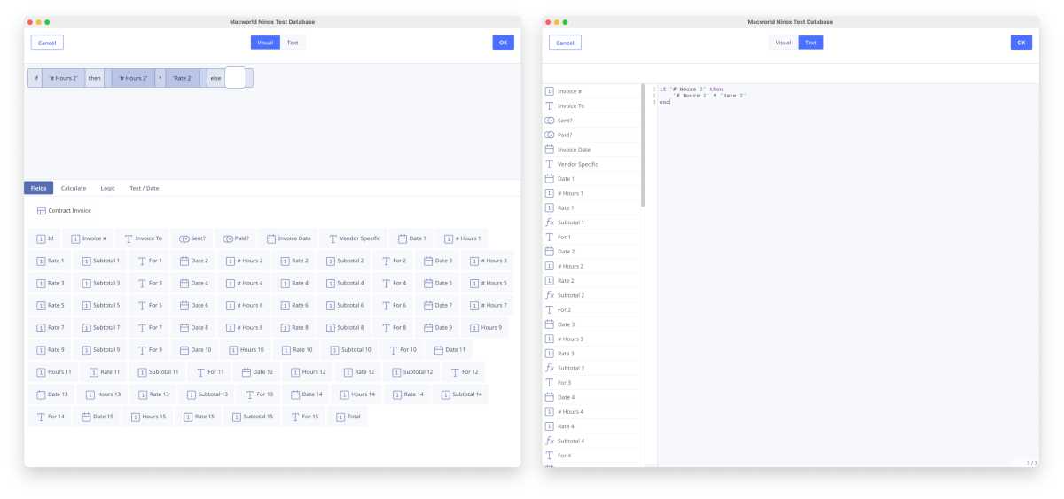
Ninox’s formula editor in both visual and text modes. [Right-click and select “Open image in new tab” and switch to said new tab to view images full size.]
Jon L. Jacobi
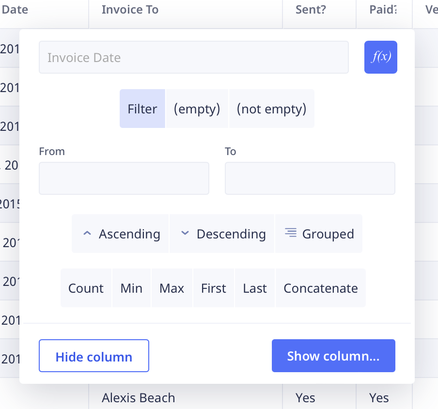
Ordering, sorting, and filtering are a snap. Just right-click on any header in a table and you’re offered easy picks for ascending, descending, and grouped. The latter sorts records into groups based on the content of the field.
There’s also a filter (e.g. Invoice # > 1000) and even a query transform f(x) function; type that same ‘Invoice #” > 1000 into that and the field will display a Yes or No depending on whether it meets the condition.
Ninox imports and exports only .csv (Comma Separated Value) text files (basically, the raw data). It creates the fields for you, but there’s no importing forms, views, reports, etc. Recreating those can involve a lot of drudgery, so it’s something to contemplate before you switch over. I found it well worth the effort.
As mentioned, Ninox also resides online where there’s support for teams, including privilege levels (read/write). The local Ninox for Mac client reviewed here operates standalone with local databases, but can also access Ninox Online–the interfaces are identical. That, of course, requires the $10 monthly account that also includes storage for databases.
Ninox interface
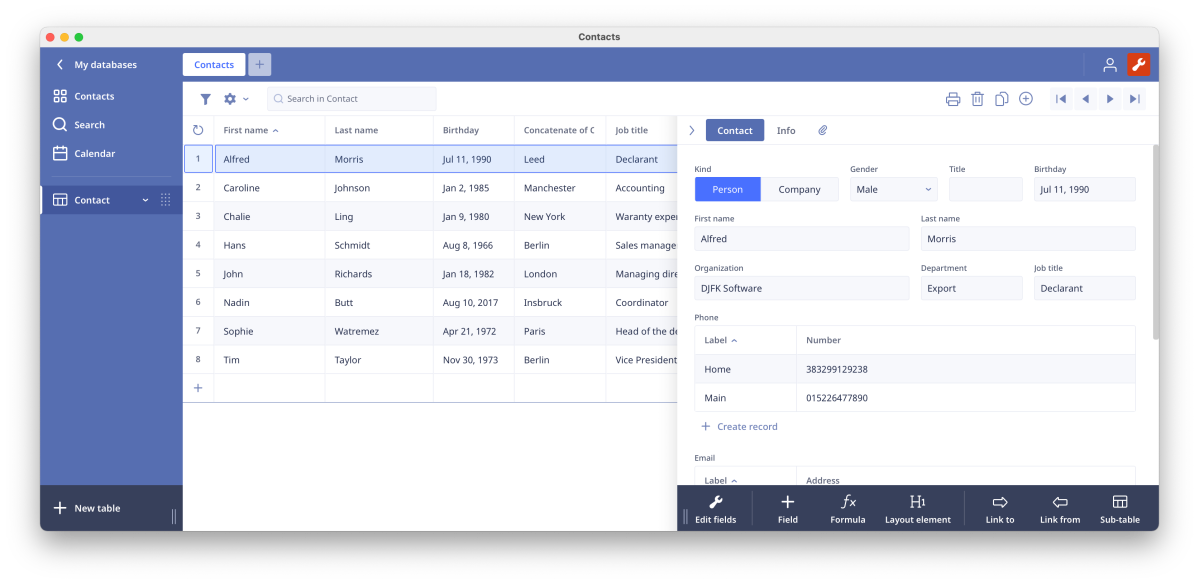
Where Ninox is light years ahead of most of the equal-powered competition is in ease of use. It’s not perfect, but it’s a darn sight better than anything I’ve used. It’s also intuitive, though that of course depends on your experience. Attractive? To my eyes, very.
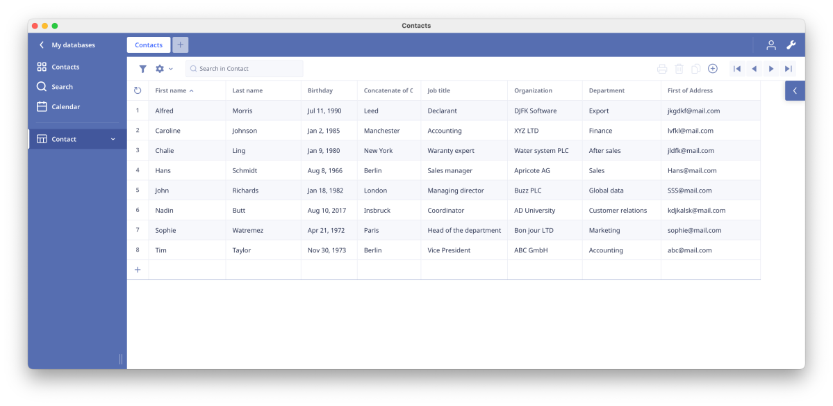
The interface is a single-window affair, with a hideable navigation column to the left, and a back button at the top to exit the main areas. There’s a minimal number of icons, which are large and easy to read. They’re also displayed contextually (only when you need them).
Ninox lets you view your data and records in a number of ways: table view, a default form view, user-designed form views, charts, cards, Kanban (manufacturing schedule), Gantt (Project schedule), and as a pivot table.
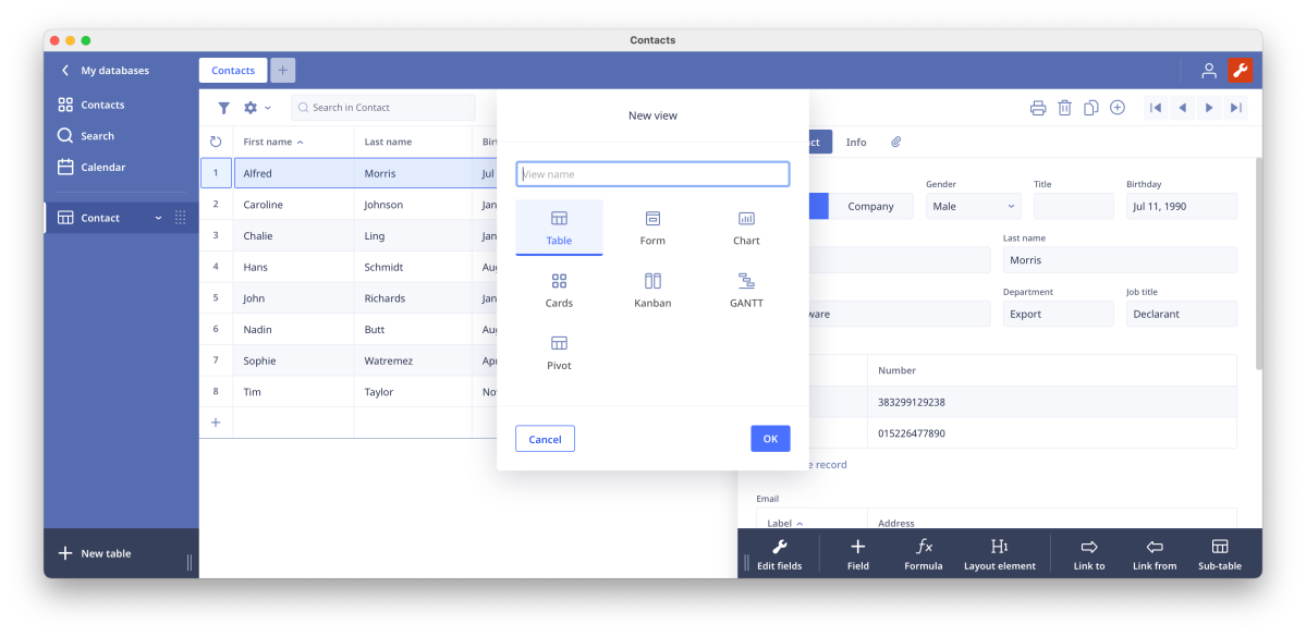
Designing or modifying print views (reports) is largely a drag-and-drop, free-form affair, which makes the task quite easy. With form views, on the other hand, elements flow on a continuous track and automatically position themselves until you insert a “layout element” such as a line break or stretchable space.
Alas, with forms you may only drag one field at a time. This made recreating and moving the 58 fields in my imported database tedious at best. Print views allow bulk moves and deletes, though you can only format fields one at a time. In general, Ninox could use more bulk editing operations. A work in progress no doubt.
Ninox: Not perfect, no white fencing
Aside from the need for more bulk operations, I did note one issue. All my dates are in the format month/day/year, e.g 1/4/2022 or 1/4/22–January 4th 2022. They imported fine as you can select the format being used. Subsequently, however, pasting 1/4/2022 into a date field, it became Jan 22nd, 0004. Yes, the year 4 A.D.
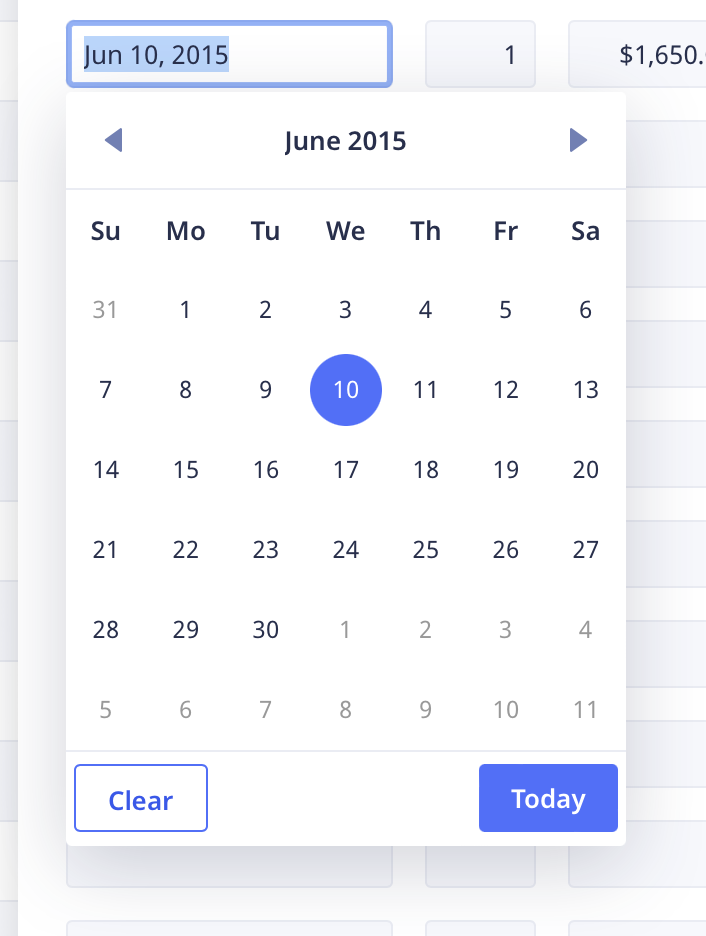
That isn’t a huge deal, but it might bite some. Most of the time you’ll simply use Ninox’s handsome calendar-style date picker selector shown below. Note that this was an old record with the date already in place–my clock was not set wrong. It’s nice that it syncs.
One other thing that bugged me: when you access one of the drop-down controls (yes/no, date picker, etc.), Ninox resets the tab counter/location (the tab key moves from field to field) to the first field in the form, forcing you to select the next field in the form with mouse or tab through all the fields again.
I must also stress that Ninox for Mac is an end-user only database. There’s no “white fencing” (a term I heard from Ninox), i.e., customizing the front end with company logos, etc. and hiding the Ninox branding. For the price, I don’t care, but I don’t develop database applications for others anymore.
I found Ninox extremely fast, especially compared to Access on Windows, which has recently become slothful when opening forms. Imports, scrolling, drag & drop, image loading were all very, very quick–like blink of an eye quick. Of course, I was only dealing with a thousand rather small records with no images, etc. most of the time. How well it scales I can’t tell you, but Ninox has enterprise customers, so that should be a good sign.
Bottom line
Making a rather complex and powerful database this easy to use and attractive is no mean feat. $35? Wow, even if it is a loss leader for the online version.
Ninox is my all-time favorite database–by far (if I don’t count Smart DB from the days of DOS). Even if recreating my forms was somewhat labor-intensive. I’ve kicked Access to the curb. ‘Nuff said.
For all the latest Technology News Click Here
For the latest news and updates, follow us on Google News.
