The iPhone 14 Pro’s Dynamic Island solves a problem I didn’t know I had
Dhruv Bhutani / Android Authority
Long before Apple revealed the iPhone 14 Pro, the rumor mill had already predicted that Cupertino’s latest would sport a radically different front camera. The rumors started off accurately describing the two camera cutouts, and eventually went on to nail the pill shape with camera indicators in between. However, what came out wholly out of left field was Dynamic Island — Apple’s co-mingling of software smarts with hardware constraints to hide the unsightly cutouts.
Some may call Dynamic Island a prime example of Apple’s infamous reality distortion field to draw attention away from the two gaping holes in the display, but I’ve been using the iPhone 14 Pro for the last five days, and it surprises me to say that I’m sold on the idea.
More Apple: The iPhone 14 draws a line between experts and normies
Putting aside the notch, what do you think of Dynamic Island?
1 votes
Dynamic Island isn’t what you expect

Dhruv Bhutani / Android Authority
But first, let’s start with some context. I’m guilty of ridiculing the feature as a gimmick and as nothing more than Apple’s way of covering up the camera cutouts. To be fair, it is that, but five days later, I’m ready to take back my words. There’s much more to the story here.
In a significant faux pas for Apple, last week’s iPhone 14 ‘Far Out’ event was, in my opinion, one of the rare instances where the company fell short in explaining its latest feature enhancement. Is it a new notification system? A better way to multitask? A whole new interaction medium or perhaps just a task switcher?
Apple’s launch event didn’t do a very good job at explaining what Dynamic Island truly is.
To start with, it is none of the above. It takes using Dynamic Island to realize that it sits at the corner of being an intuitive notification system and a multitasking switcher without being a replacement for either.
While I initially expected the island to behave similarly to the ill-fated MacBook TouchBar, that is not the case here. Unlike the TouchBar, which is specifically designed for interaction, I’ve observed that the island in its native state largely fades away from my peripheral vision. When expanded to a wider pill shape for timers or music playback, the UI is subtle enough not to break focus from the task at hand.
Focus only on activities that need immediate attention

Dhruv Bhutani / Android Authority
Instead of integrating all your notifications into one single pane, Apple has smartly segregated information that requires immediate attention to its own separate pill. Honestly, I’m surprised it took so long. I often use timers as part of my daily workout routine, and it makes sense to have the countdown display above a YouTube fitness video or rep-counting app — Dynamic Island enables that.
It smartly segregates information that requires immediate attention away from other non-urgent notifications.
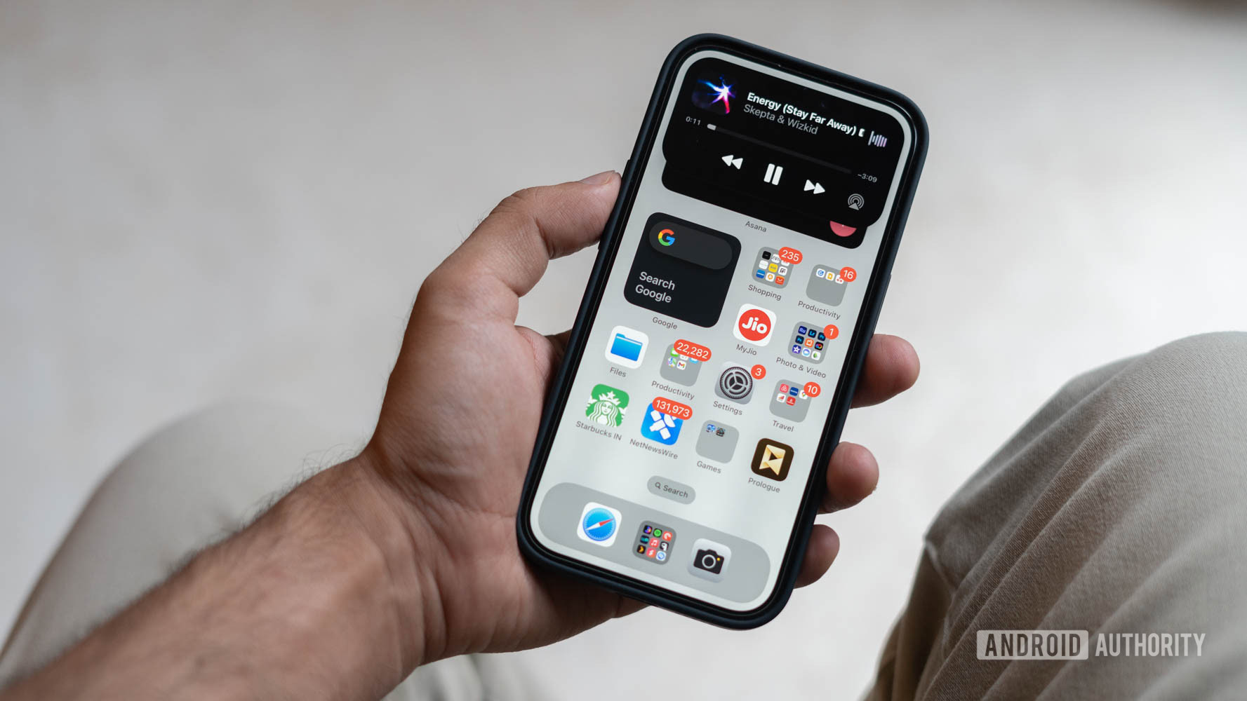
Similarly, for music players, it offers a single tap context switcher for getting to music or a long press for controlling essentials like playback or AirPlay destinations without leaving the page you are on.
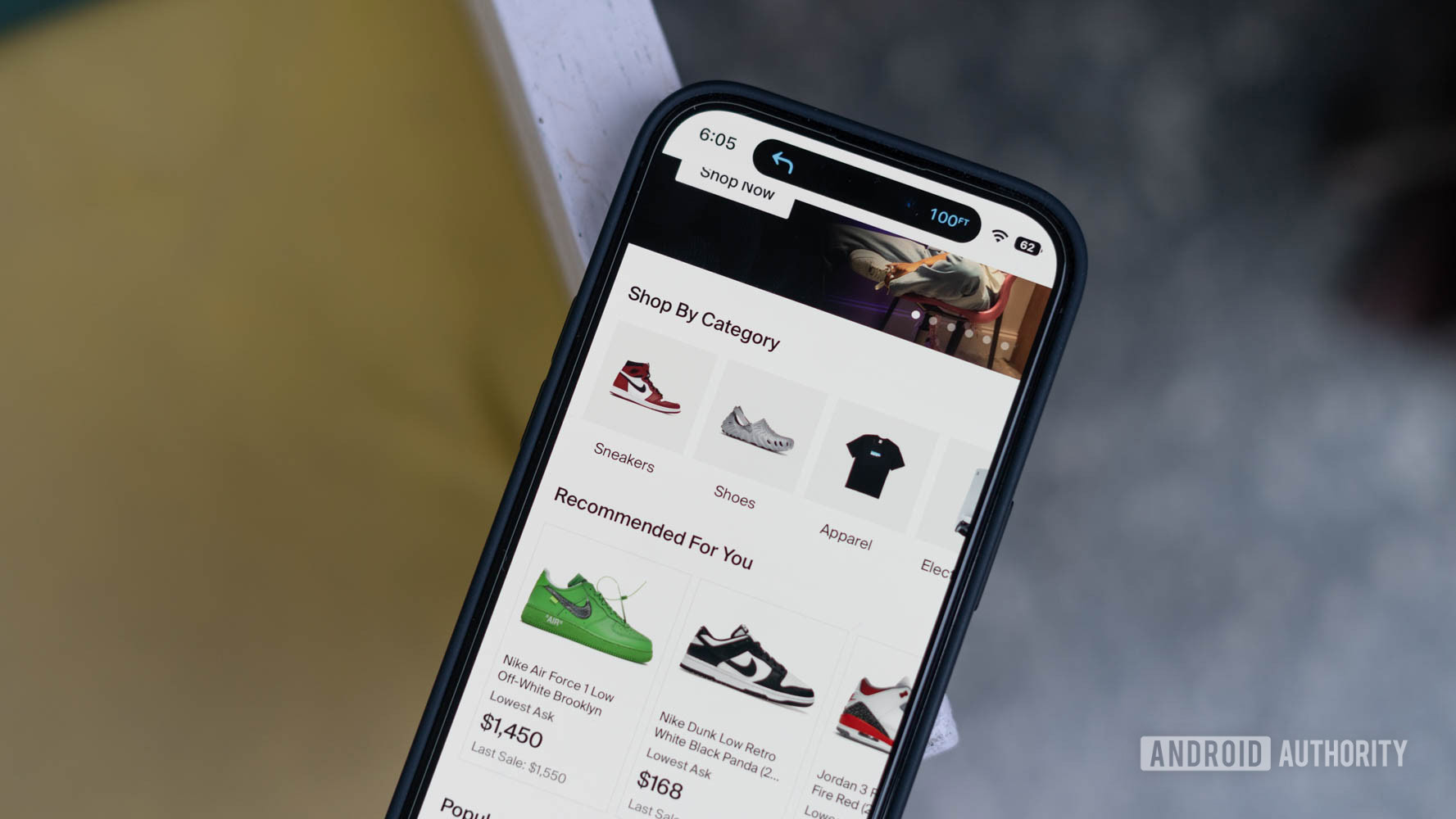
Turn-by-turn navigation is another use case that benefits from Dynamic Island. While it was possible to get a heads-up display for navigation instructions on older phones, this would sit below the notch previously. The Dynamic Island cleverly uses the safe space that Apple already accounts for to give you step-by-step information, once again, without stepping out of whatever screen you are on or covering up important information.

Dhruv Bhutani / Android Authority
The list of supported apps and integrations is woefully small at the moment and, for the most part, is relegated to system apps and settings. That said, the supported integrations give users a good taste of what to expect from Dynamic Island. Moreover, once the Live Services API rolls out, I expect the island to be even more useful. As an impatient person, I keep popping open the local food delivery app to keep a tab on delivery status. So I’m excited at the prospect of having that displayed as a stock-ticker while I doomscroll through Reddit.
The Dynamic Island isn’t a replacement for notifications. Instead, it sits adjacent to the standard hub for time-critical information.
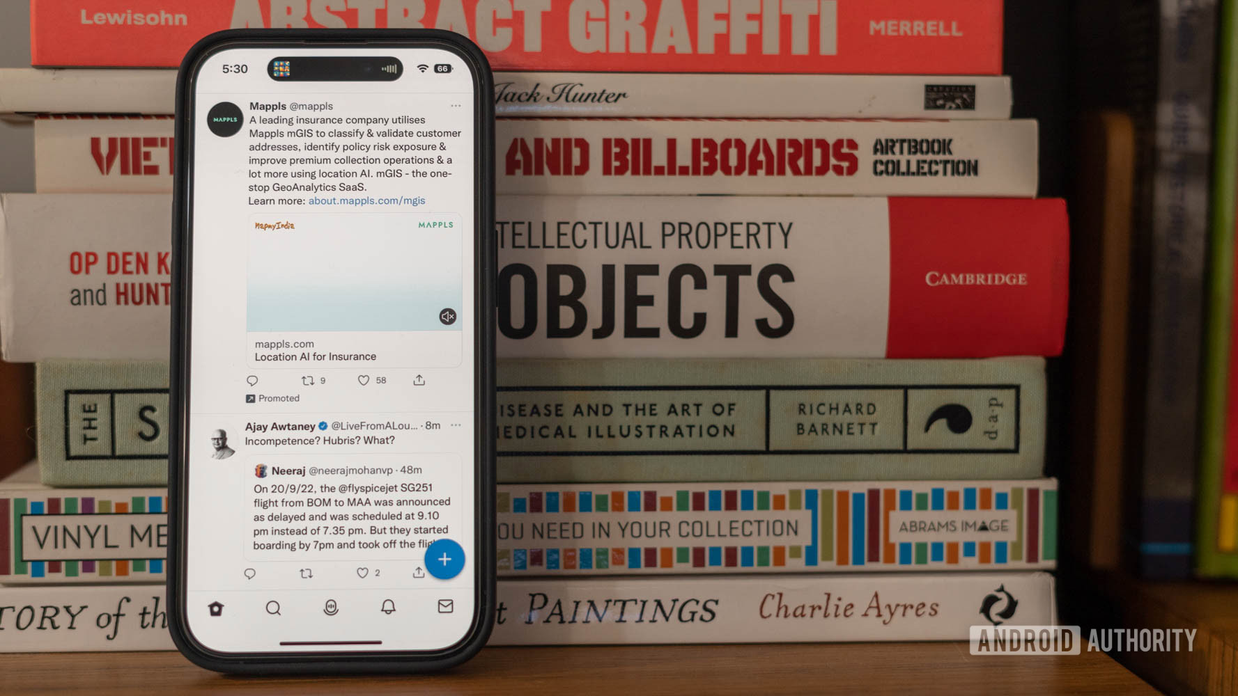
And that’s where the real differentiator lies. Apple appears to be positioning the standard notification center as a catchall for notifications that might not be critical. Think text messages, Twitter mentions, and Facebook updates. None of those need immediate or ongoing attention. Meanwhile, the island is solely focused on details that require you to keep a tab on an app or have a frequent enough pace of interaction that the user would benefit from a persistent shortcut.
It’s not an entirely new idea. Both Huawei and LG have experimented with it previously, but neither had the slick and seamless experience on offer here, and when it comes to software, it is always the implementation that matters.
Of course, the skeptic in me believes it is just another form of forced product differentiation to give users a reason to upgrade to the iPhone 14 Pro. Would a system such as this be workable with the older-style notch? Perhaps. Though I suspect it wouldn’t look quite as seamless. There’s also the matter of the enormous pill-shaped black space while watching video content. However, that was a concern even with the notch that cut into the display.
It’s a feature worth copying but only if done right

Dhruv Bhutani / Android Authority
Overall, I remain cautiously optimistic about Apple’s new-fangled heads-up display. We’re already seeing Android smartphone brands teasing variations on the island. There’s also genuine interest among the broader enthusiast community, with custom-built solutions popping up mere days after the iPhone’s launch. But without the dedicated APIs and purpose-built software, an Android take on the Dynamic Island would merely be another way to show all notifications.
In the days since I’ve been using the iPhone 14 Pro, I’ve taken a shine to having persistent access to tasks that I’d constantly switch apps for, and I hope to see an equally well-thought-out implementation on my next Android phone.
Up next: Dear Tim Cook, should I toss my Pixel in a landfill?
For all the latest Technology News Click Here
For the latest news and updates, follow us on Google News.
