Are round smartwatches terribly impractical? Why the rectangular Apple Watch makes way more sense
What could that be? While most people’s first association with a watch is a more desirable and fashionable choice, mostly stemming from tradition, the classic form factor might not be the best suited one for smartwatches in particular.
Here goes a probably controversial opinion that rectangular smartwatches akin to the Apple Watch are much better suited for their intended purposes in comparison with the more traditional round smartwatches that we’ve grown accustomed to over time. There’s a key reason why Apple relies on the rectangular form factor and hasn’t come up with a classy dress smartwatch, and it has a lot to do with efficiency and the way we consume content on our wrists.
But before we take a look forward, we need to take a step back and explore why watches are the way they are.
Classical watch design: A brief history
Or why round stuck around
From the very get-go, pocket watches and wrist watches were conceived with a round form factor. While modern watches are round in order to pay homage to the traditional circular design, the very first compact timepieces were circular for a set of very mundane and practical reasons.
It was efficiency and practicality that made the first watches round, as all the dials, knobs and elements inside were also round, so it made sense for the watchmakers of olden times to use the most rational form factor.
What many consider to be the very first wristwatch, the Breguet No. 2639, was created by Abraham-Louis Breguet for Caroline Murat, the Queen of Naples, in 1812, was certainly a round one. Despite that it’s irreversibly lost to history, this timepiece can anecdotally be perceived as the “smartwatch” of the early 19th century, as it even had a thermometer on board (and the thermometers on the latest Samsung smartwatches are still non-functional as of late October 2022).
Less than a hundred years ago, in 1926, Rolex came out with the legendary Rolex Oyster, widely regarded as the first fully-tight, hermetically-sealed wristwatch that’s both waterproof and dustproof. Yet, evidence exists about waterproof pocket watches from all the way back to 1851, when a W Pettit waterproof watch was displayed at the Great Exhibition in London. But we digress. Can you guess what form factor both the Oyster and the W Pettit watches had? Don’t let your imagination run too wild, both were classic round smartwatches, but there’s another reason for that, and it has everything to do with pressure.
Classic wristwatches were round for a reason
In fact, one of the very first modern wrist watches that didn’t employ a traditional round form factor was created in 1904 by famed jeweler Louis Cartier (yes, the Cartier) for Alberto Santos-Dumont, a pioneer of sustained flight and aeronautics, who complained that it’s difficult to check his pocket watch in flight. See, it was cumbersome to fiddle around in his pockets while carefully maneuvering an unreliable flying apparatus; there were no autopilot systems back then.
A vintage 1916 Santos de Cartier in near-pristine condition
Cartier’s answer was a rectangular watch with leather straps and exposed screws that snuggly fit on the wearer’s wrist. More than a hundred years later, the Santos de Cartier is still a legendary line of wristwatches that pairs its timeless design with a super-premium build (and an exclusive price tag to match, of course).
Smartwatch design needs to prioritize function over form…
… and rectangular is the way to go!
So, we established that traditional watches were round for a slew of reasons. Shouldn’t we apply the same rules to smartwatches? Absolutely!
Putting form over function is the polar opposite of what classic watchmakers initially went for, so it would be a mistake to blindly follow into their footsteps just for the sake of tradition and habit. Smartwatches should absolutely adopt the most efficient form factor for their main intended purpose, which is not only to tell the time, but also allow the user to interact with notifications, use full-blown apps, and so much more.

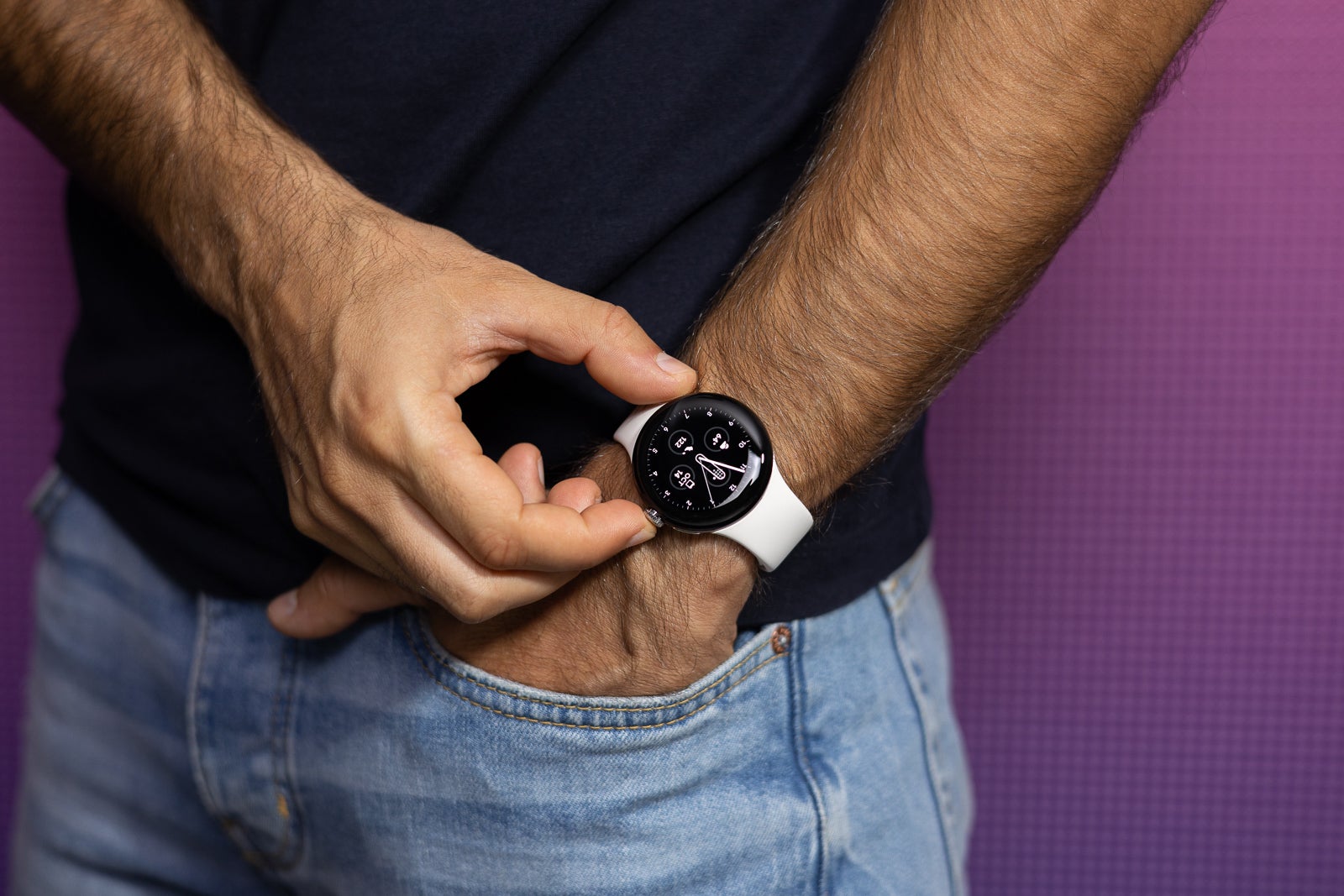
Modern smartwatches surely are classy (Image Credit – PhoneArena)
And what’s one thing that’s universally true of almost any smart platform or operating system in use today? Almost all intended and optimized for rectangular or rectangular displays (even though corners aren’t necessarily 90-degree ones), and that’s what humans in the modern era are most familiar with. Smartwatches, as extensions of our phones, have to conveniently display similar types of content, like messages, notifications, and various snippets of info, presenting the maximum amount of information at a glance due to the limited screen space.
There’s no reason for smartwatches to be round
Not saying the Apple Watch does things the best, there are many aspects of the interface that could certainly be improved.
A brief example, if you may.

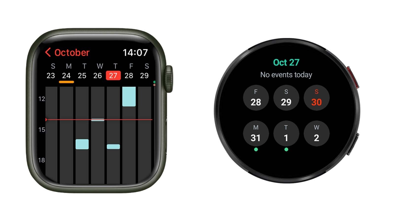
Apple Watch vs Samsung Galaxy Watch interface comparison
Both screenshots above are taken from two rather similar modern smartwatches, a 44mm Apple Watch Series 7 and a 44mm Galaxy Watch 5. Despite doing its best to make do with the interface of its smartwatch, at the end of the day the constraints of the circular screen on its wearable ultimately show way less data than the mostly rectangular-shaped display of the Apple Watch, which gives you a much better idea what upcoming events you have in your calendar, and how long these would take.
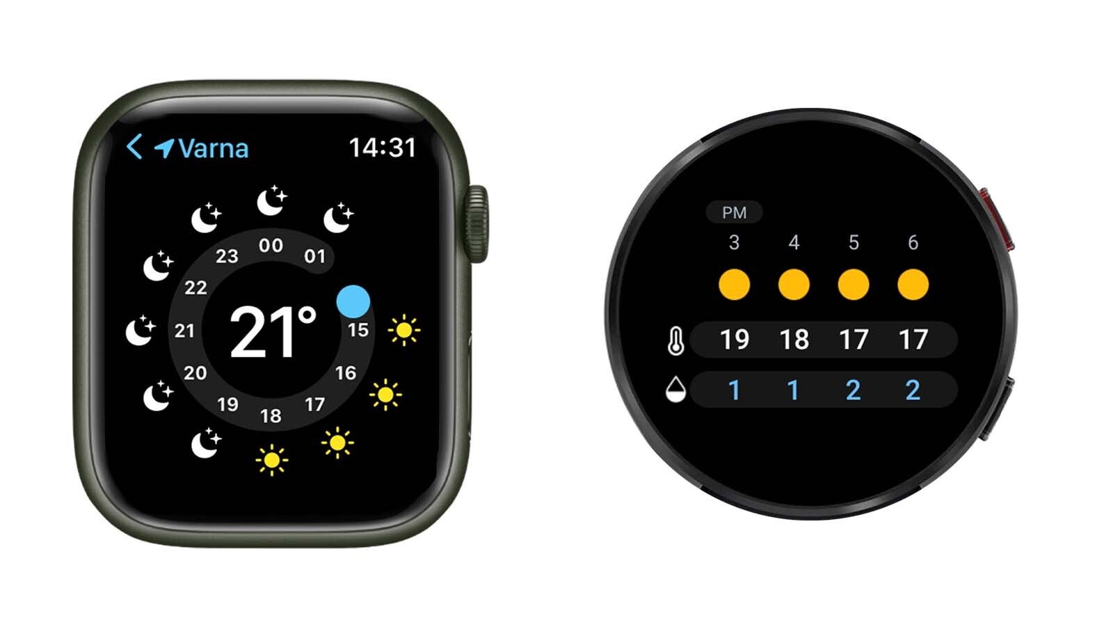
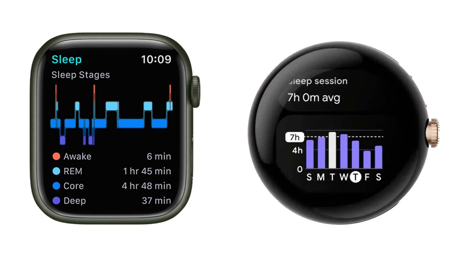
And here’s another example that ironically proves the opposite: you can design a good circular UI on a rectangular smartwatch and show more data than a round watch with an interface that’s not designed in an optimal way.

Apple Watch vs Samsung Galaxy Watch interface comparison

Apple Watch vs Pixel Watch interface comparison
While it’s universally true that “beauty lies in the eye of the beholder”, thus what’s good for me might not be as good for you, or vice versa, it’s hard to argue with the fact that most interfaces we interact on a daily basis are better suited for rectangular displays, smartwatches included.
There’s zero reason for modern smartwatches to be round: none of the hardware inside requires this form factor in particular, there are no round dials, knobs, and what have you. The only reason why round smartwatches took off was hardware manufacturers’ desire to come up with a familiar and friendly design to bridge the gap between the old and new.
I’ve used both round and rectangular smartwatches, and even though I have no issues wearing a Galaxy Watch 5, for example, using the Apple Watch certainly feels like a way more complete and pleasing experience, with the interface layout and overall form factor playing no small part in this overall satisfaction of mine.
For all the latest Technology News Click Here
For the latest news and updates, follow us on Google News.
