I wish the Pixel Watch app was as powerful as the Galaxy Watch app
Rita El Khoury / Android Authority
Google is phasing out the old generic Wear OS app that was compatible with all smartwatches running its operating system. Starting with Wear OS 3.0, every smartwatch maker will have to build their own companion app, including Google itself. That’s why you have to download a new app on your phone when setting up the new Pixel Watch. And although that app is leaps and bounds ahead of the previous Wear OS app, it still is, in my opinion, lagging behind the companion app Samsung provides for its wearables.

Rita El Khoury / Android Authority
The Galaxy Wearable app surprised me when I first got my Samsung Galaxy Watch 4 over a year ago. Here was an app that complemented my watch so well and could change every setting on it. No more scrolling through endless lists on a minuscule display with my finger hiding half of what I was seeing, or trying to minutely customize every complication on a watch face by tapping on tiny targets. And instead of getting both of my hands cramped up by holding up the watch in one and tapping on it with the other, I could do everything single-handedly on my phone’s display.
The Galaxy Watch’s companion app is awesome. It lets me set and manage everything on my watch.
For over a year, I used the Galaxy Wearable app whenever I wanted to make any setting changes on my Galaxy Watch. I customized watch faces to my liking, added and organized tiles, moved apps around in the launcher, made sure the quick settings toggles I used most were easily reachable, and more.
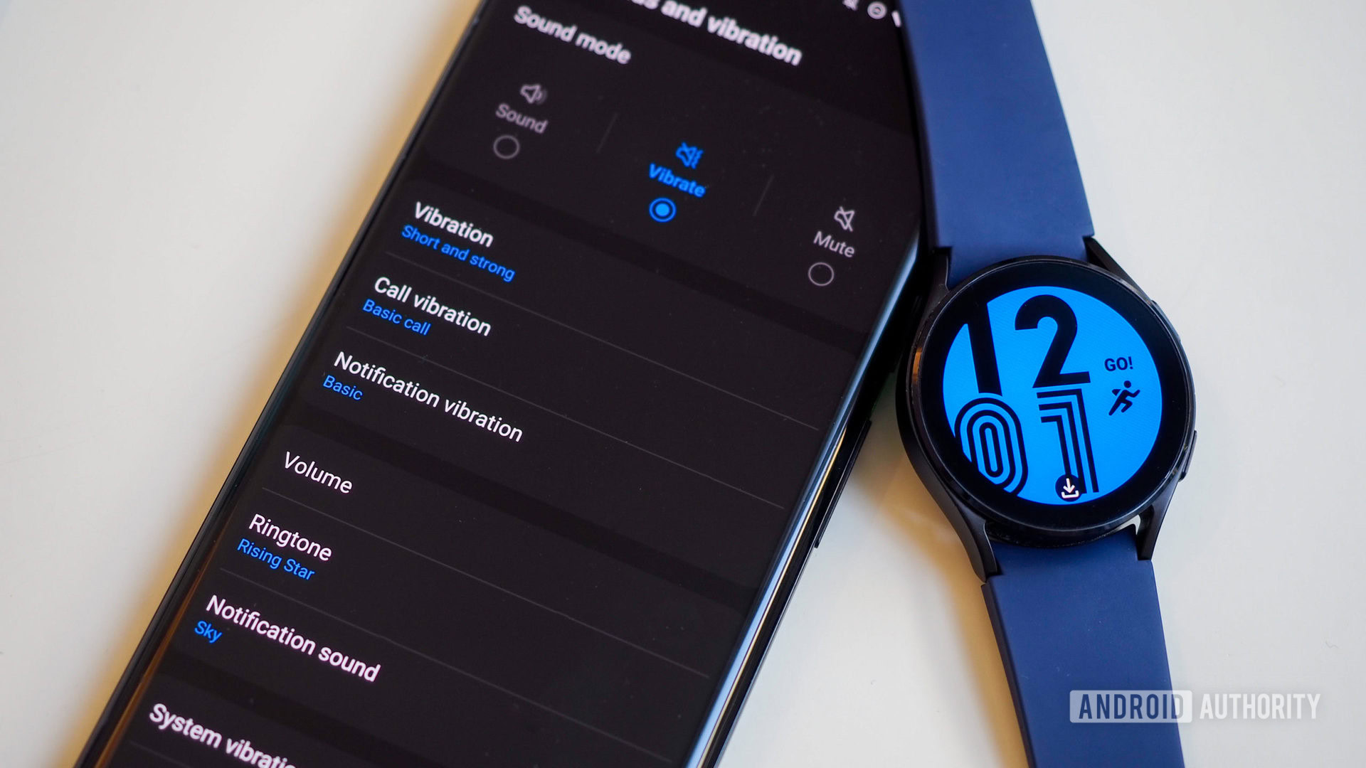
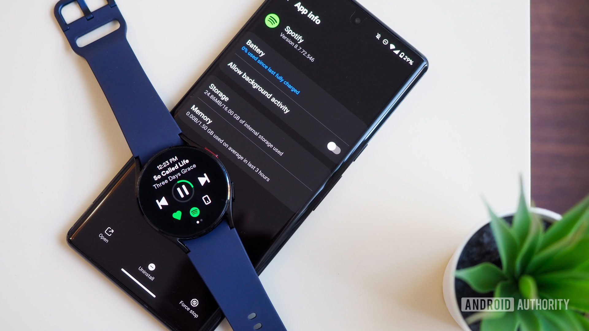
Buttons and gestures, notifications, sound, vibration, frequency of heart rate measurement, and almost any (every?) other watch setting are available in the app. Even third-party app info and management are accessible, so I can see how an app impacts my watch’s battery or storage and uninstall it directly from my phone. Overall, Galaxy Wearable feels like a completely integrated experience and a proper “companion” app.

Rita El Khoury / Android Authority
The Pixel Watch app takes a similar approach but stops midway. You can customize watch faces and add and organize tiles, control notifications, and modify a few random settings, but things don’t go further. For every setting that shows up in the app, there are four or five more that are only accessible from the watch.
In a way, I understand Google’s thinking there: The most important settings can be changed from the convenience of your large phone display, and the rest are available on the watch. Simplicity wins, but you pay for it in consistency and visibility.
The Pixel Watch’s companion app is simpler, but less complete. Many settings and options are hidden several layers deep on the watch.
The differences between the app and watch create a guessing game and hide away potentially crucial features until you dig and tap and scroll on your tiny watch display. Many users may not know, for example, that they can trigger app updates from the watch’s built-in Play Store, change the display font size, disable speech output from the Google Assistant, or switch to a different default app for messages. Third-party app management looks like it’s available, but all it does is take you to the Play Store to download more; there’s no way to check an app’s impact or remove it from the phone.
Personally, save for editing watch faces, tiles, and notifications, I’ve stopped using the companion app because I’m never sure if the setting I need is there or not. The inconsistency makes the app’s few useful settings less useful overall for me.

Rita El Khoury / Android Authority
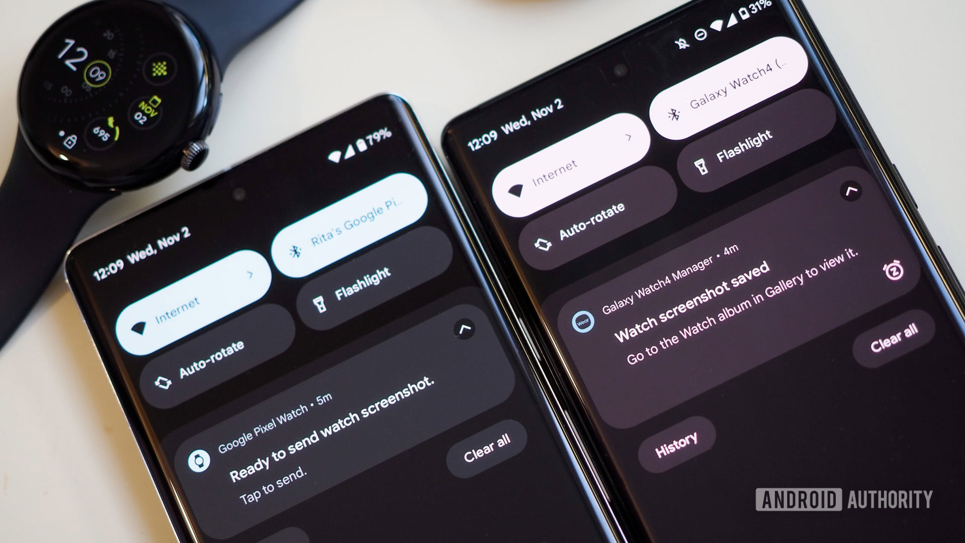
The companion app also perpetuates Wear OS’s mishandling of screenshots — the bane of our existence as tech writers. Whereas I can simply take a screenshot on my Galaxy Watch 4 by pressing the two buttons at the same time and the image is immediately saved to my phone, the Pixel Watch doesn’t let me do any of that.
There is no button combination to capture the screen, the only way to do it is through an invisible menu in the app. You have to enable Developer options on your phone to trigger a three-dot menu on the top right of the Pixel Watch app, otherwise you won’t even see it. And still, every captured screen shows up in the notification shade on your phone with only an option to share. No saving to local storage. It’s needlessly annoying.
The new Pixel Watch app is much better than the old generic Wear OS app, but I wish Google went the extra mile with it.
It’s worth reiterating that the new Pixel Watch app is miles ahead of the old Wear OS app, and a worthier companion for this modern piece of tech, but I wish Google went the extra mile and provided all the settings and features in it, instead of stopping 80% of the way and calling it a day. Perhaps future updates will bring the missing options and allow us to change every setting and manage all apps from the phone — at least I hope they do.
For all the latest Technology News Click Here
For the latest news and updates, follow us on Google News.
