Android 12 Review: Sweet Material You
Hey, how do you make a mature operating system fresh and interesting once again without changing the paradigm?
Read more:
Android 12 release date
What is Android 12 called?
Google abandoned the official use of dessert names after Android 9 Pie in 2018. It was the last Android version to officially carry a dessert name, and was followed by Android 10 and Android 11 which officially carried no fancy confectionery names. Internally, however, those two were reportedly called Quince Tart and Red Velvet Cake, respectively.
What phones will get Android 12?
Android 12 is now available to most of Google’s latest Pixels and will eventually be available to a trove of current and last-gen devices from all phone manufacturers. However, if you’re not using a Pixel, you will definitely have to wait a bit as manufacturers need time to implement the new software in their custom Android skins, for better or worse. Samsung, OnePlus, Motorola, Xiaomi, and all other Android manufacturers will bring it as soon as possible, but it will still take a couple of months at least.
Which phones will get android 12 first?
What are the changes in Android 12?
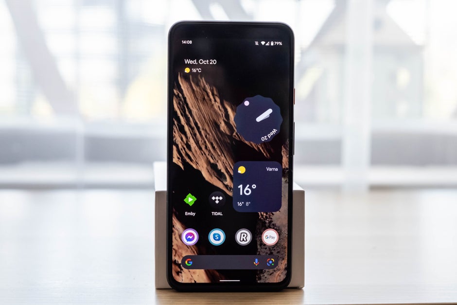
Design is undoubtedly the biggest novelty with Android 12, and the new design language carries the promising ‘Material You’ moniker. It’s the logical evolution of Google’s Material Design style that was announced a long, long time ago, back in 2014 alongside Android 5.0 Lollipop.
The new interface visuals are playful and vibrant, revamping the somewhat stale looks of Android which slowly lost their colorful Material Design identity with time. Gone are the lifeless, sanitary monochrome backgrounds that dominate most menus; in are some lightly colored, pastel backdrops that make text, icons, and on-screen content pop out while simultaneously adding a much-needed splash of color throughout the whole interface.
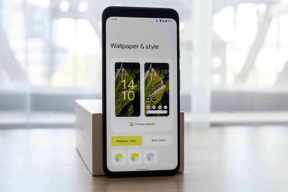
The color palette will automatically change based on the wallpaper you set for a more coherent visual experience, while simultaneously giving you the option to spruce up the style and choose your own hues.
How has Google achieved that? Thanks to a feature dubbed Color Extraction, Android will automatically determine which colors are dominant and which ones are complementary, painting over the notification shade, the lock screen, the new volume controls, the new widgets and much more.
But color is not everything. Motion also plays a big role in Material You. Google has also sprinkled tons of smooth new animations that evoke a coherent feel of fluidity throughout the whole interface.
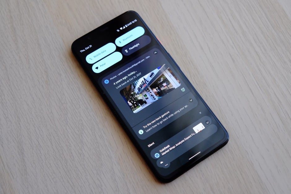
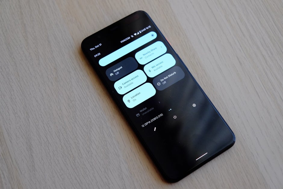
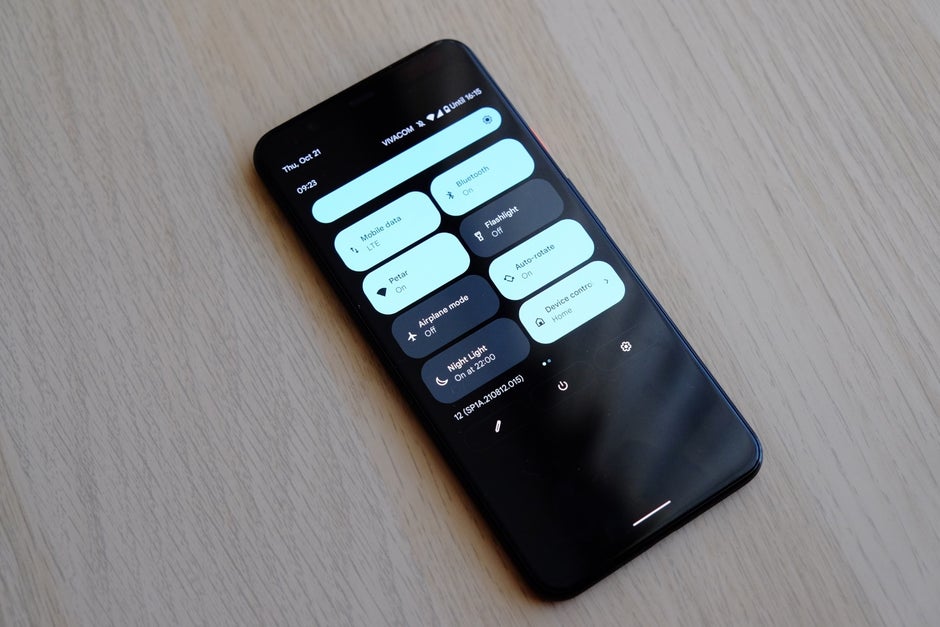
Aside from color and motion, the interface itself has been drastically changed. For one, the Quick Settings panel has also been streamlined: the brightness slider now sits at the top of the notification shade and is much bolder and larger than before. There are merely four quick toggles when you swipe down and the notification shade isn’t fully expanded, which definitely makes for a clean appearance that unfortunately sacrifices functions.
Swipe down again and four more tiles will present themselves to you. Of course, the Now Playing music widget is still there when needed, giving you easy access to your music or podcasts. Google Pay and Home Controls are also two quite important new arrivals to the notification pane.
The notifications themselves now pop up over an opaque background and get bundled together when that makes sense. With slightly more rounded corners and less visual clutter, notifications appear much cleaner than before. What’s more, notifications now act as an integral part of the notification shade and nor just something that sticks there temporarily, if that makes sense. Notifications from chat apps still appear as conversations, get stickied to the top, and allow you to easily continue chats without ever opening the target messaging app.
Rolling, or long, screenshots are now part of stock Android. While just about any other Android manufacturer has implemented this in their custom skin, and even Apple adopted the feature a few years back, it’s still nice that Google finally bakes in the functionality in stock Android.
Read more:
What are the advantages of Android 12?
Aside from the visual portion of things, which is quite important, there are tons of improvements to Android 12 that make it noteworthy.
Android 12: Privacy and security
Google did focus on security and privacy quite a lot during the opening Google I/O keynote. There are new iOS-like privacy indicators in the upper right corner which clearly indicate if your camera or microphone are being actively used by a certain app. Tapping on these icons will tell you exactly which apps are using the microphone and camera on your phone.
Two new tiles in Quick Settings allow the user to shut down access either the microphone, the camera, or both from being accessed by the system as a whole, which should bring a relaxing peace of mind to privacy-conscious individuals.
Another privacy-conscious feature is the revised Privacy dashboard, which easily shows you what data is being accessed, how often and by what apps. You can also easily revoke granted app permissions straight from the dashboard in order to know what’s happening with your phone privacy-wise and rein in the misbehaving software. Location access has also been revamped. Users are given the option to grant apps access to precise or approximate location upon the first start of the app, but of course, this can be changed later if the user decides..
Does Android 12 improve performance?
Each and every year, Android becomes faster and more efficient, and you bet Android 12 is no different. Thanks to intricate under-the-hood improvements have made Android 12 faster and more responsive than Android 11. On top of that, Google says the latest Android is also more power-efficient as well, so we get yet another win.
How has Google achieved this? Without sparing the technical lingo, Google goes in pretty detail about its advances in performance and efficiency. For example, Google says the CPU time needed for core system services has been reduced by up to 22%, while simultaneously reducing big cores CPU usage by the system server by up to 15%. Those are impressive gains that will definitely yield much better battery life in the long run.
On top of all that, there’s a new standard implemented in Android 12 dubbed Performance Class, which helps identify high-performance devices and ensures that demanding features and functionalities will work as intended. Performance Class devices will have to cover certain speed standards, like camera startup latency, codec availability and encoding quality, as well as minimum memory size, screen resolution and read/write performance.
Android 12: The verdict
Overall, I’m pleased with Android 12. While it’s not revamping the overall Android experience by any means, it’s close to being the perfect software update: it overhauls just enough core features for the better while also boasting a new coat of paint to improve its user-friendliness. Material You looks fresh despite the wasted space here and there; provided that Google sticks to it and improves it further, I could see it become the definitive, signature design language of Android.
For all the latest Technology News Click Here
For the latest news and updates, follow us on Google News.

