Big steps forward, a few behind
The emergence of the Samsung Galaxy Fold was a landmark moment for the smartphone industry, as it and the Huawei Mate X were the first two foldable phones from major manufacturers. Reality soon bit hard though, as it was discovered shortly before launch that the Galaxy Fold had major screen and durability issues.
Samsung dutifully addressed these issues and delayed the launch, eventually delivering a device that clearly showed potential. The firm would follow up with the Galaxy Z Fold 2, addressing a number of concerns like foldable screen durability, a better traditional display on the outside, and more.
But how do you follow up on something like the Galaxy Z Fold 2? Well, that’s where the Samsung Galaxy Z Fold 3 comes into play. Samsung is pushing hard to make its latest foldables mainstream devices, but does it succeed with this one? We’ve already given our extensive verdict in our review which you can read below, but we also wanted to give the phone another look with fresh eyes. Let’s dig into it in this Samsung Galaxy Z Fold 3 review second opinion.
Our verdict: Samsung Galaxy Z Fold 3 review
The ups and downs of foldable design
Hadlee Simons / Android Authority
As someone who only had fleeting looks at the likes of the original Galaxy Fold, Huawei Mate X, and Royole Flexpai at industry trade shows, jumping straight to the Galaxy Z Fold 3 for testing as a daily driver means I’ve skipped some of the early teething issues with large screen foldables.
The Galaxy Z Fold 3 definitely looks and feels like an expensive piece of kit.
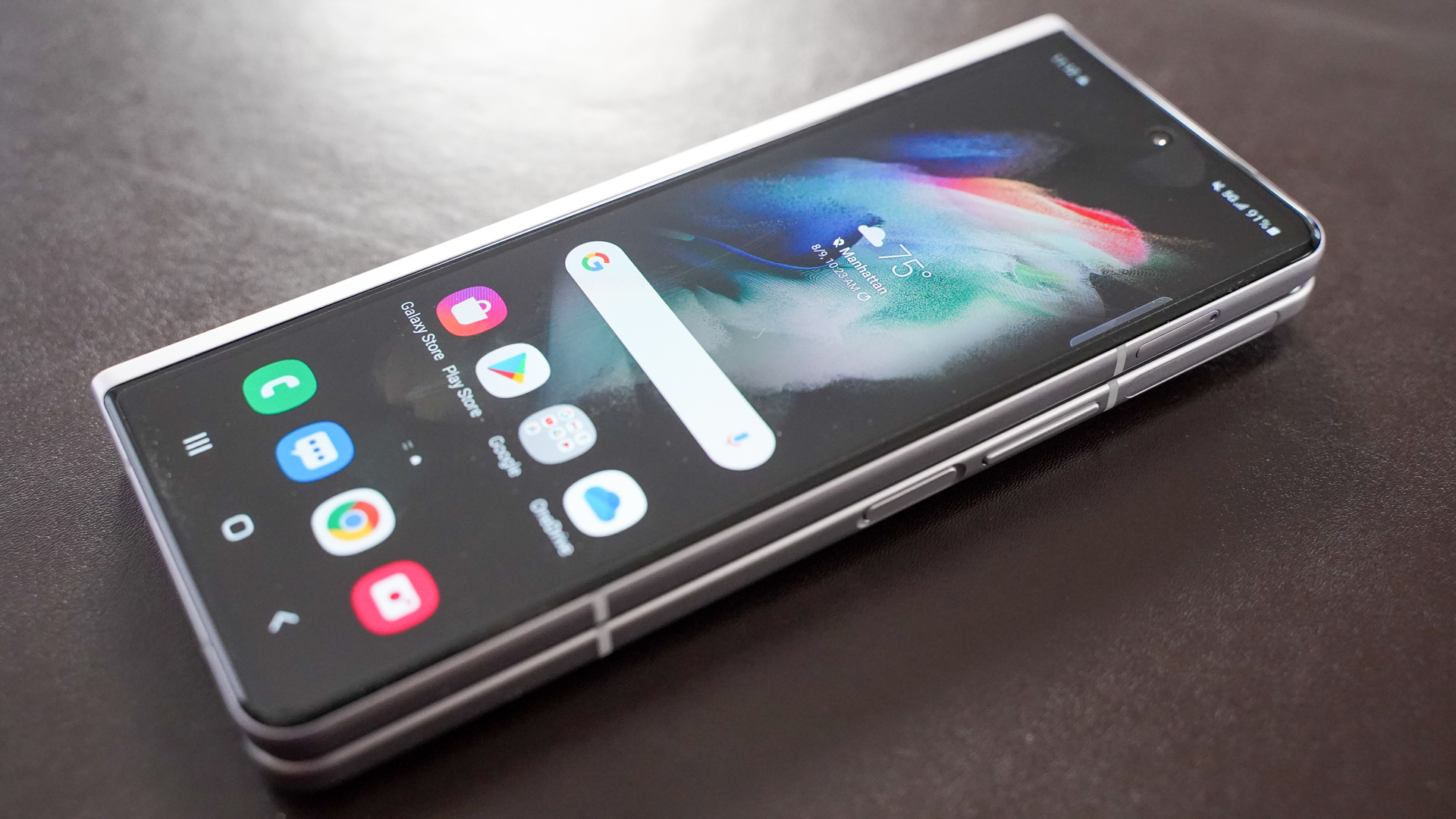
There’s no denying that Samsung’s latest foldable is much thicker and heavier than traditional flagship phones, at ~14mm and 271g, respectively. You’re essentially carrying two relatively slim smartphones strapped to each other. You can definitely slip this phone into a jeans pocket without issue, but the thickness and weight mean it’s a bit of a tight fit. So you can’t (and probably shouldn’t) keep much else in the same pocket.
Otherwise, I was pretty impressed with the build quality overall. You’ve got an aluminum frame, a glass back that doesn’t attract much fingerprint grease, and that metal hinge protector with the Samsung branding on it. All of this contributes to a device that definitely looks and feels like an expensive piece of kit — which it should considering its $1,800 price tag.
Best of all, Samsung has implemented an IPX8 water resistance rating here. This represents a major step for foldable phones in narrowing the feature/durability gap to conventional flagship phones. Unfortunately, the phone isn’t rated for dust protection, which is a downer and means you might still have to baby the phone in certain situations or leave it at home if you’re heading to the beach.
Another notable hardware improvement is that Samsung claims the foldable screen is 80% stronger than before. Samsung is also confident enough in the folding screen’s durability to offer S Pen support, albeit via a bespoke Fold Edition stylus ($49) with a tip that retracts under pressure.
What’s foldable life like?
Hadlee Simons / Android Authority
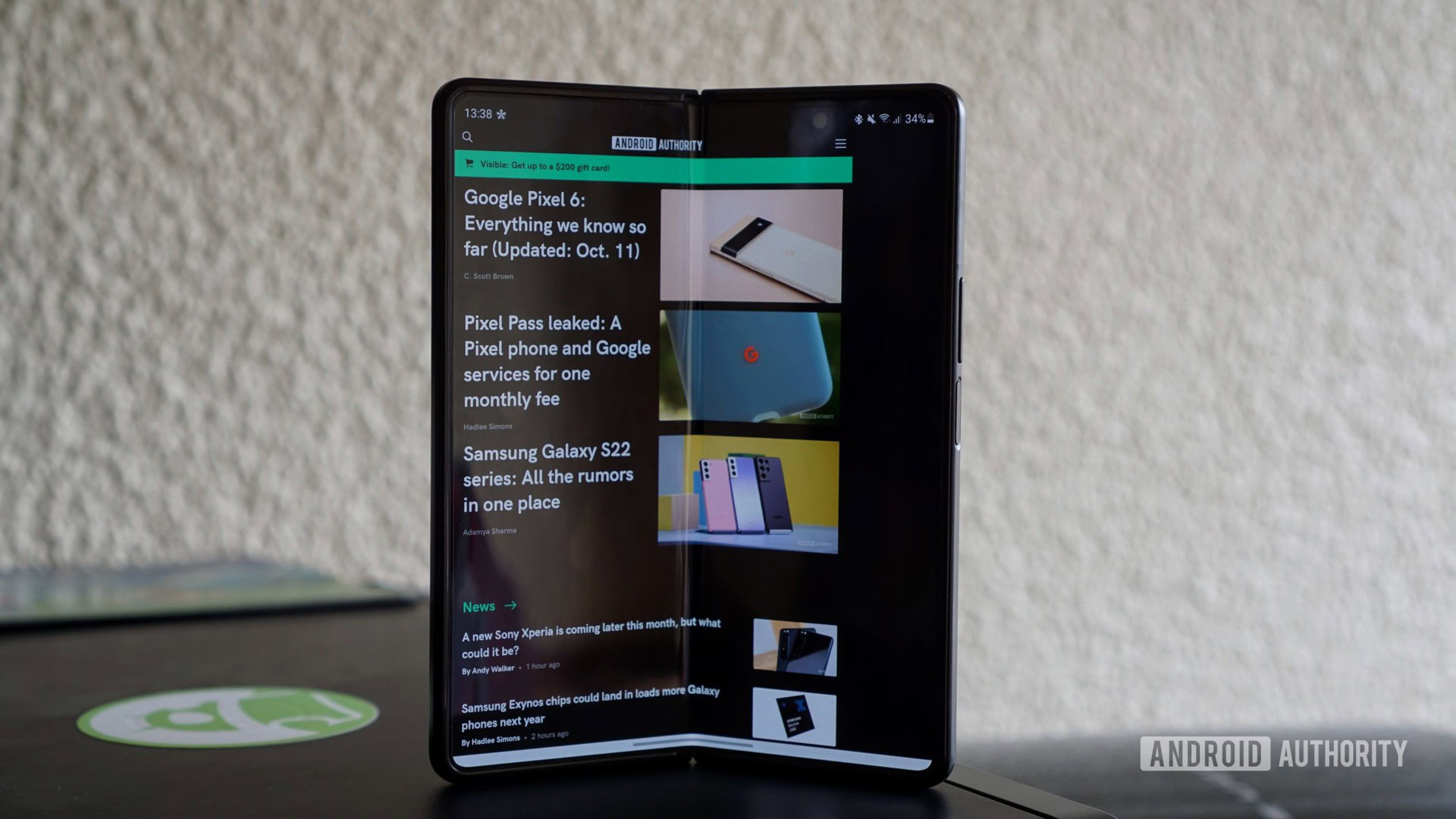
What about the folding side of things, though? Well, the Galaxy Z Fold 3 might be incredibly thick when folded, but it’s also very narrow in this orientation. This means that you’ve got an almost TV remote-style form factor when used as a phone, featuring a very quirky 25:9 screen ratio for the smartphone screen.
If you’re like me and have never owned or extensively used a foldable phone before, then you’ll be glad to know that the actual foldable phone experience feels pretty polished here. You’ll need two hands to unfold the device, but I found that folding it back was definitely possible with a single hand (placing your thumb on the crease to help get it folded). Folding the device produces a satisfying thwack too.
The big selling point of the Fold series is the tablet-sized foldable screen. And despite the 80% durability claim and use of Ultra Thin Glass (UTG), it must be said that you can definitely tell that you’ve got a plastic screen here. It simply doesn’t feel as hard as the screen on any conventional phone, but I never felt like I was on the verge of breaking the screen by prodding it with a little force.
The aforementioned S Pen support is one way to get scorned Galaxy Note fans interested, but the lack of an integrated S Pen slot — or at least without an awkward case — is a bummer. In saying so, the expanded screen area is very welcome compared to bonafide Note phones like the Note 20 Ultra, while palm rejection worked well here too. Either way, the support is a statement by Samsung that the screen is much tougher than before.
A slightly bigger screen would be appreciated though, especially for the likes of YouTube, where videos don’t effectively use all that screen real estate unless you’re watching 4:3 content. Videos are still a treat on here, while web browsing and reading are very pleasant experiences as well. The screen gets sufficiently bright too, so outdoor usage was generally fine, although there’s more glare coming off this screen than the front smartphone display.
More reading: The best thing about foldables could one day be their durability
It’s also worth noting that the Z Fold 3’s foldable display has a noticeable crease, which makes me wonder just how much bigger previous creases were. The crease is very noticeable under your finger too. However, I did get to spend a few hours with the Galaxy Z Flip 3 and I’d say that the crease there makes for a worse experience, as you’re almost always going to be touching it. On the Z Fold 3 though, you’re mostly touching the left and right-hand sides of the foldable display and avoiding the middle altogether.
As for handling the phone while closed, the narrow design when folded means that the Galaxy Z Fold 3 is pretty comfortable for daily use, despite the thickness and heft in general. The external screen — clad in Gorilla Glass Victus for protection — is pretty sharp and gets more than bright enough when outdoors too.
The Galaxy Z Fold 3 could do with a wider external display. Huawei managed to do this with the Mate X2.
The external display is a little too narrow though. This downside is felt keenly when you need to enter text, as the keyboard is just a little too small for the screen. It’s also acutely felt when reading passages of text (e.g. in the Kindle app). I understand that design considerations likely forced Samsung’s hand here, and I’m well aware that this still seems to be a big improvement over the original Galaxy Fold. But it certainly feels like Samsung is gently prodding you to use the large screen when reading.
On the plus side, scrolling through something like Reddit and Twitter is pretty neat here. You’re only getting slightly more content in your feed compared to a traditional smartphone, but it’s still a pleasant experience. Nevertheless, perhaps going a little wider while slightly reducing the overall thickness would be a better solution for a future Z Fold device. After all, the Huawei Mate X2’s phone display goes a little wider (delivering a 21:9 aspect ratio).
A foldable is nothing without software

Hadlee Simons / Android Authority
Any decent foldable requires software to take advantage of the form factor, and Samsung has generally done a good job of this with its previous foldables. The same applies here, as the company’s One UI skin supports adaptations for the two screens as you’d expect, as well as a few more features.
Related: Everything you need to know about Samsung One UI
Flex Mode was introduced back on last year’s Galaxy Z Flip and Z Fold 2 devices, with app developers being able to take advantage of the foldable being half-open. This feature is here on the Galaxy Z Fold 3 as well. Leave the foldable half-open like a laptop and you can watch YouTube like this (no kickstand needed), take photos without the need for a tripod, or video call via Google Duo or Zoom.
Samsung has also done a solid job of implementing features like app continuity (allowing you to choose which apps switch to the smartphone screen when you fold the device) and home screen consistency (whether your main screen has the same home screen as the smartphone display).
There’s definitely room for improvement though. For example, the ability to toggle refresh rate by screen would be great. Separate volume controls for each screen would also be handy, as I’m far more inclined to require volume on the media-friendly foldable screen.
Samsung’s foldable software is pretty polished, but it could do with a few more mindful tweaks.
Another minor annoyance is that auto-rotate can’t be toggled on a per-screen basis. The external display is just too narrow for doing things in landscape orientation, but things like Flex Mode rely on auto-rotate functionality. There are rotate prompts as per Android 11, and these do make life easier, but these prompts affect the other screen too. So that means when rotating a video on the main screen to landscape, you’ll need to hit the rotate button again before closing the device, as your smartphone screen will be in landscape mode too.
Perhaps the biggest issue with the Galaxy Z Fold 3 software experience is that quite a few third-party apps still don’t account for the foldable form factor. For example, Samsung’s own keyboard offers a split arrangement, with half the keys on the left side and half on the right (and nothing on the crease). However, Google’s Gboard misses out on this feature altogether. It’s a particularly weird omission as Android Marshmallow for tablets offered a split keyboard way back in 2015.
Hadlee Simons / Android Authority
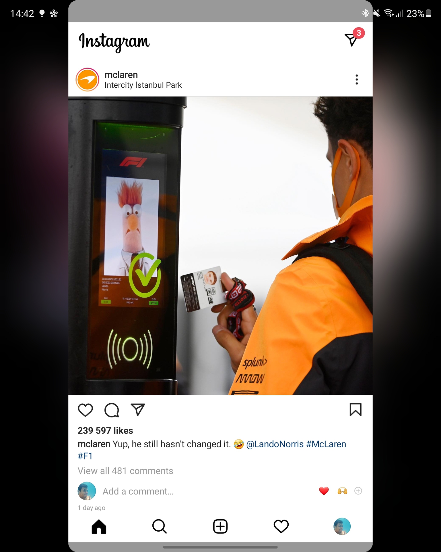
Another major third-party app that hasn’t been optimized for foldables is Instagram. You’d think the company would want to use the entire foldable screen to showcase content, but you get an extremely unpolished interface instead, as seen above. This is doubly disappointing because this was an issue with the Galaxy Fold and Galaxy Z Fold 2 but still hasn’t been resolved.
Hey, Galaxy Fold Z 3, 2019 called and it wants its cameras back
Hadlee Simons / Android Authority
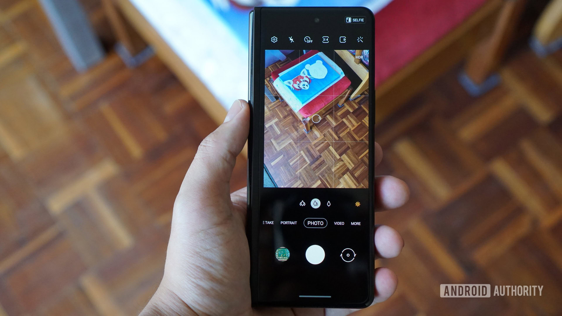
Those hoping for a modern flagship camera experience will be disappointed, as the Galaxy Z Fold 3 camera specs read like a Samsung flagship from a few years ago. The rear combo features three cameras, namely a 12MP primary sensor, 12MP 2x telephoto shooter, and a 12MP ultra-wide lens.
See also: The best camera phones you can get
You won’t be getting 8K video recording or 8K Video Snap here, as 8K resolutions require 33MP or higher cameras. Another feature you’re missing out on is long-range zoom, as the foldable only packs a 2x telephoto sensor. Nevertheless, the phone still sports night mode functionality, Samsung’s excellent Single Take mode, Director’s View, Super Slow Motion, and Super Steady video capabilities. So you’ve still got a respectable variety of modes to play with.
As for the actual image quality, pictures taken with the 12MP main camera generally look crisp and offer good autofocus performance, although the Scene Optimizer (enabled by default) cranks saturation up way too much for my liking. I’m also not sure if this is a by-product of occasionally aggressive HDR or something else entirely, but I’ve noticed that scenery like mountains gains a smudgy outline upon closer inspection as well. Zoom in on the penultimate shot to see what I mean. Nevertheless, the main camera does a good job on the whole, but it’s not going to win any end-of-year awards.
The ultra-wide camera takes some pleasantly wide shots thanks to its 123-degree field of view, and images shot during the day generally have a similar color profile to the main shooter. Unfortunately, this camera suffers from an extremely noticeable drop in detail on the edges of the picture. This isn’t an uncommon occurrence for ultra-wide cameras, but it’s more pronounced here than on other phones I’ve reviewed recently.
Another disappointment for the ultra-wide camera (and perhaps a contributing factor to the mushy edges) is that there’s no autofocus here. So tapping on the screen only changes the exposure rather than the focus. It also means macro shots are out of the question.
More photography coverage: Want a phone with a great camera? Here’s what to look for
Switching to the 12MP 2x telephoto lens, and this camera does a solid job at 2x to 4x zoom levels, although colors are definitely more muted compared to the main and ultra-wide camera. Those wanting decent long-range zoom snaps (~10x) should look elsewhere, as detail generally falls off a cliff. The 10x shot of the mountain in the gallery above is a good example, as even my 2018-era Huawei Mate 20 Pro managed to capture a shot with less noise and over-sharpening.
The main camera acquits itself well enough come night-time, although shooting without night mode makes for quite a noisy, dark scene compared to something like the Vivo X70 Pro Plus. Samsung’s night mode does a good job of boosting brightness without going too bright, but Vivo’s mode definitely has more detail and looks more aesthetically pleasing to me.
Meanwhile, the ultra-wide camera is a mess in low-light situations, but the night mode is capable of turning super-dark, noisy scenes into usable shots. Still, the Galaxy Z Fold 3 lags behind many premium flagships when it comes to low-light shots with the ultra-wide.
You’ve also got a 12MP selfie camera in a punch-hole cutout on the front and a 4MP under-display selfie camera on the foldable screen. The latter produces a very noticeable haze with light backgrounds. You’ll also notice the camera outline when the screen is turned off or against dark colors.
I could certainly excuse the haziness if the under-display selfie camera was good, but even budget phones have better selfie shooters than this. Despite Samsung’s software smarts, the under-display camera lacks detail, with shots in ideal conditions looking mushy too. And you often don’t have to pixel-peep to notice how bad these images look. An equally big casualty is dynamic range, and while it’s clear that the phone’s image processing attempts to balance things, it simply doesn’t hold up compared to even budget phones from three or four years ago.
Then again, Samsung is positioning this for use during video calls. Either way, you should use the smartphone screen’s shooter, as it’s noticeably better in terms of capturing overall detail in the scene as well as HDR. Check out a comparison below.
Video quality tops out at 4K/60fps, and the actual quality is pretty good. I saw little to no dropped frames and while there is some noise in dark parts of the clip, it’s kept under control. Samsung also offers a Super Steady mode, which tops out at 1080p/30fps. Stabilization here is pretty solid, albeit with the jelly effect now and again. I would love to see Samsung bring this up to 1080p/60fps, as the extra frames make for a much smoother video.
Taken together, the cameras are definitely the weakest link in the Galaxy Z Fold 3’s chain. And if Samsung wants to attract Galaxy Note enthusiasts or premium flagship fans in general, it’ll need to address this with the Galaxy Z Fold 4, because software updates can’t fully address everything that’s wrong or missing here. That’s not to say you aren’t getting a decent camera experience in general, but you can get a similar experience from other phones like the Galaxy A72 and Galaxy S20 FE for under half the price. You can take a look at full-resolution shots via our Google Drive folder.
Flagship-level performance
The Galaxy Z Fold 3, much like Samsung’s previous foldables, has high-end internals to keep things ticking. For 2021, that means a Snapdragon 888 SoC, along with 12GB of RAM, and 256GB to 512GB of expandable storage.
Benchmark performance generally reflects the flagship silicon, although the AnTuTu score was a little on the low side. Meanwhile, our in-house Speed Test G benchmark yielded a time of about 97 seconds. That’s significantly slower than phones like the Xiaomi Mi 11 series, the Galaxy S21 Ultra, and the Oppo Find X3 Pro.
Real-world usage is what matters for many though, and Samsung’s foldable is a very nippy performer. The phone handled swiping through menus, loading apps, and scrolling through web pages without breaking a sweat. Plus, the experience felt equally slick on either screen.
Gaming is one way to potentially bring a phone to its knees, so we downloaded the likes of Genshin Impact, Call of Duty Mobile, and Hitman Sniper. Genshin Impact ran smoothly here, with little slowdown while still looking lush on that huge foldable screen. Meanwhile, Call of Duty and Hitman Sniper also ran at a good clip here, with little perceptible judder or slowdown. Emulation via Dolphin was a good experience too, as we tried out Metroid Prime and F-Zero GX. Both games did have some stutter here and there, but they’re very playable otherwise.
The Galaxy Z Fold 3 isn’t top of the class for benchmarks, but real-world usage shows that it’s pretty fast.
The phone clearly delivers plenty of real-world horsepower then, but what about mileage? I was able to get over six hours of screen-on time with the Galaxy Z Fold 3 on several occasions using the dynamic refresh rate option. This usage was mainly via the smaller screen and was relatively heavy too, with one cycle consisting of roughly 90 minutes of YouTube, half an hour of Genshin Impact, some YouTube Music playback, and podcasting.
A day of pushing the device pretty hard resulted in six and a half hours of screen-on time. This consisted of plenty of benchmarks, just under an hour of gaming/emulation, and almost three hours of YouTube playback (mostly on the small screen). That’s quite impressive in our book, so mobile gamers or those wanting to consume plenty of videos will be in good stead here.
Related: Here are the best Samsung Galaxy chargers
Once you’ve exhausted the battery, you won’t be able to rely on a bundled charger to top up the Z Fold 3. But the phone supports 25W speeds, and charging the device from zero to 100% took roughly 90 minutes. That’s pretty slow when charging times of under an hour are now commonplace in the flagship space. Even a one-hour charging time would’ve been a nice boost. At least there’s 11W wireless charging here if you’re partial towards charging pads.
Samsung Galaxy Z Fold 3 review second opinion: The best foldable, but not the best phone
Hadlee Simons / Android Authority
The Galaxy Z Fold 3 isn’t necessarily the best foldable for all people, as the Galaxy Z Flip 3 is a great pick if you want to buck the trend of ever-larger smartphones while still having all the wow factor of a folding screen. Samsung’s smaller foldable also delivers a more durable screen and an IPX8 design, but the small size comes at the expense of a decently sized battery and telephoto camera.
But if you like the idea of a powerful tablet in your pocket and were waiting for some foldable kinks to be addressed, then the Galaxy Z Fold 3 doesn’t really have any viable competition outside China. The addition of a tougher folding display and IPX8 design really goes a long way towards assuaging durability concerns in a way that even Huawei and Xiaomi’s China-only foldables don’t seem to do.
Otherwise, you should wait for the Galaxy Z Fold 4 if you want a foldable phone that has all the bells and whistles of a premium flagship, or buy a Galaxy S21 Ultra instead. Because even with its unique design quirks and added polish, it’s still fair to expect better cameras, a more conventional smartphone display, and faster charging for the whopping $1,800 asking price.
Samsung Galaxy Z Fold 3
The first foldable with an IP rating for water resistance.
Samsung’s latest foldable flagship looks a lot like the 2020 model but boasts some new design elements and some better specs. It also has an IPX8 rating and supports the use of an S Pen, all at a lower entry price than previous years.
For all the latest Technology News Click Here
For the latest news and updates, follow us on Google News.
