

It’s a hot summer day in the office. You let procrastination take over and start planning your perfect vacation. You browse through your friends’ Facebook profiles basking in all the amazing colors of those amazing places – lagoons, teal as your childhood dreams, palms, greener than your neighbor’s lawn, and cocktails so bright that you can almost feel the vitamins (khm, alcohol) sipping through the image.
You book that perfect place in Greece for a week and start feeling the excitement electrifying your neural network. Then a week later you and your friends/family/girlfriend arrive at the spot but something seems a bit off.

Your perfect vacation in your head
But it never “clears up” or gets any better. Your vacation is okay-ish but an insidious feeling of disappointment lingers at the back of your mind. What’s happening?
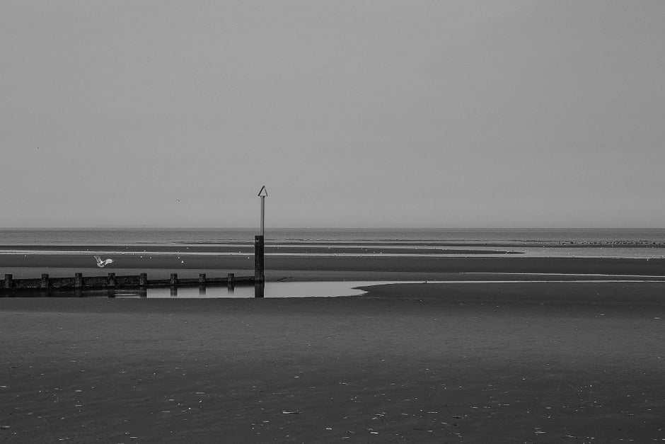
The actual place
Image processing – dreams vs reality
Now, if we want to argue for the sake of arguing we can say that all digital images are processed to a certain extent. There’s some statistical noise reduction going on even before analog-to-digital conversion, and sometimes there are things such as chromatic aberration correction or lens distortion correction.The real “issue” happens after the RAW data is saved and it has to do with color boosting and dynamic range enhancement. And while you can turn off the HDR setting in most modern smartphones, the post-processing of the color information is often off-limits. Your only option is to use RAW and edit it to your liking afterward but very few people, photography enthusiasts mainly, would go that route.
Here’s a RAW sample next to the final processed image:
Who’s to blame?
People love poppy, bright, and saturated photos. It’s hard to pinpoint the main culprit – maybe it all began when paper magazines started photoshopping their images, or maybe (most probably) there were methods to enhance pictures even before that.
We recently did a blind camera comparison, and the winning photos were the ones with the most boosted, saturated colors. I was there, looking at every frame with my own eyes and I can tell you this – the pictures with the most realistic colors ended up last.

ZenFone 8

Galaxy S21

iPhone 12

Pixel 5
The psychology behind it
The (sad) truth is that we’re hardwired to pay attention to vivid colors. Evolution taught us that bright red means danger (blood), bright yellow/orange means food, dark green means shelter, and blue means water (or other equally important things strongly connected to our survival).
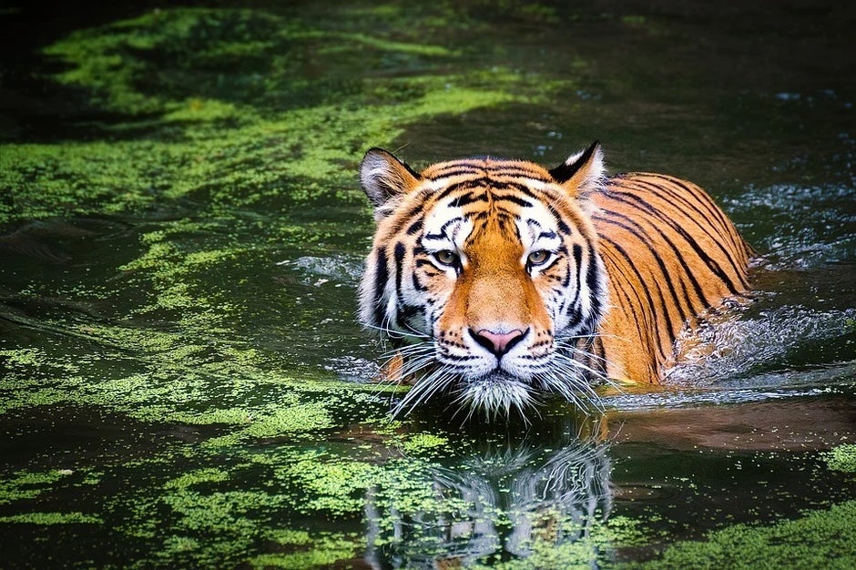
Can you spot the orange thing in the water… too late, you’re dead!
Our ancestors developed a trichromatic vision (the ability to see different colors) to be able to see food at greater distances, spot predators, and find shelter (actually, evolution did this through selective mutation). The same goes for contrast – high contrast scenes get our attention because making up as many details as possible can be key to survival.
So, in the end, when we see an oversaturated, high dynamic range picture, we subconsciously perceive it as “good” because it triggers a stronger response.
The moral dilemma
Back to our perfect vacation scenario. Smartphones are just the tip of the iceberg. We had the same problem with TV sets (and still have it) long before smartphones were even a thing. And some people spend more time looking at their TVs and smartphones than looking at the sky outside. What’s the real color of the sky then?
That’s another exaggeration, of course, but it begs the question – does image processing bend our perception of reality? And if so, shouldn’t there be some standard in place – maybe a mandatory color setting, called “normal”, or “real” baked in modern TVs and smartphones?

Should we keep our pink glasses on?
Granted, some of those gadgets already have “natural”, or “standard” settings but it’s not a mandatory requirement. I wish I just had a “real” switch on all my gadgets so I don’t have to calibrate or tweak settings.
What do you guys think? Do we need to tone things down a bit? Or just let colors be in our ever-so-gray mundane reality?
For all the latest Technology News Click Here
For the latest news and updates, follow us on Google News.