Fitbit Sense 2 Review: Running in reverse
Fitbit unveiled its newest smartwatch, the Sense 2, alongside the Versa 4 and the Inspire 3 fitness tracker back in August. Since then, both Apple and Google launched new smartwatches, with Google’s Pixel Watch largely stealing the show from Fitbit thanks in part to its inclusion of the company’s tracking tech.
That leaves the Fitbit Sense 2 in a lurch. At $399 in Canada, it’s about $50 cheaper than the base Wi-Fi/Bluetooth Pixel Watch. It’s also $100 more than the Versa 4, and $200 more than the Charge 5. One upside to this price is it’s less than the original Sense retailed for. The problem is that a lot has changed since then.
Previously, the Sense series was the pinnacle of Fitbit wearables – it offered the best tracking tech and a smartwatch experience. Now that the Pixel Watch exists, the Sense series doesn’t hold the crown for best Fitbit smartwatch. While it still offers the premiere tracking experience, it’s hard to justify paying as much as $200 more for the few extra benefits the Sense 2 offers. And if you’re looking for a smartwatch first, with the added benefit of Fitbit tracking, the Pixel Watch is a much better option.
None of that is to say the Sense 2 doesn’t have a place – it certainly does. Unfortunately, it feels like a more niche option, ideal for those who want Fitbit fitness tracking first and foremost, plus a taste of smartwatch functionality. Alternatively, it could be an option for iPhone users who want a smartwatch with fitness-tracking tech, but don’t want to go with the Apple Watch. Unfortunately, the Sense 2’s few smart features are further restricted in Apple’s smartphone ecosystem.
I could see the Sense series having a place as the ‘budget’ Google smartwatch (i.e. as a spiritual Pixel Watch Series-A), but that only works if the Sense series offers Wear OS and smart features like Google Assistant. The Sense 2, however, sports what can best be described as a cheap imitation of Wear OS, and abandoned smart features like Google Assistant that were available on its predecessor.
Specs
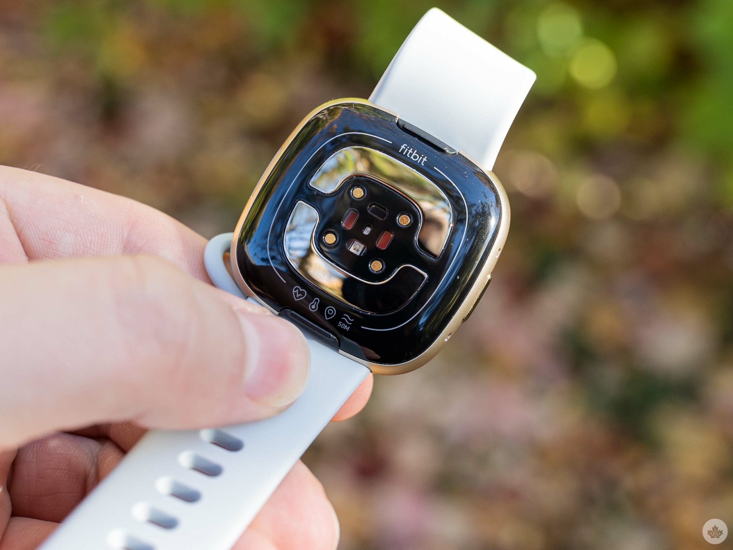
- Connectivity: Wi-Fi/Bluetooth
- Case: Aluminum
- Dimensions: 40.5×40.5×11.2mm
- Display: AMOLED with Corning Gorilla Glass 3
- Sensors: Multi-path optical heart rate sensor, ECG, electrical sensor for continuous EDA, red and infrared sensors for SpO2, gyroscope, altimeter, 3-axis accelerometer, ambient light sensor, NFC, skin temperature sensor, GPS
- Water resistance: 5 ATM
- Smartphone compatibility: Android 8+ and iOS 13.3+
Thinner, sleeker design
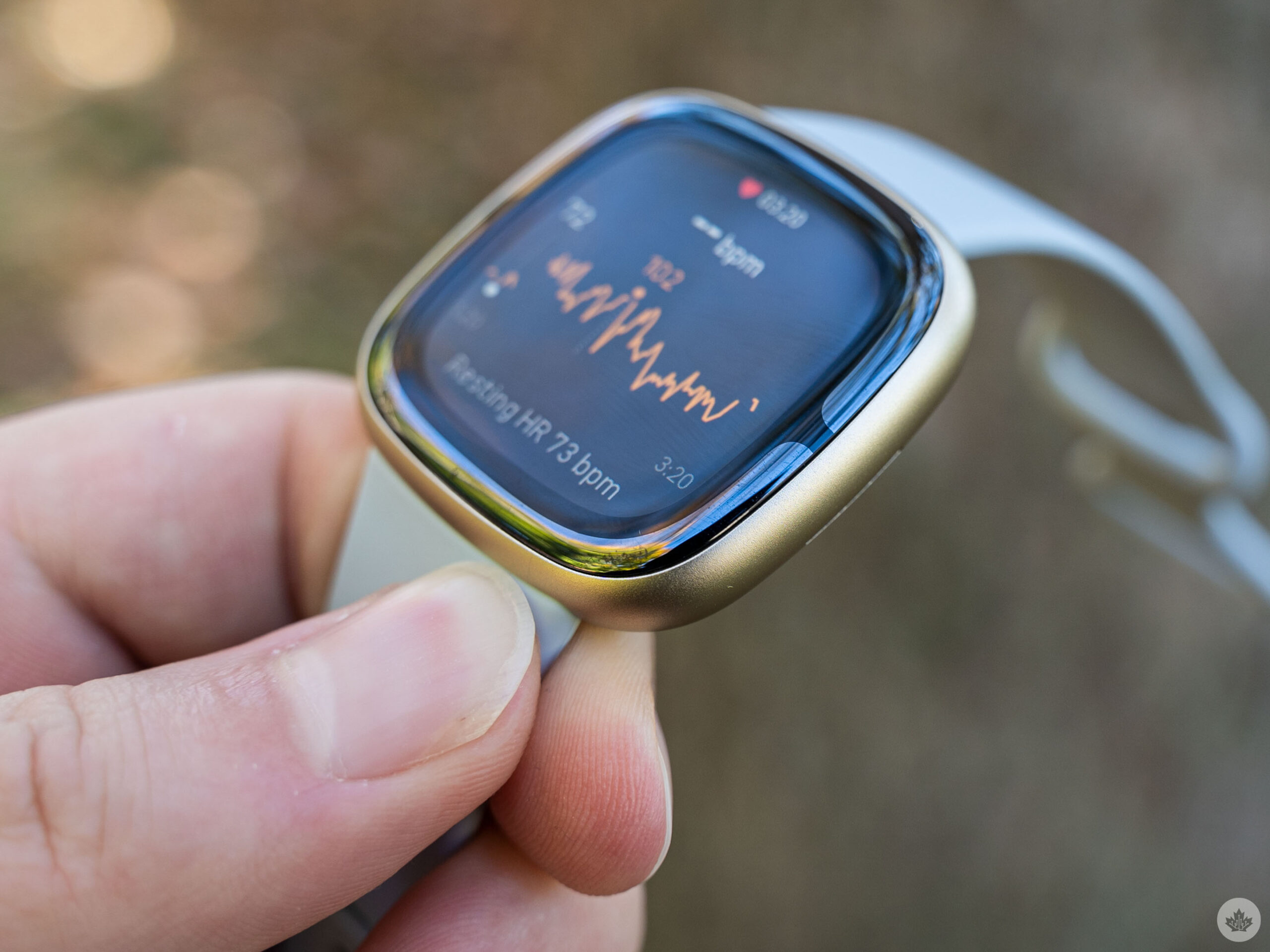 One of the best overall improvements with the Sense 2 over its predecessor is the design. The Sense 2 is the same length and width as the original Sense, but is a fair bit thinner and lighter (although the Sense 2 is still heavier than the Pixel Watch).
Beyond that, the Sense 2 doesn’t really change much. It sports the same squircle shape as the original Sense. It’s got the same band mechanism too, which means if you loaded up on cool bands for the Sense, they’ll still work with the Sense 2. Fitbit did move the metal band used for electrocardiogram (ECG) measurements. Instead of wrapping around the edge of the watch, the Sense 2 moved the ECG band to below the glass so it wraps around the screen like a slight extension of the bezel. It makes for a bit of an odd look and, while I don’t think it’s bad, it contributes to the Sense 2 display appearing “deep” in the watch.
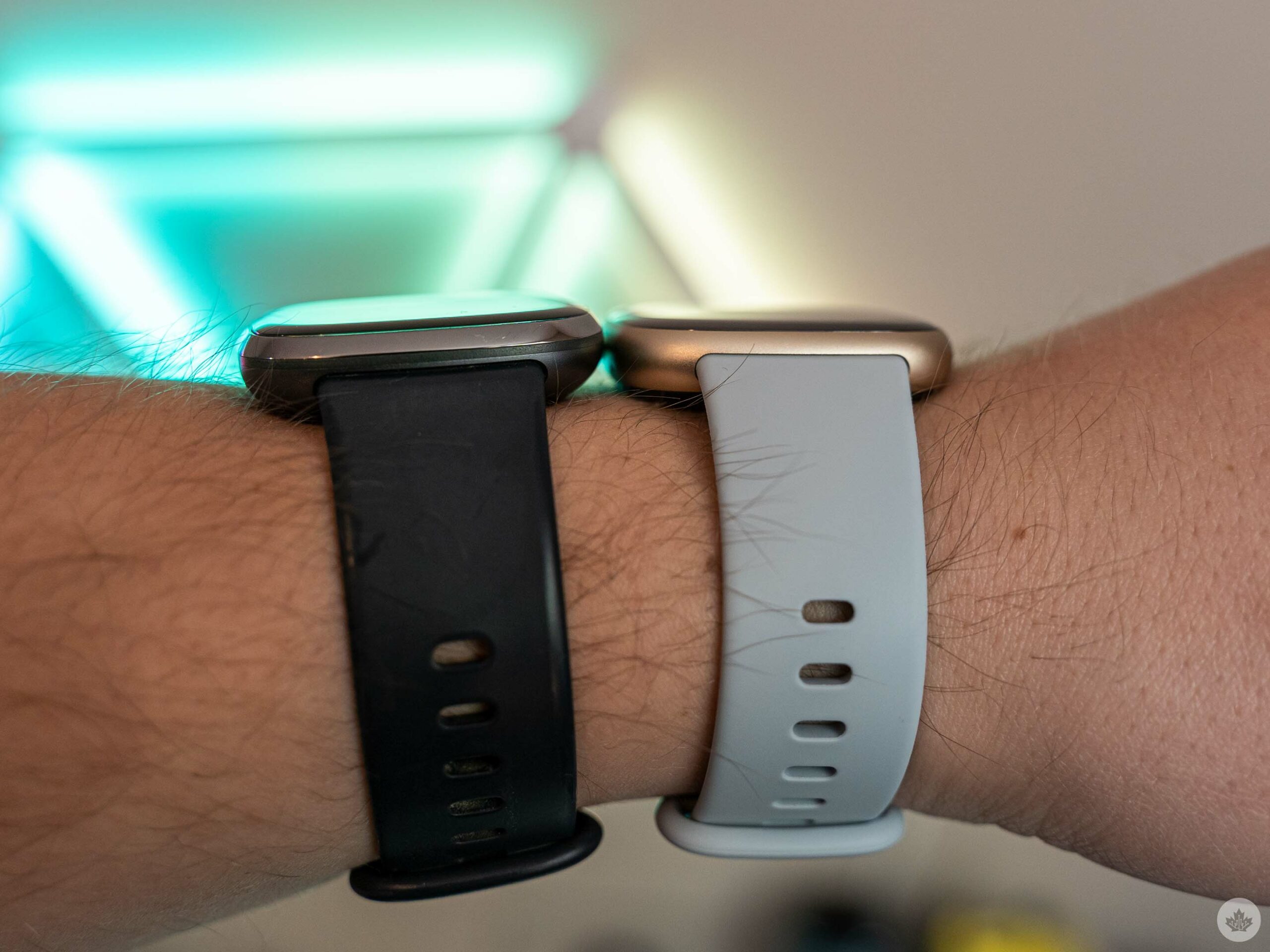
Fitbit Sense (left) and Sense 2 (right) on a wrist for size comparison.
Perhaps it’s a side-effect of coming from the Pixel Watch, but the Sense 2 display appears sunken into the glass. On most devices, the screen appears to be at least on the same level as the glass, even if it’s not. That’s not the case with the Sense 2.
Weird depth aside, the Sense 2 display is otherwise fine. It’s not significantly better than the display on the original Sense, but it’s not worse either.
What’s the big deal about a button, anyway?
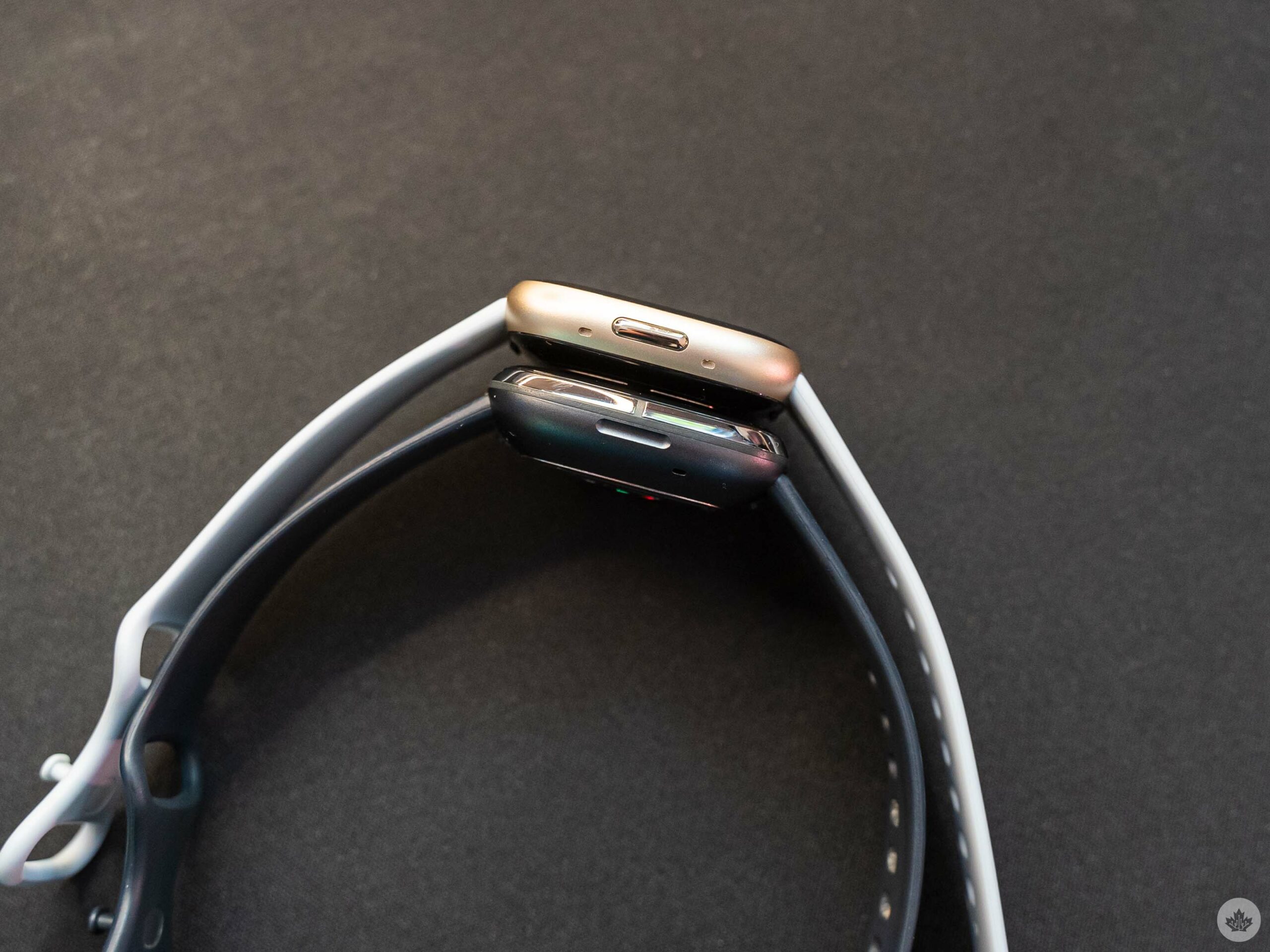
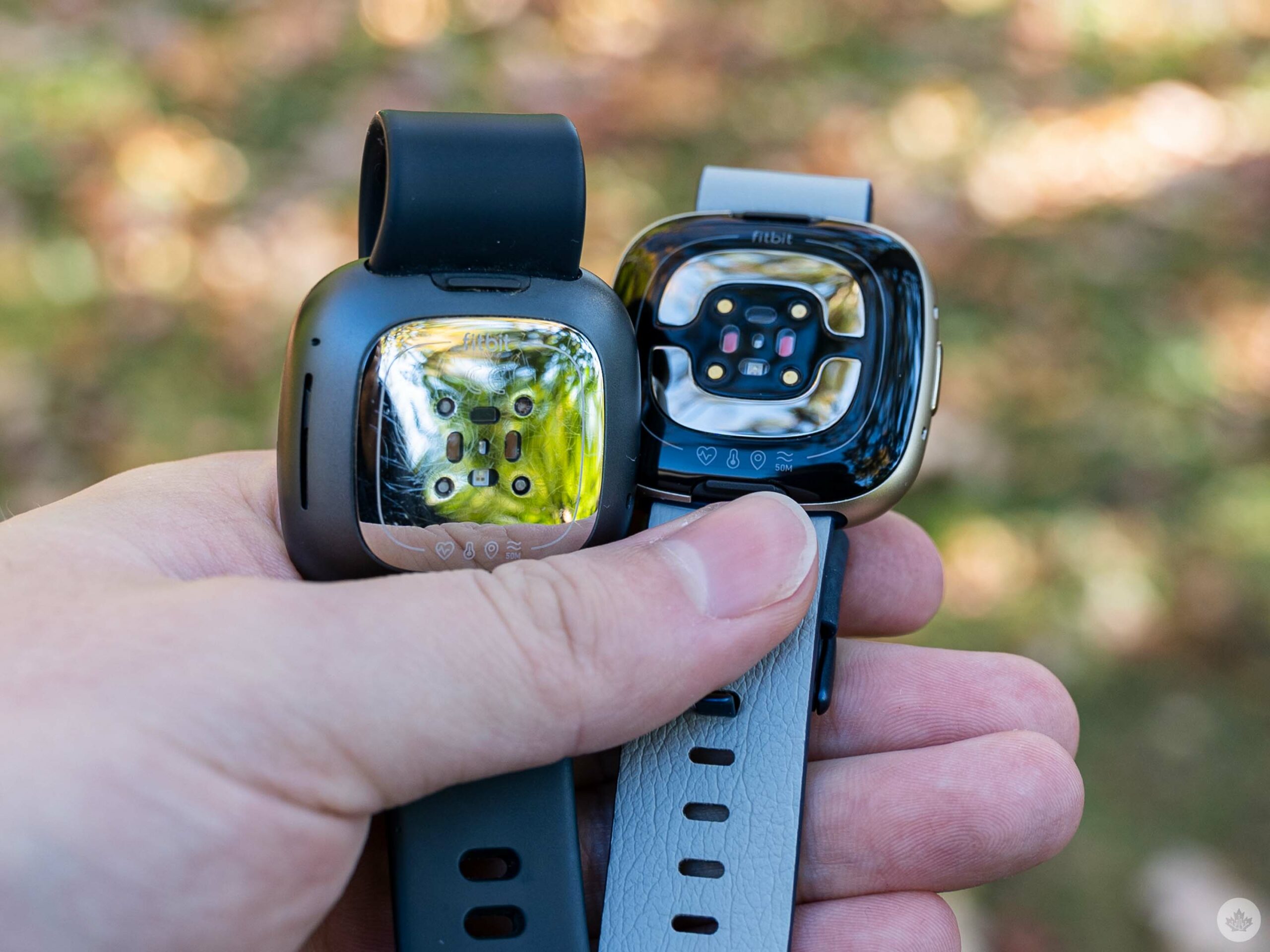
The button on the Fitbit Sense 2 (top) and the button-that-wasn’t-a-button on the Sense (bottom).
If you’ve followed Fitbit news, you’ve likely heard by now that the Sense 2 has a physical button. Indeed it does, and it’s not a bad button, although it doesn’t offer a satisfying tactile click. For some people, that’s more than enough of an improvement, while others might wonder why it even matters.
Before the Sense 2 (and Versa 4), most Fitbit devices had an inductive “button,” button here referring to a small, touch-sensitive divot on the side of Fitbit wearables. The button-that-wasn’t-a-button was a frustration for many users, although I never had an issue with it on the original Sense (older Fitbit trackers I tried did have some issues with the button, however).
The move to a physical button thus will please the few who abhorred the fake button and will make no real difference to the vast majority of users since, functionally, nothing has changed.
Trying really hard to be Wear OS
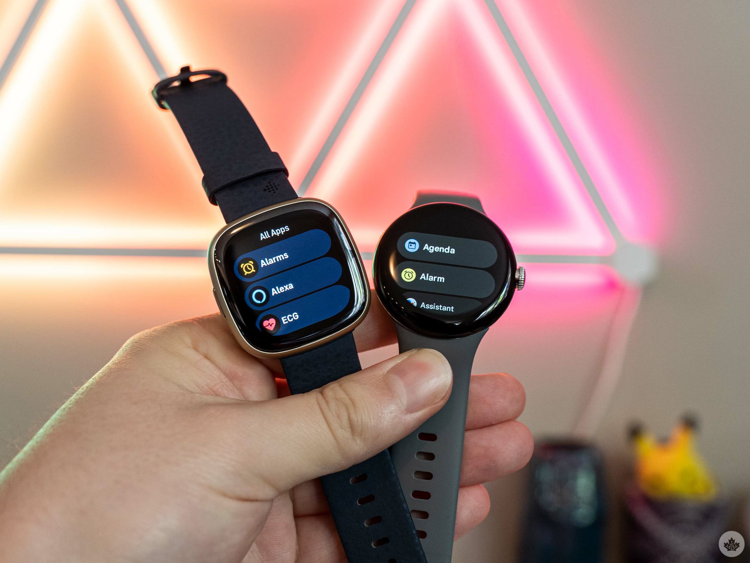
The app list on the Fitbit Sense 2 (left) and Wear OS-powered Pixel Watch (right)
With the hardware portion out of the way, let’s talk software. Unfortunately, this was where the Sense 2 started to fall apart for me.
First, Fitbit told me that the Sense 2 doesn’t run Wear OS, but that didn’t stop the company from loading a mediocre copy of it onto the device. The Sense 2’s user interface (UI) is a nearly 1:1 replication, including the same swipe gestures, tile system, and more. It also completely changes how you use the Sense 2 compared to older Fitbit smartwatches, which will likely cause confusion for anyone upgrading from a Fitbit. If you’re coming to Fitbit from Wear OS, first: why? And second, you’ll feel a little more at home on the Sense 2 thanks to the similarity to Wear OS.
Swiping down on the Sense 2 opens the quick tiles for adjusting common settings on the fly (on the OG Sense, this was a swipe in from the left). Swiping up on the Sense 2 shows notifications (on the OG Sense, this was a swipe down).
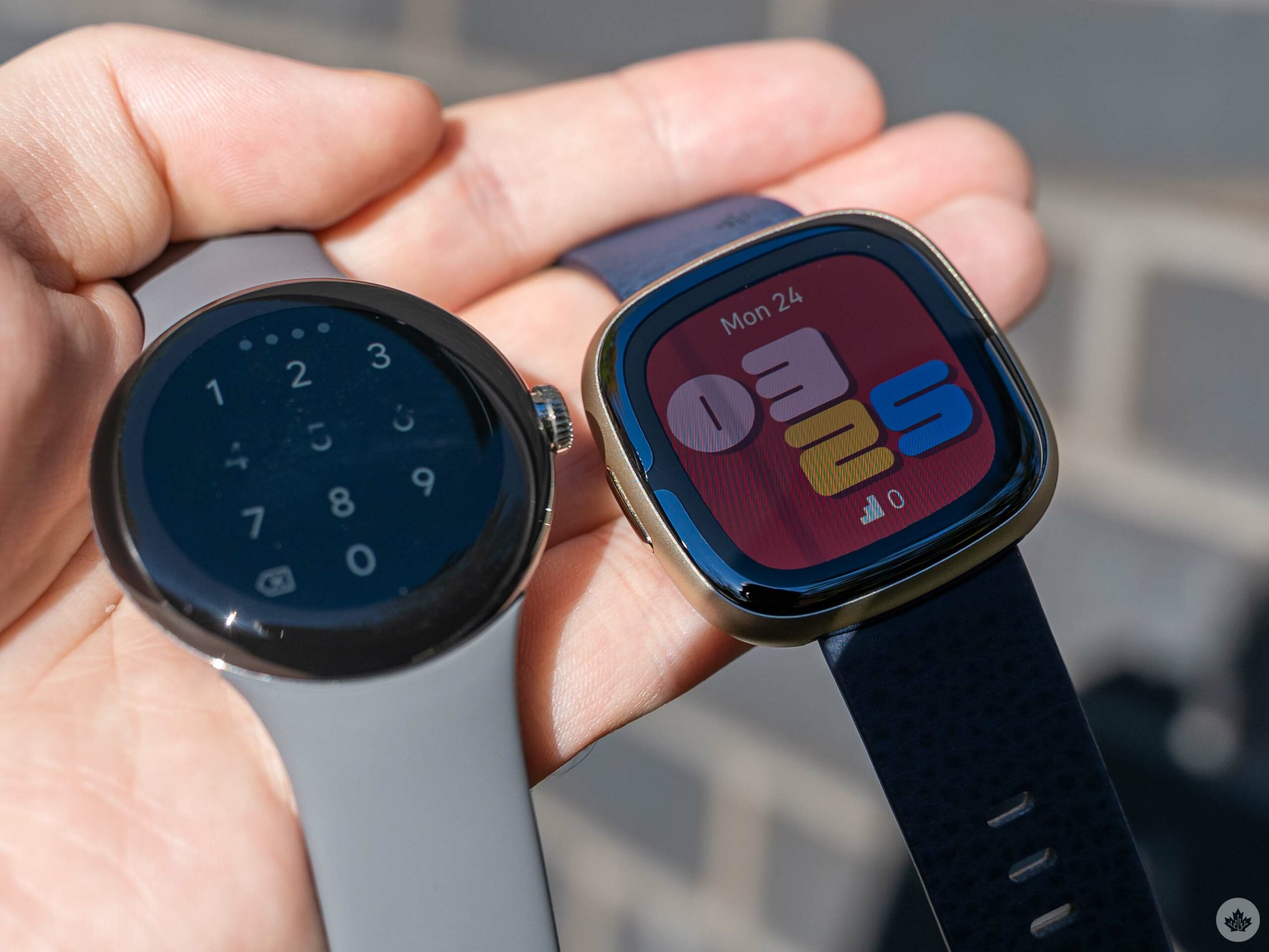
In direct lighting, the Fitbit Sense 2 bezel is more apparent.
Left and right swipes on the Sense 2 cycle through ‘tiles,’ which are currently dedicated to showing various fitness metrics. That’s similar to the system on Wear OS, and like Wear OS, users can edit the order of tiles through the companion app.
Finally, like Wear OS, the button acts both as the home button to return to the main watch face, and also as a way to open the app drawer, which is also designed to look just like the app drawer on Wear OS. (On the OG Sense, you swiped in from the right side to access apps.) The physical button also offers a few shortcuts, like a press-and-hold action to activate a shortcut of your choosing, such as payments or Amazon Alexa. You can double-click the button to launch a shortcut menu with access to Alexa, Settings, Notifications, and Fitbit Pay.
Performance is lacking
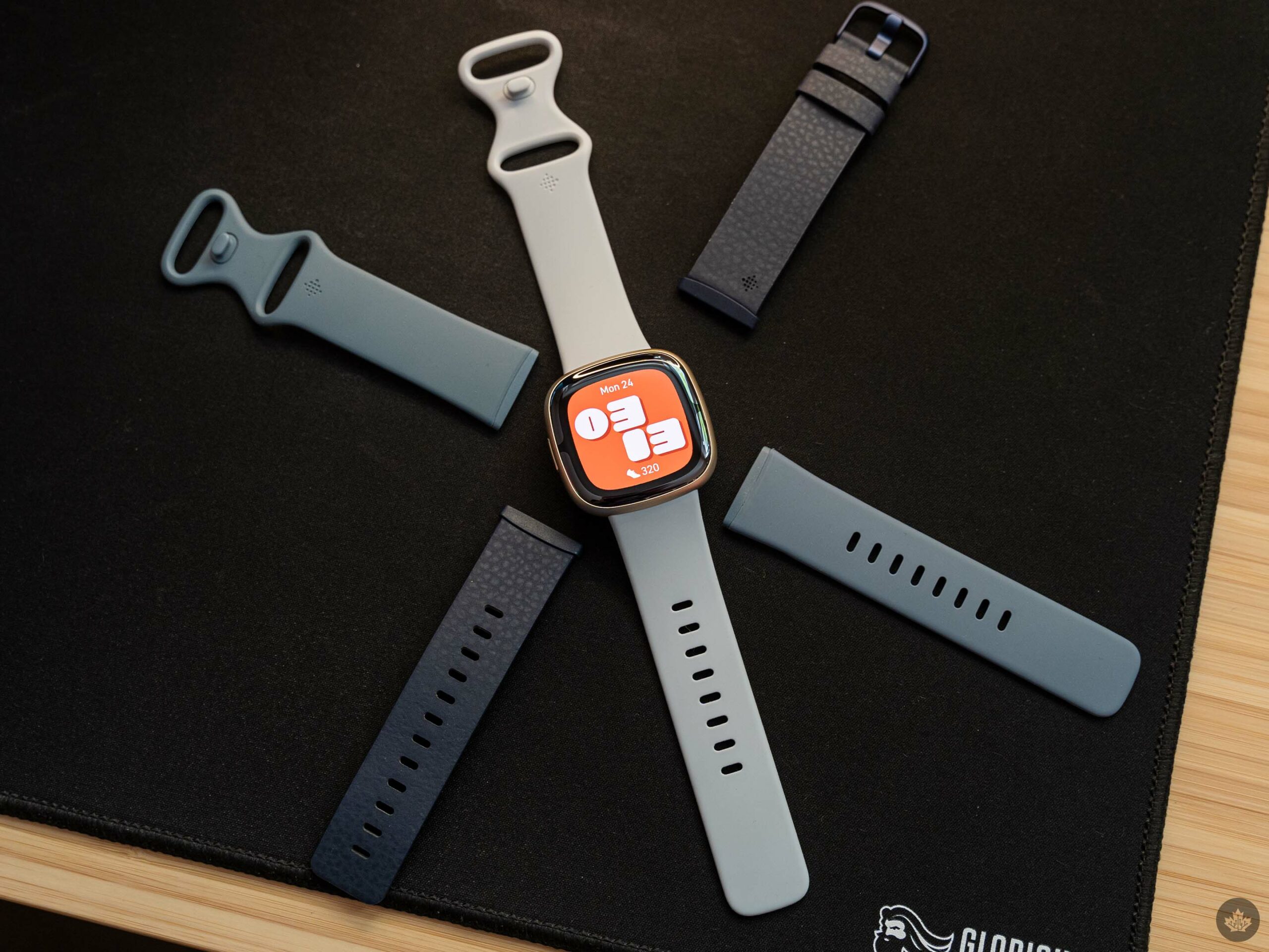 Regarding lag and UI performance, I’m usually a little more forgiving of smartwatches. By their nature, they aren’t as powerful as smartphones, which are expected to offer a buttery-smooth experience all the time. With that in mind, there’s a fairly stark difference between a responsive watch with the odd bout of jitter, and an unresponsive, laggy watch. Unfortunately, the Sense 2 is more often in the latter category.
The Wear OS-like UI is fairly swipe-heavy, and as you try to navigate around, you can often see frames dropping and animations jittering. The watch is useable, but it often feels like I’m waiting for it to catch up to me.
If the Fitbit Sense 2 were more of a smartwatch and less of a fitness tracker, the performance might be a bigger problem. I mostly used the Sense 2 as a fitness tracker, which was generally fine. But when trying to engage with the ‘smart’ features, the performance often made using the watch more trouble than it was worth.
One bright spot, however, is battery life. In my testing, the Sense 2 easily hit the six-day claim Fitbit made. That said, I didn’t make much use of the GPS features since I’m not a runner – heavy GPS users will likely see shorter battery life.
Less smart before
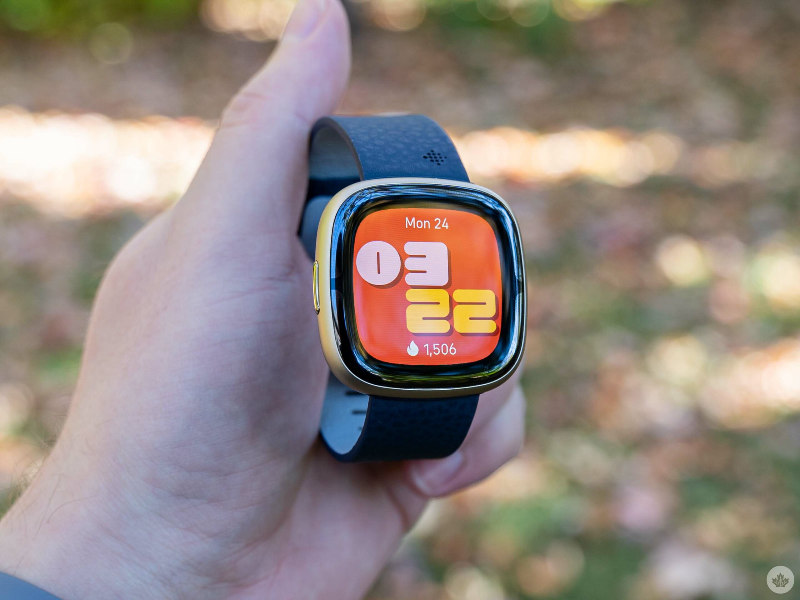 It doesn’t help that Fitbit seems to have stripped away many of the features that helped the Sense line feel like a smartwatch. Basics like calls and notifications showing up on your wrist are still there (but only Android users can reply to texts or notifications from their wrist). Other features like Google Assistant are missing. That’s a particular frustration for me, given that Google Assistant was the main thing I used on my OG Sense. I also praised on-wrist Google Assistant in my Pixel Watch review, in part because it feels like a necessity.
Voice commands make using the minuscule display on a smartwatch much, much better. And what’s strange is the Fitbit Sense 2 still has Amazon Alexa, so it clearly has the chops to run a voice assistant.
When I asked Fitbit about the missing features, a spokesperson told me the company completely redesigned the watch and prioritized integrating the most important features for Fitbit users, like fitness tracking. Moreover, they warned that some features “will take longer than others to release.” That includes things like Google Maps and Wallet, but when I asked specifically about whether Google Assistant would come to the Sense 2 in the future, Fitbit couldn’t “confirm or deny” whether it would happen.
 I’m interested to see how Maps and Wallet will work when they arrive, but I don’t have high hopes. I also find it exceptionally odd that the Sense 2 would support some Google services like Maps and Wallet, but not Assistant.
Moreover, there’s a lack of third-party apps too. I was never a big fan of apps on watches, but my OG Sense had a few useful options like Spotify or Starbucks. Those are nowhere to be found on the Sense 2, with the Fitbit App Gallery only listing a handful of Fitbit apps, all of which came pre-installed on the watch.
Fitness remains the star of the show and the Sense 2’s Achilles’ heel
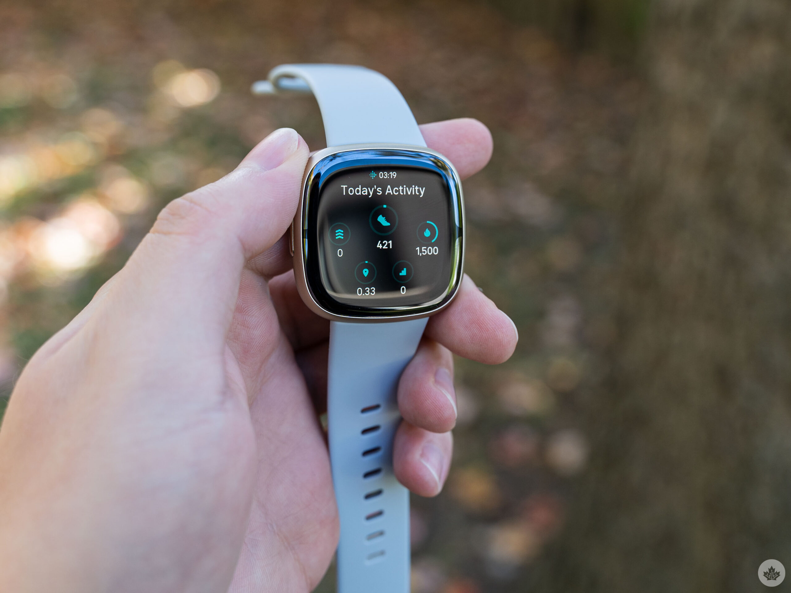 Despite all the other issues, the Fitbit Sense 2 still handles fitness tracking well. It’s got the most fitness features of any Fitbit device, including the Pixel Watch, and remains the best option for those who want the ultimate Fitbit tracking experience.
Tracking options include SpO2, heart rhythm and heart rate, skin temperature, breathing rate, and a wealth of stress-tracking features (to name a few). The problem, however, is that aside from a small selection of the stress tracking features, most of the fitness tracking capabilities are also available on the Versa 4 or Charge 5, which are both quite a bit cheaper.
In other words, if you’re not a particularly stressed person (or if you’re not interested in keeping an eye on stress), you’ll probably do just fine with other Fitbit devices. The Versa 4 offers almost all the same features, minus the stress stuff and ECG, for $100 less. The Charge 5 has ECG, lacks the stress features and several of the smart features, but clocks in at half as much as the Sense 2.
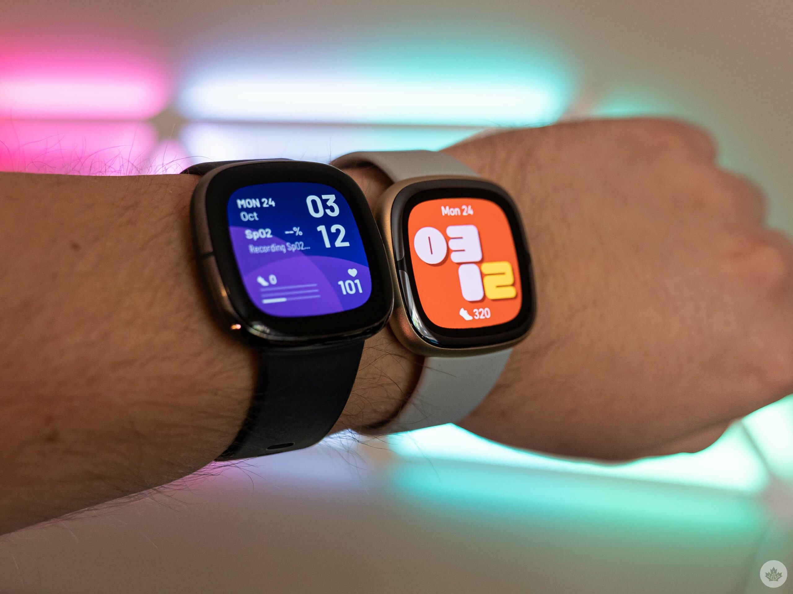
Fitbit Sense (left) and Sense 2 (right) wrist comparison.
One other interesting note I have about the Sense 2 tracking is that, at least in my experience, it’s significantly different from what the Pixel Watch reported. For example, the Sense 2 almost always listed my daily step count at around 1,000 steps more than what the Pixel Watch said. At first, I thought this was due to wearing the Sense 2 on my right wrist, as I’m right-handed. However, after swapping it to my left wrist, there was still a significant disparity in reporting. Other things, like Active Zone Minutes (a measure of activity based on heart rate) and calories burned, were similar with smaller discrepancies between the devices. Given some other testers have also reported issues with the Pixel Watch’s tracking accuracy, I’d lean towards the Sense 2 numbers being correct.
For all the latest Technology News Click Here
For the latest news and updates, follow us on Google News.
