Google working on a fresh redesign for some Chrome for Android sections in time for Android 12
Android 12’s first stable version release is getting closer now, and although its exact release date is still unknown, Google has been working hard on equipping apps with the necessary looks so they can match Android 12’s Material You design. Now, XDA-Developers reports that Google is testing a new UI for the downloads and the bookmarks panel of Google Chrome for Android.
A new interface for the downloads and bookmarks is coming to Google Chrome with Android 12
The tech giant has already rolled out minor UI updates to some of its apps so they can match with the new look Android 12 is going to bring, dubbed Material You. Chrome for Android and Gboard already have some elements of the new design introduced, such as support for dynamic themes. And Chrome for Android will now be getting another look in its downloads and bookmarks panel as well.
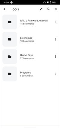
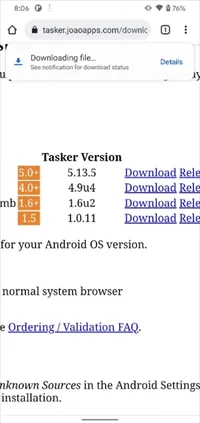
The screenshots above show that Google Chrome for Android will have a completely new look for its downloads panel. The pop-up at the bottom that shows a file downloading will now be represented at the top of the screen. Once the download is completed, the file will appear in the same location in a rounded card with an “Open” button. The bookmarks pages have also received a similar redesign, with larger icons and more spacing between items, giving them a more modern look:
Many users running recent Canary builds of the browser should now have the new downloads panel UI, which is enabled by default on the most recent Canary version. If you don’t see it yet, you can enable it manually by flipping the “show download progress message” flag in chrome://flags.
On the other hand, the bookmarks UI redesign is not enabled by default for Canary builds, so you need to enable it from the “enables the visual refresh for bookmarks” flag.
Both these two design changes are currently limited to Chrome Canary releases, so there’s no way to confirm if they will end up in a stable release or not. Whether or not Google decided to go with the new design will become clear pretty soon, if the rumors for the Android 12 release coming soon are correct.
What else to expect from Android 12?

Android 12 seems to be the most exciting update in years for Android users, as it brings a much-needed operating system redesign with a vibrant and new look. As we already stated earlier, some Material You elements have been spotted appearing on the Gboard theme menu, with the different themes showing up in pleasant cards with rounded corners, and the selected theme more visually distinguishable from the other ones.The Material You redesign will come with fresh and vibrant looking colors, and a subtle and soft overall look, making the Android experience even more enjoyable. With the new redesign, the simple white backgrounds will be gone, to be replaced by a slightly tinted pastel background. The new backgrounds make text, icons, and other on-screen content stand out more, while at the same time adding a splash of color to the Android interface.
Other exciting Android 12 features include more privacy settings that the new OS will bring. For example, Android 12 will have a Privacy dashboard, which will give you important information about when your data is used by apps and which apps use what. Additionally, Android 12 also offers you the option to give apps an “approximate” location instead of your “precise” location.
On top of that, Android 12 is expected to bring even more efficient and fast performance overall.
Recently, Oppo’s digital assistant somewhat leaked a possible Android 12 release timeframe hinted by the Color OS 12 release date. This means, if true, that Android 12 will be dropping in the week between the 7th and 10th of September.
For all the latest Technology News Click Here
For the latest news and updates, follow us on Google News.


