How Apple has revamped System Preferences in macOS Ventura
With macOS Ventura, Apple decided to rename and redesign the macOS System Preferences. It resembles the one in iOS, but Apple didn’t completely make the two UIs mirror each other. The Mac and iPhone have different screen and user dynamics, so Apple made interfaces that take advantage of the platform while achieving a sense of uniformity. Here’s what you can expect to see in Ventura.
macOS Ventura: System Preferences is now System Settings
Apple changed the name of System Preferences in macOS to System Settings to match the Settings app in iOS. It’s still located in the Apple menu under About This Mac.
Why Systems Settings and not just Settings, as it’s called in iOS? It’s to clarify that these settings are macOS settings and there are no settings for any apps on the Mac in this section. Mac app settings are still called Preferences and they are still located within each app’s Preferences menu. In iOS, the Settings app contains both system and app settings, thus the Settings name sans System.
macOS Ventura: New look
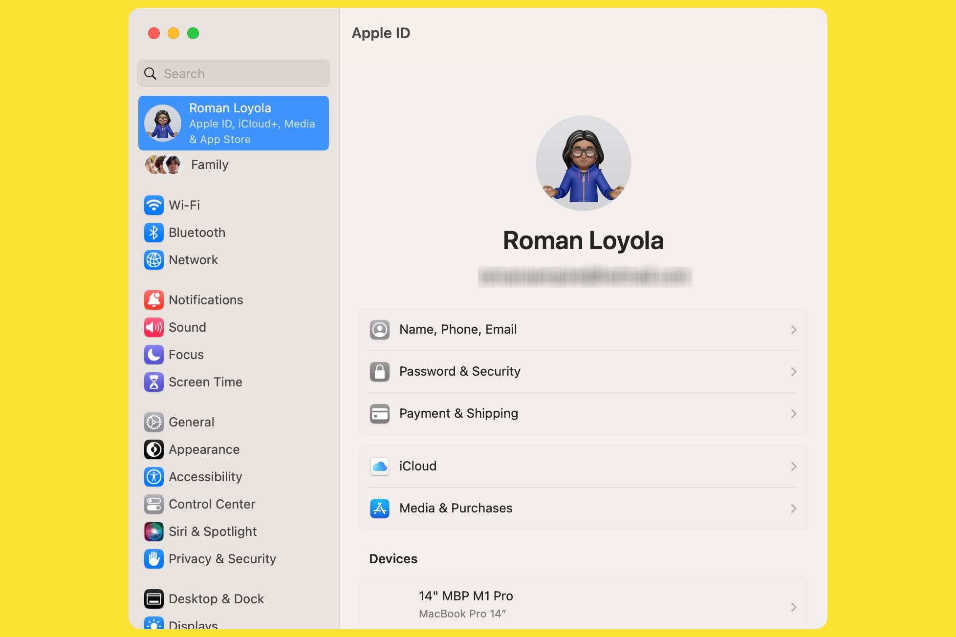
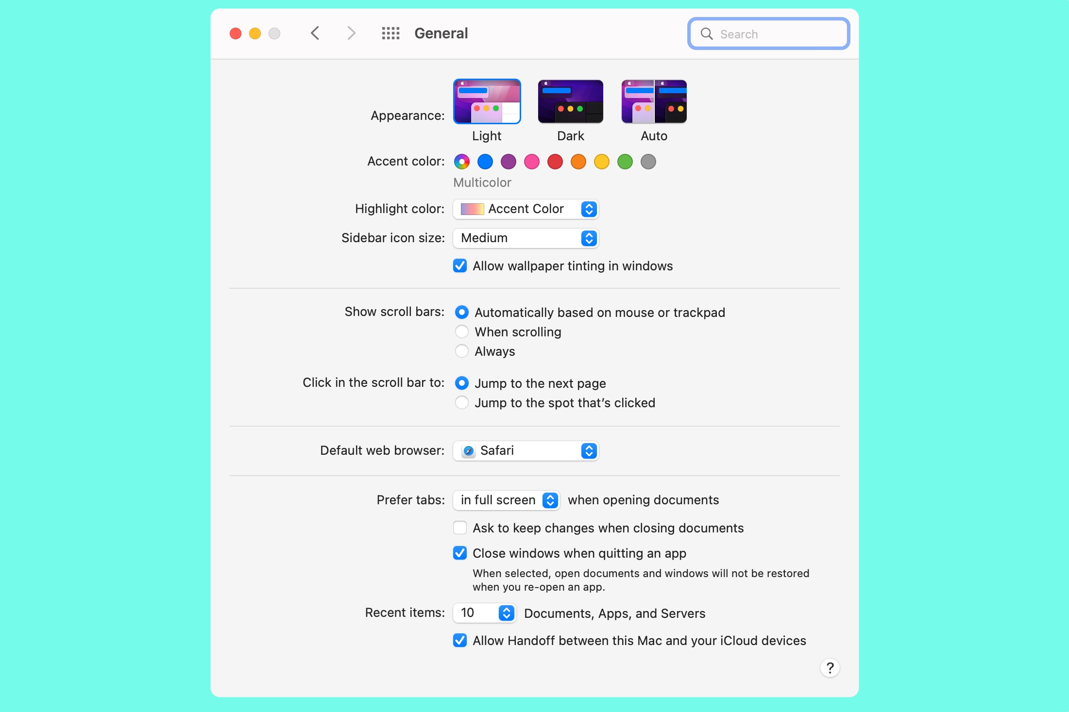
Here’s how System Preferences looks in macOS Monterey, and the new System Settings in macOS Ventura. Drag the slider to see how different the two apps are.

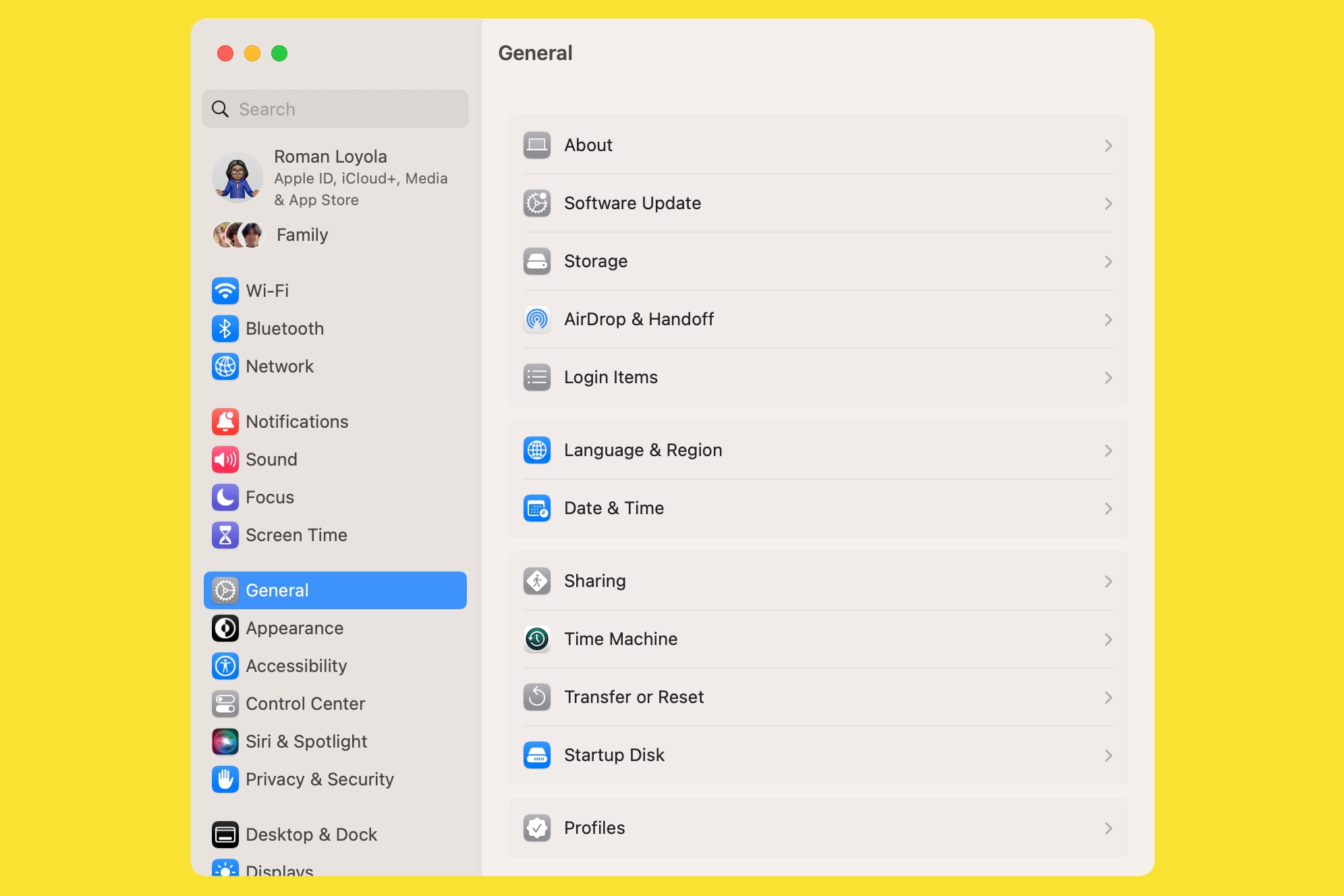
The icon grid is gone, replaced by a list in the left column. In the old UI, you clicked on an icon and the window would open to the setting. In the new UI, the setting that you click on opens in the main part of the window. This new layout makes it more efficient to switch between settings.
Apple also made changes to the controls within each setting. They’re similar to what was used before, but Apple did some fine-tuning to make the controls more intuitive and easy to use. The overall look is a lot cleaner, making settings and controls easier to find.
macOS Ventura: Relocated settings
The new look and feel is easy to adjust to, but what will throw some users off is that Apple also moved many settings around from where they used to be located. For example, the General pane has different settings now; some of the settings it used to have, such as Appearance, are now its own separate setting pane, while others are now in a different or new setting.


This is going to take some getting used to. Chances are, though, that the settings you frequently adjust are in Control Center or the menu bar, so you won’t have to hunt for those settings. Apple didn’t take away the search field, however, so you can use it to find what you need.
For all the latest Technology News Click Here
For the latest news and updates, follow us on Google News.
