How to add a drill through button to a visual in Microsoft Power BI
Power BI performs a lot of tasks internally, which is a good thing for designers. In many cases, you can build upon those tasks. For instance, Power BI automatically adds drill buttons to visuals when you build drill through functionality into a visual.
However, those buttons aren’t always obvious in a visual, so Power BI lets you add buttons with the same functionality that are more user-friendly. You can also right-click a series and click through a couple of dropdowns to drill, but this route isn’t obvious either.
SEE: Hiring kit: Microsoft Power BI developer (TechRepublic Premium)
In this tutorial, I’ll show you how to add drill through buttons to a visualization in Microsoft Power BI. Thanks to the text property, you can display meaningful instructions, so end users don’t miss out on the detailed data they need. For this tutorial, I’m using Power BI Desktop on a Windows 10 64-bit system.
Here, you can download the Microsoft Power BI demo file for this tutorial and follow along.
Jump to:
Why you should consider adding drilling buttons for Power BI visuals
Drilling through data is a feature that many users rely on for a more detailed glimpse into visual data. They might expect drilling to work with a simple double-click, but that won’t trigger Power BI drilling.
End consumers use the drilling functionality to analyze and explore data at a greater depth than they can do with surface-level data; you’ll definitely want them to be able to take advantage of this feature, so they can derive more value from their data insights. That means making the feature obvious and easy to use.
SEE: The Complete Microsoft Power BI Super Bundle (TechRepublic Academy)
To trigger a drill through visual the traditional way, the end user must right-click a series in the main visual (the summary visual). Then, they must click through two dropdowns to get to the details. Not only is that too many clicks, but it’s also not user-friendly. That’s why you, the designer, should consider supplying drill through buttons instead.
How to use the drill through feature in Power BI
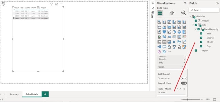
Figure A shows a monthly sales summary. The Fields pane shows the fields in this summary visual. The Table visual in Figure B is the detailed sales records. Check the Fields pane to see the fields in this visual. Also, check the Drill Through section bucket. As you can see, it’s the Month field from the Date Hierarchy. Power BI adds the Date Hierarchy when you import a Date/Time data type.
Figure B

Notice that the pages have names but not numbers. Page 1 is Summary and page 2 is Sales Details. You’ll need to remember this information for later in our process.
Once you add the drill through field to the detail visual — the one on page 2 — you can use the feature. Simply right-click a month in the summary visual, and Power BI will display the detailed sales records for that month.
The problem is that right-click and follow-through. First, you must know that a right-click leads you to a detailed visual, and second, the process requires three clicks. That latter fact isn’t too big of a deal, but you can make it easier and more user-friendly for end users if you make the functionality more prominent.
You can’t skip this step. If you do, Power BI won’t know how to connect the two visuals. In this case, the Table visual displays the sales record for the month selected in the donut visual, and that happens only because you specified a drill through field (Figure B).
If you’re not familiar with the drill through feature, you can read Understand Microsoft Power BI’s default drilling for more information.
How to add a drill through button in Power BI
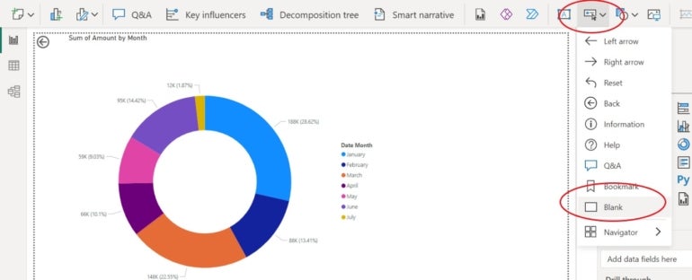
With the drill through feature activated, you can now add buttons to make the functionality more obvious to end users. Return to page 1, select the donut visual and add the button as follows:
- Click the Insert menu.
- Click Add A Button To Your Report.
- Choose Blank (Figure C).
Figure C

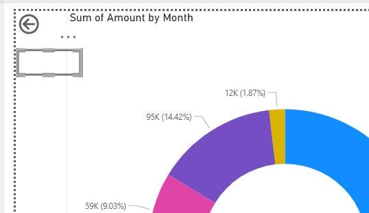
You might have a hard time finding the blank button, but if you look closely, it’s in the top-left corner, on top of the drill through feature’s default button. Simply drag it down, and you’ll see both buttons (Figure D).
Figure D

We didn’t discuss the default button earlier; it’s a nice way to get back and forth between the main and detailed visuals. You must press and hold down the Ctrl key for it to work properly, which is another thing your end users might not know.
With some simple formatting, the blank button will become a user-friendly button that end consumers will readily recognize and use. With the button selected, Power BI displays the Format pane. Make the following changes to the button:
- Expand the Action section.
- Switch the Off button to On.
- From the Type dropdown, choose Drill Through.
- From the Destination dropdown, choose Sales Details — the name of page 2 with the Table visualization (Figure E).
Figure E

- Click the Off/On button to the right of Text to On.
- Next, expand the Style section.
- In the Text control, enter See Sales Details.
- Change the font size to 20 (Figure F).
Figure F

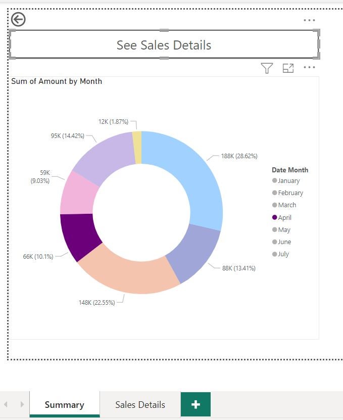
Now, let’s use this button to quickly navigate to the detailed visual. To begin, return to page one, Summary. Click June in the donut visual, and then, hold down the Ctrl key and press the See Details Report button shown in Figure G. Doing so will display the detailed visual on page 2, Sales Details, filtered to display only the records for June.
Figure G

The tooltip tells end users to hold down the Ctrl key, so even though that step is still necessary, the end consumer now has clear instructions to do so. Once the drill through button is working, you can remove the default arrow button.
SEE: Quick glossary: Business intelligence and analytics (TechRepublic Premium)
In such a simple example, the full impact isn’t obvious. The button is easier to find, and the text certainly makes its purpose clear. But, in a more complex visual with more moving parts, adding a drill button or several can make for a much better and more navigable user experience.
Read next: Best business intelligence tools (TechRepublic)
For all the latest Technology News Click Here
For the latest news and updates, follow us on Google News.
