
Displaying values on a map chart is more meaningful than handing someone a sheet of data. Thanks to Microsoft Excel’s Geography data type, creating a map chart is easier than you might think.
Most will agree that a picture is worth a thousand words, and where geographical data is concerned, it’s never been easier to create that picture. We can thank Microsoft Excel’s geographical data type for the ease of implementing geographical charts. It’s almost like doing no work at all—almost. In this article, we’ll discuss the Geography data type and then use it to display data in a map chart.
SEE: 83 Excel tips every user should master (TechRepublic)
I’m using Microsoft 365 on a Windows 10 64-bit system. Although this feature is available in Web Online mobile apps, it isn’t available in earlier desktop versions. You can work with your own data or download the .xlsx demonstration file. This article assumes you have basic Excel skills, but even a beginner should be able to follow the instructions to success.
About the Geography data type
In the past, creating a map chart required specialized knowledge. Today, even casual users can create neat map charts, thanks to the built-in Geography data types. Within context, these data types are similar to VBA data types but identifying data as such requires the user interface. They’re really links because once applied, they create a link to cloud information. What’s important to know at this point is that the process is simple. Once you identify data as a Geography data type, the created link will retrieve all kinds of data for you.
SEE: Windows 10: Lists of vocal commands for speech recognition and dictation (free PDF) (TechRepublic)
How to create a link to a map in Excel
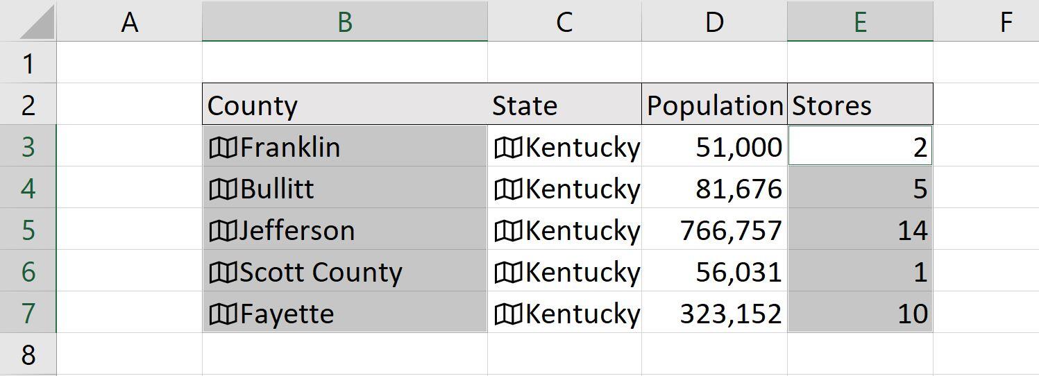
Figure A shows a simple data set with five Kentucky counties. We can use the Geography data type to populate the population file for us. Notice that the data is in an Excel Table object. This isn’t strictly necessary but using a Table object will make updating the data easier in the future.
Figure A
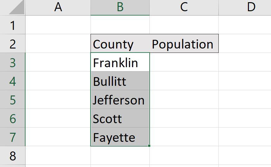
We’ll apply the Geography data type to the Kentucky counties in column B.
Now, let’s work through this together:
- Using Figure A as a guide, enter and select the counties (B3:B7).
- Click the Data tab.
- In the Data Types gallery, click Geography. If it isn’t visible in the Quick gallery, click the gallery’s More button. It will take a second or two to retrieve the data and apply the data types. When done, the data type displays a small map icon, as shown in Figure B. Before doing anything else, notice that Excel also displays an Insert Data button in the top-right corner of the selected range. We’ll use that button later to fill data.
Figure B
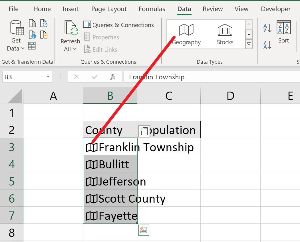
The icon indicates that Excel found a linked match for the county.
For now, notice that connecting turned Franklin into Franklin Township and Scott into Scott County. When the data you entered manually changes, for instance, Franklin to Franklin Township, it’s a good idea to check why. For example, is Franklin county Kentucky the same county as Franklin Township? You can usually find out quickly enough. In this case, we’ll use the Insert Data button to see if they’re all Kentucky counties as follows:
- Click the Insert Data button.
- Choose Admin Division 1 (State … ) (Figure C).
Figure C

Retrieve the state for each county in your list.
You might notice right away that Franklin Township links to Pennsylvania, not Kentucky, as shown in Figure D. The other counties are linked correctly to Kentucky. To fix the link, select B3 and delete Township. When you enter the edit, the link will automatically update to Kentucky.
Figure D
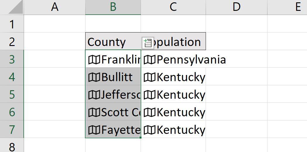
The link to Franklin county in Kentucky is incorrect.
When you’re sure you have the right links, you can use the same list shown in Figure C to populate columns with county data. Now granted, one of the links had to be fixed, but that’s not difficult, and it seldom occurs. Considering how quickly you retrieved up-to-date county data, it’s worth the small hitch. Now, let’s add the population for each county.
You don’t have to keep the state values, but for our purposes, they’re not in the way. Select B3:B7 if necessary and then click the Insert tab again and choose Population. Excel automatically fills the populations for all the counties in our list, as shown in Figure E. The feature even accommodated the column of Kentucky entries that we left.
Figure E

Add the population for each county.
Notice that the Kentucky entries in column D display a new Insert Data button—they’re also linked. This button will display Kentucky data when you select these values. If you don’t see this button, select the linked states.
Map custom values
At this point, we could insert a map (chart) based on the existing data set, but let’s add some custom values instead. Suppose you want a map that shows how many stores are in each county. That’s data you’ll have to enter yourself, as shown in Figure F.
Figure F
Enter the number of stores in each county.
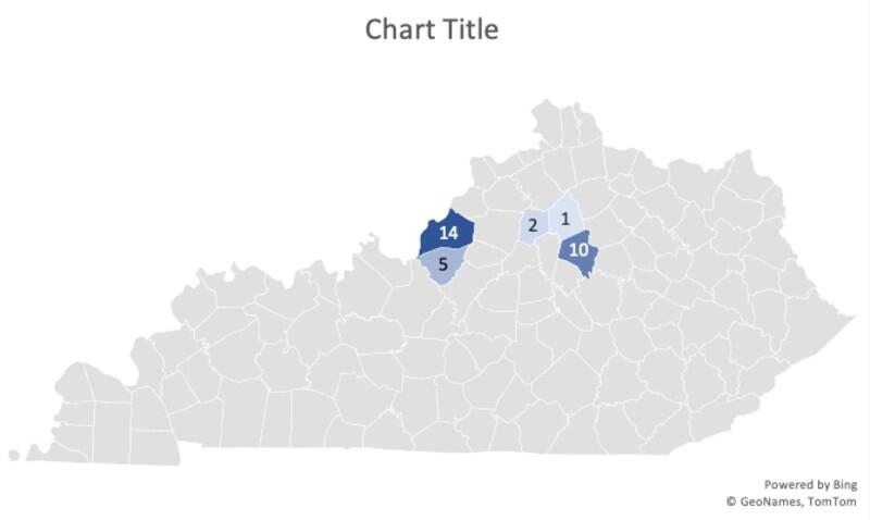
We could map the counties and population, but you don’t have to—I did this on purpose so you can see how flexible this feature is. Now, to create a non-contiguous selection, select B3:B7, the counties. Hold down the Ctrl key and select E3:E7. To insert the filled map, click the Insert tab and then click Maps in the Charts group. Select Filled Map from the dropdown list. Excel creates the map shown in Figure G. Thanks to the link and all that cloud magic, the feature knows what map to insert and which counties to highlight!
Figure G
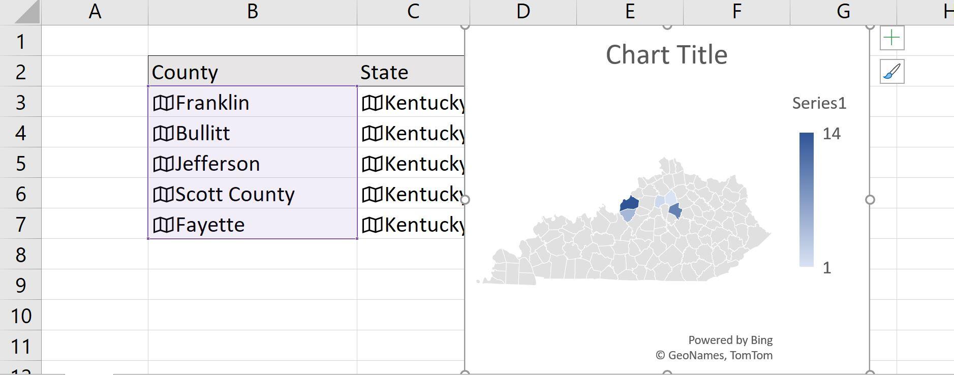
The default map highlights the Kentucky counties in column B.
The default map doesn’t display store numbers yet, but a bit of formatting will fix that. With the map selected, click the Elements button (the + sign at the top-right corner of the chart). Check Data Labels, and then select Show, as shown in Figure H. If the values don’t display immediately, as shown in Figure I, select More Data Options and click Values in the Format Data Labels pane. If they still don’t display, enlarge the map chart.
Figure H
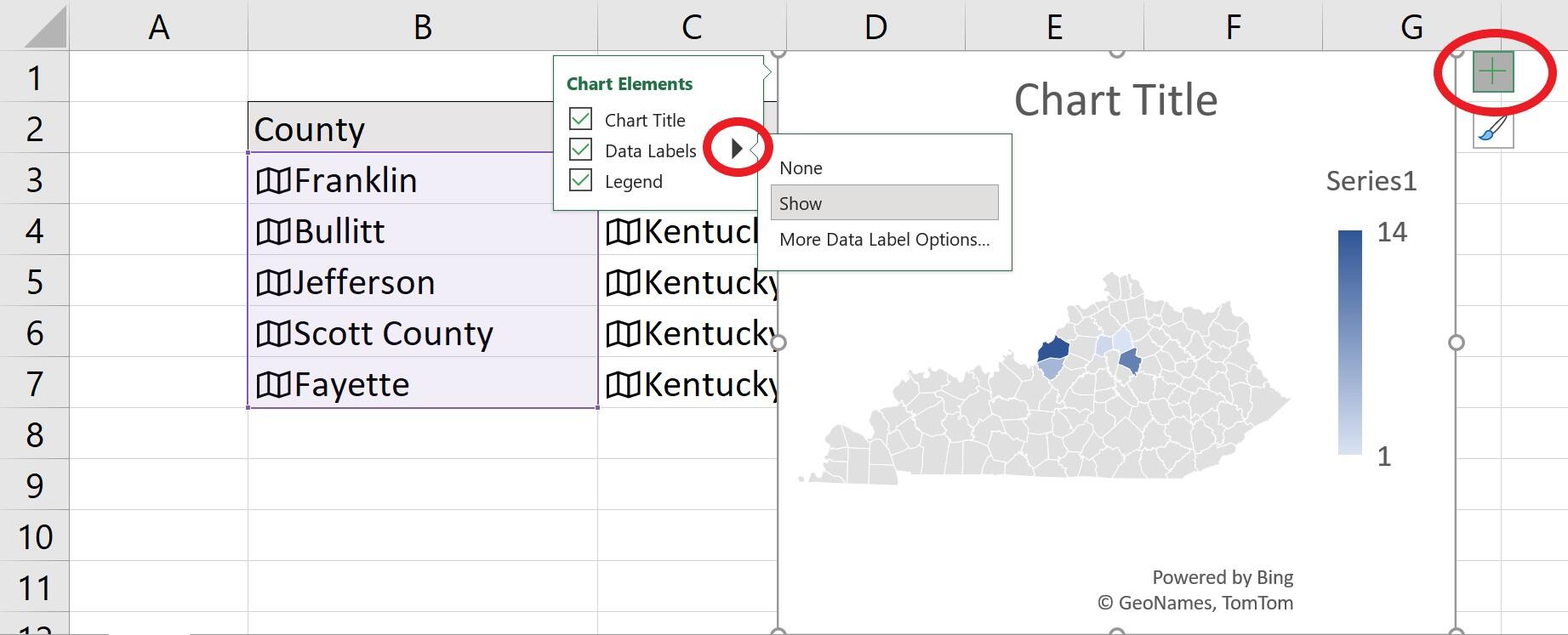
Choose Data Labels to display individual store values.
Figure I
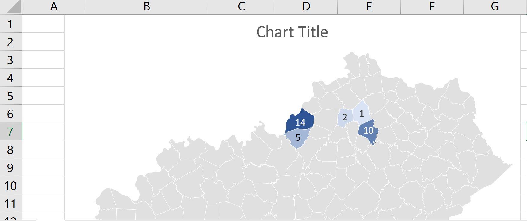
The map chart displays the number of stores in each county.
Some things to consider
When you create the link, Excel displays an icon indicating that it found a matching link. If Excel displays a ? mark instead, Excel can’t match your value(s). Check for misspellings first. If that doesn’t work, click the ? icon and use the resulting pane to search using keywords.
Once the map chart is inserted, you can make several formatting changes. You can add a meaningful title or legend—we didn’t do either. Using the Chart Styles button (the paintbrush), you can apply a suggested style.
You’re not stuck with its position. You can resize it, drag it to new position, or paste it to a new sheet.

Microsoft Weekly Newsletter
Be your company’s Microsoft insider by reading these Windows and Office tips, tricks, and cheat sheets.
Delivered Mondays and Wednesdays
Also see
For all the latest Technology News Click Here
For the latest news and updates, follow us on Google News.