iOS 17: Every new feature we hope to see unveiled at WWDC
Apple will almost certainly kick off WWDC with a keynote presentation, as it does every year. And as it does every year, it will unveil its new operating systems for release in the fall: iOS 17, iPadOS 17, macOS 14, watchOS 10, and tvOS 17.
As is also tradition, we’re going to make a wishlist of some of our most-desired features and changes. Since this year’s release is rumored to be more maintenance and smaller improvements than flashy new features, we’ve focused on things we want to see improved in iOS 17—little tweaks that will make a big difference in how we use our phones.
Apple certainly doesn’t come to us for advice about this stuff (and it’s too late to make major changes anyway), but it’s instructive to see how well “what we want” lines up with “what Apple delivers.” For what it’s worth, Apple actually delivered several of our iOS 16 Wishlist features, and if iOS 17 brings us more of the changes on this year’s list, we’ll consider that a success. Here’s what we want to see this year:
Overhaul the App Library
First introduced with iOS 14, the App Library is a good fundamental idea: Let your home screen be cluttered with only those apps you truly use every day and hide the dozens of other apps on your iPhone away from view.
It’s just a bad design! Apps are stuffed automatically into category folders that don’t always match up with what you’d expect. I have two Fender guitar apps on my iPhone. Fender Tune is in the Entertainment folder where it doesn’t belong, and Fender Play is in Other. Intuitively, these belong in the same folder, which should probably be Creativity. Everyone I know has numerous examples like this.
The folders are represented by four icons, three of which are actual app icons that open the app when you tap on them and the fourth is a group of four more tiny app icons that open the folder. This is an interaction and interface model that doesn’t exist anywhere else in iOS and iPadOS, and it’s not intuitive. Oh, and all the folders and their contents move around and change so you can’t develop muscle memory.
Apple
We have a few simple suggestions. Tapping the search box at the top of the App Library gives you an alphabetical list, which is a much simpler and intuitive way to find an app. It should be the default view—or be able to be set as the default view.
At the very least, make the folders in the App Library work like folders throughout iOS. Don’t move them around, make them so you open the folder when you tap on them and never one of the apps within. And maybe incorporate a number showing how many apps are in the folder.
End the App Store monopoly—for all
A recent report claims that Apple will start to open up the iPhone in iOS 17, allowing the distribution of apps outside of Apple’s own App Store, the use of NFC for touchless payments beyond Apple Pay, browsers that don’t have to use Apple’s Webkit rendering engine, and more. It’s all necessary to comply with the EU’s new Digital Markets Act, and the expectation is that it will only apply to those iPhones running iOS 17 in the regions covered by EU law.
Apple should go ahead and make the changes–whatever they are–global. Naturally, we expect Apple to do the minimum possible to be in compliance with the Digital Markets Act, and we’re probably going to be in for a round of hearings and lawsuits and such saying that Apple isn’t in full compliance.
I still think whatever limited additional choice and freedom the EU iPhone users get will be a good thing, and would be good for users the world over, on balance. Moreover, it might be a smart move by Apple. The company is under antitrust scrutiny in several other markets, including the U.S. It could take a lot of heat off itself by offering the same solution that satisfied EU regulators, possibly preventing even stricter remedies in other regions.
It would also make iOS easier to maintain and test as a single cohesive release, rather than fragmenting iOS into regional variants.
Improve Siri in a big way (yet again)
Siri is definitely getting better and got a nice set of improvements in iOS 15 and iOS 16. It finally got offline processing, which speeds things up a lot and improves privacy. It also got a bit smarter and more reliable and is a lot better about understanding what is on the screen and reacting to it.
But Siri simply isn’t getting good enough fast enough. Not a day goes by that I don’t ask my Google Assistant something to which I get a good answer, and then—just out of curiosity—I ask Siri as well, and Siri fails.
The emphasis on new large language models such as ChatGPT is moving the bar for how we expect to be able to converse with AI. Siri needs more than just a “20 percent better than last year!” update, it needs a big forward leap that you can hear and feel every time you use it. It needs to sound better, work better, do more, and be right more often. It needs to truly feel conversational.
Siri kicked off the first generation of smartphone AI and fell behind. Wouldn’t it be great if Siri was the first true “next-generation” smartphone AI?
Make it easier to use 2FA apps
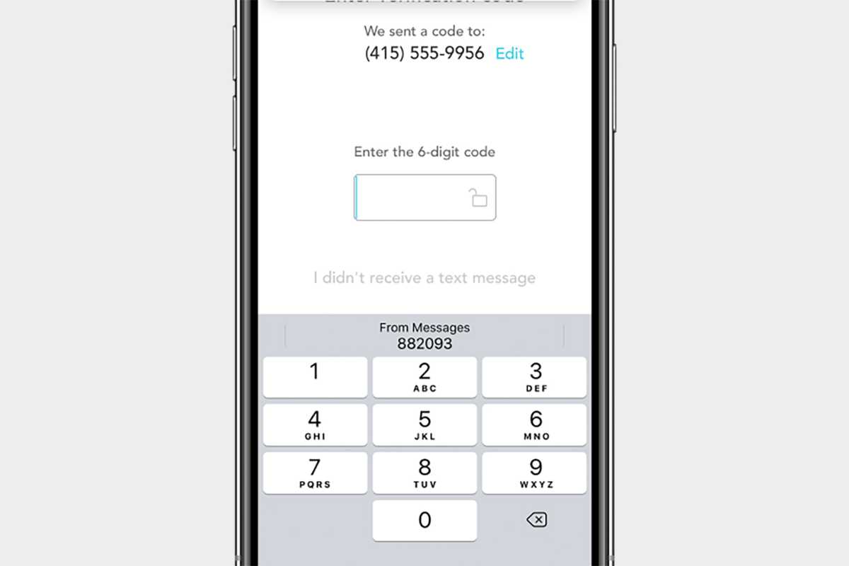
There’s this awesome feature in iOS that takes 2FA authentication codes you receive via SMS and makes them an autofill option just above the keyboard. This allows you to fill in the code without jumping away from the app or website that requested it and back again.
The only problem is that this only works with 2FA codes from SMS or Apple’s built-in Passwords feature.

Apple
We don’t suggest using SMS for 2FA codes unless you have to–they’re not as secure as they should be. Using the built-in password manager to generate codes isn’t a great option either because it really only works well on your iPhone–if you ever need to log in anywhere else, it’s a real pain to jump three layers deep in Settings to get your code. And some businesses mandate the use of certain 2FA apps.
We’d love for Apple to provide a framework for one-time-password code generation apps such as Authy, Google Authenticator, Microsoft Authenticator, and others so they can securely autofill codes when requested just like Messages.
Screen and record calls
Spam calls are out of control, and Apple should be using every tool in its arsenal to solve one of the biggest annoyances plaguing every smartphone user. For some time now, Google Assistant has been able to screen calls from unknown callers on Android phones. It can produce text transcripts and recordings, too.
This seems like a thing Siri should be able to do. In fact, Apple should go a step further and build an iCloud call spam service. These apps and services already exist, but they require you to set up a call-forwarding service–Apple, with low-level access to the operating system, could make this easy and seamless. Just like the iCloud Private Relay service, this should be an obvious feature for a company that bills itself as the “security and privacy” smartphone choice.
Make the Island more Dynamic
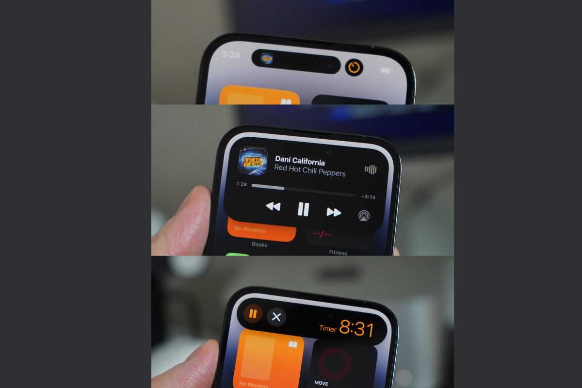
The Dynamic Island is a wonderful interface convention that we expect to see on all four iPhones models this year. But it can do more!
New notifications should flow out of the Dynamic Island when they come in instead of just sliding down from the top of the screen, and the option to see you how many unread notifications you have would be useful too. Maybe Siri could suggest new Live Activities based on the apps you use.

Foundry
But most importantly, the Dynamic Island should not be a place for notifications to live, just where they briefly appear when they first come in. The use of this area is clear: it’s for persistent background activities and “here and then gone forever” toasts like the Face ID authentication or AirPods connecting.
Unify the version numbers
There’s no good reason for Apple’s ecosystem to have fragmented version numbers that are hard to keep track of. More than ever before, the software is updated in sync with features meant to work together, so why do we have one version number of iOS and iPadOS and tvOS, another for watchOS, and another for macOS?
This is only going to get worse when the Reality headset is released and has xrOS 1 or something similar.
Just jump everything ahead to 17. Or better yet, version 20. Why not? After all, Apple skipped the iPhone 9 entirely, jumped tvOS to version 17 out of the blue, and ket macOS at version 10 for more than a decade.
Help make it clear for users: the latest release for each device’s OS will have the same version number. The releases might not always happen on the same day, but consumers should be able to easily see that the latest watchOS 20.2 update will be the one that goes with iOS 20.2, which goes with macOS 20.2, and so on.
For all the latest Technology News Click Here
For the latest news and updates, follow us on Google News.
