Microsoft Edge’s new sidebar widgets are actually worth using
If you use Microsoft Edge, you may notice something new to the right of your browser as of late last week: a small vertical sidebar of icons. Some, specifically a collection of widgets called Tools, are actually worth using.
Adding sidebars functionality isn’t new; other browsers, such as Vivaldi, have made it one of their centerpiece features. And Edge, too, has offered sidebar functionality for some time, with the ability to search for a term in a sidebar, so as to avoid the need to move to a new window or tab. But the new icons are essentially a control panel for many of the functions you’ll use in Windows.
First, if you want to turn the Edge sidebar off, you can: there’s a small “window”-ish icon to the bottom. Click it, and the sidebar will slide closed. To re-enable it, simply go to the “ellipsis” menu in the upper right and navigate down to “Show sidebar,” or use the Ctrl+Shift+/ shortcut instead to toggle the Edge sidebar on and off.
Mark Hachman / IDG
First, though, the Edge sidebar is worth exploring.
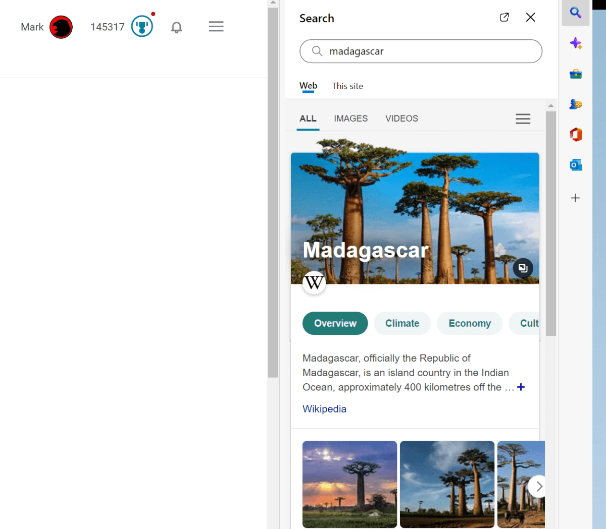
At the top of the column of icons is a Search icon, with the same functionality that you’ll find in the Widgets menu that appears in the lower right-hand corner of your screen. It’s a Web search, nothing more, nothing less. Microsoft is playing a bit fast and loose with your content preferences here, however: Edge’s Search box says “Search with Bing,” and it won’t respect your preference for another search engine, like Google.

Mark Hachman / IDG
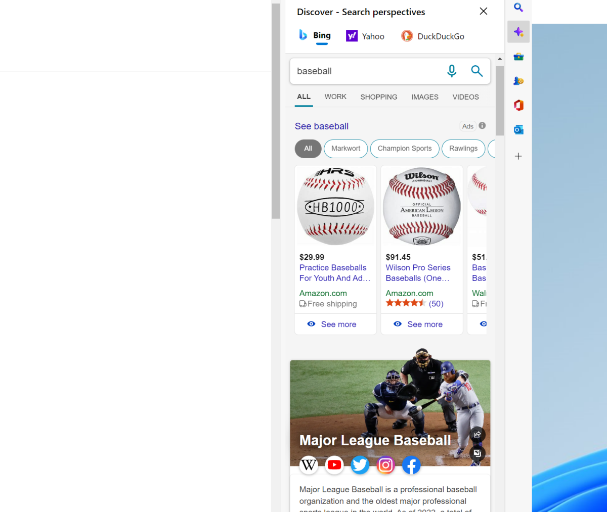
Below the Search icon is “Discover,” which provides some interesting context about the page that you’re on. Normally, this “Discover” information would appear to the right of a search result on the Bing page. Discover provides you different contextual information depending on the site; a page on “baseball” may offer a schedule of the day’s games, or the ability to buy tickets. Sometimes Microsoft will offer an analysis of the site’s traffic. In certain cases, Discover seems to offer various contextual information from search engines like Yahoo and DuckDuckGo — but not Google.
The idea appears to be that if you have the screen space — and let’s face it, a 4K monitor probably leaves a lot of screen space unused if a tab is opened across the full screen — you can search with the Discover sidebar enabled and have a richer experience.

Mark Hachman / IDG
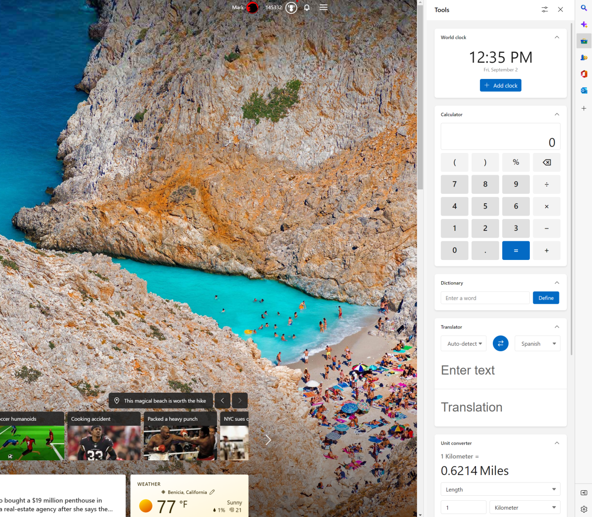
The Tools option, though, is where the sidebar really starts to shine. Tools aren’t much more than modern representations of the some of the traditional Windows widgets (or Gadgets) that populated older Windows operating systems, like Windows XP. Here, you have a choice of everything from a world clock to a calculator to a unit converter, as well as a translator/dictionary plus Bing’s own Internet speed test widget at the very bottom. These are genuinely useful little functions.
You can argue that some of the “widgets” in the Widgets drawer are useful as well, if you like knowing the current temperature, stock prices, and traffic. But I always find myself searching for these dumb little conversions, and I can certainly appreciate them being at my fingertips.

Mark Hachman / IDG
Edge’s sidebar widgets have room for improvement. First, they’re not open to third parties, so they’re subject to what Microsoft suggests. And UTC time, or Coordinated Universal Time, doesn’t appear in the World Clock either as a UTC option or as the time zone of Greenwich, England, where it resides.
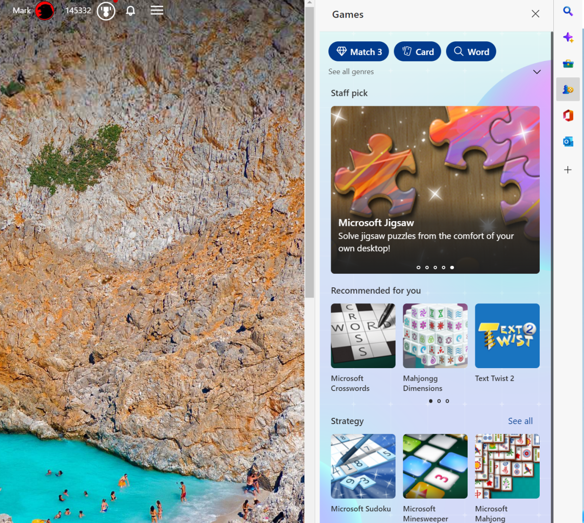
A list of Games is directly beneath the Tools option. Nothing here will surprise you; there’s just the usual list of Microsoft games including Solitaire, Jigsaw, Crosswords, Bubble, Mahjongg, Wordament, and more. Still, they’re all time-wasters, and detract from the productivity ethos that seems otherwise prevalent.
It’s a little jarring, too, given that directly beneath Games appear Microsoft’s Office and Outlook icons. The Office icon opens up a list of documents that haven recently been shared with you, and allows you to open the Web apps of Word, Outlook, OneDrive, Teams and more. (Naturally, you’ll need a Microsoft 365 subscription to access them.)

Mark Hachman / IDG
The Outlook icon links only to your personal account, however, with no apparent option to connect to a work or educational account. That’s a little weird, because the Office icon in the sidebar opens up your “work” version of Outlook. Microsoft might want to spend a little time further differentiating the two — or at least allow work accounts to be added to the Web version of Outlook that appears at the bottom of the list of icons, a la Windows Mail.
It all feels like a little more thought could have been spent on the arrangement of the sidebar icons, and what functions they add to your browsing experience. I’d expect more to come, too: I’m not a habitual user of Microsoft To-Do, but that feels like a natural fit. So, too, does some sort of Calendar function so you can quickly review and add to your day’s events.
But the Edge sidebar’s widgets help make it worthwhile. And as a whole, the sidebar helps Edge feel a bit more intrinsic to your work and play, too—which is undoubtedly what Microsoft set out to achieve.
For all the latest Technology News Click Here
For the latest news and updates, follow us on Google News.
