Microsoft Surface Duo 2 review in progress: 3 things I love, 3 things I don’t | ZDNet
Jason Cipriani/ZDNet
Likes: The dual-screen approach is starting to make sense, the Slim Pen 2 is a big upgrade, and the battery life has been good so far.
Dislikes: There are still software quirks, more apps need Duo support, and the camera bump is a step backward for the Duo’s design.
Microsoft hasn’t given up on its aspirations to create a unique, if not niche, smartphone for its loyal Surface fans. With last year’s Surface Duo, the company took a novel approach to the standard smartphone. Instead of putting out yet another rectangular Android phone, the Duo featured two impressively thin displays, held together by hinges, that made it possible to fold the phone in half. Unlike Samsung’s that actually has a screen that folds in half, the Duo had two displays that are physically separated.
As is often the case with first-generation devices, the Duo wasn’t all that impressive. I purchased one and returned it within 30 days (Microsoft offers a 60-day return policy). There was clear potential with the phone, albeit I felt the concept was a better fit for a tablet (or even a laptop).
Fast forward and Microsoft is ready to ship the Surface Duo 2. There are some modest changes to the second generation device, including a speedier processor, better cameras and it runs Android 11.
Due to some shipping delays, I’ve only had access to a Duo 2 for about 72 hours as I sit here writing this. That’s not near enough time to give a full review of a device that takes a completely different approach to the modern smartphone. Heck, it’s not even enough time to fully review a standard smartphone.
So instead, I plan on living with the Duo 2 for a while, filling in gaps and updating this review in progress as I go. After my short time with the phone, here are 3 things I like so far, and 3 things I don’t.
The Glance Bar has serious potential
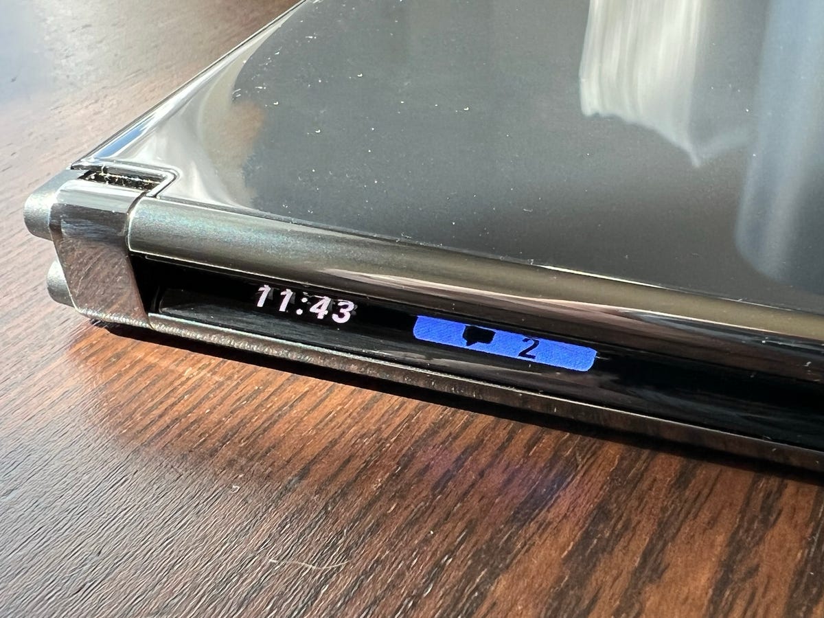
The Duo 2’s Glance Bar needs to be opened up to more developers.
Jason Cipriani/ZDNet
The original Duo lacked any way to easily check if you had any pending alerts while the device was closed. You had to slightly open the device to activate the peek feature that showed you the time and notification icons. Peek is still present to check the time (at least I can’t find a setting to turn on alerts), but thanks to rounded display edges, you can now see alert icons along the hinge when the Duo 2 closed.
Microsoft is calling this feature the Glance Bar, and currently, it’s capable of showing the time, text message alerts, missed calls, battery level, and volume.
For example, when you start charging the Duo 2, the Glance Bar will show you the battery’s current charge level — showing green or red based on the current level.
When the device is closed, you can press the power button to trigger Glance Bar and check the time as well as any pending alerts. It’s a far better experience than peek on the original Duo which required more than just a quick action like pressing a button. However, it doesn’t go far enough.
I would love for Microsoft to open Glance Bar to third-party developers and let apps like Twitter or Spark Email to show new message alerts.
Multitasking is getting easier
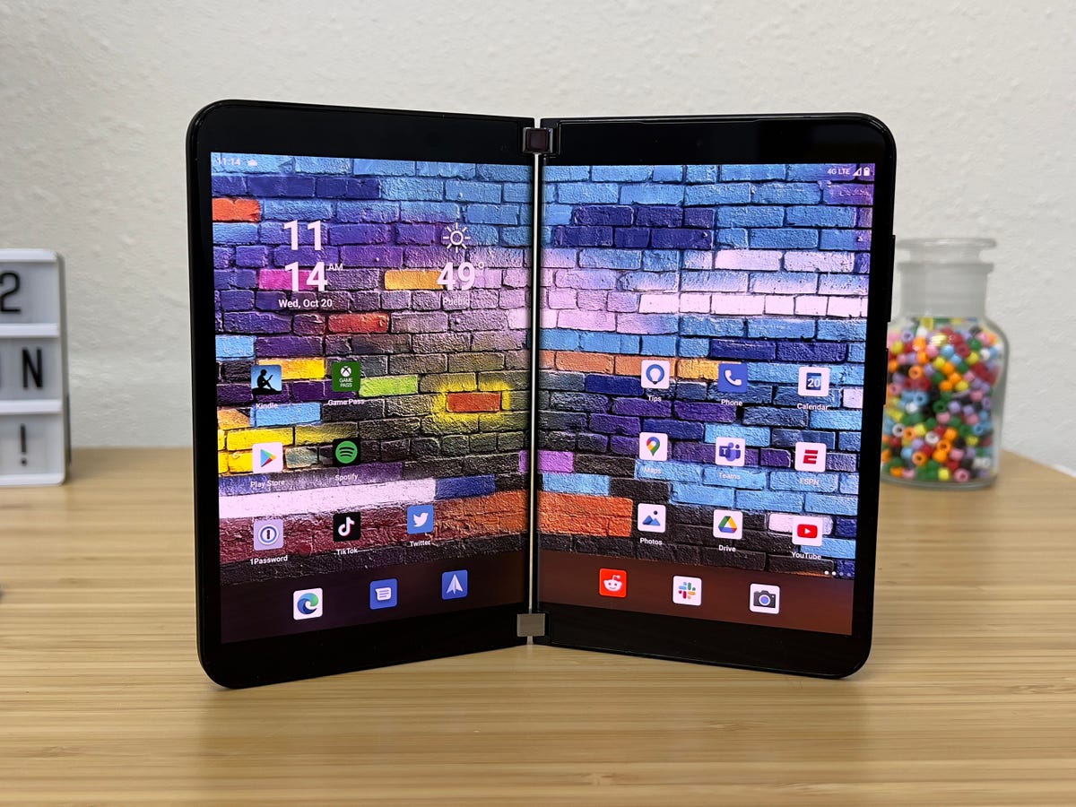
Two screens really are better than one.
Jason Cipriani/ZDNet
Maybe I never really gave the Duo a proper chance, or the Duo 2’s software ironed out enough of the usability bugs I encountered (more on that in a minute), but it feels easier to multitask on the Duo 2.
It wasn’t until about 48 hours after setting up the phone that the way to leverage two different displays started to click for me. For example, entering app-specific passwords to set up my email, contacts, and calendars normally is a process that requires jumping between a browser and an email or sync app.
But on the Duo 2, I left the Edge browser open on one display, with passwords at the ready while at the same time completing the setup process in the respective apps on the other display. What really helped me, more than being able to see all the information at the same time, was that I could use one hand to select and copy information while at almost the same time using the other hand on the opposite display to select a text field and paste the information.
It really was an Aha! moment for how the Duo 2 is supposed to be used. I need a lot more time to figure out the multitasking scenarios and how Microsoft intends for the Duo 2 to be used, but feel like I’ve started to turn the corner.
There are still some software quirks
One of my main issues with the original Duo was that the software felt unfinished and lacked overall polish for routine tasks like rotating the screen. Icons would disappear, the device wouldn’t change orientation or the launcher would flat out crash. It was bad, but I’ve been told it got better over the last year through software updates.
That effort doesn’t go unnoticed on the Duo 2 which runs Android 11. Overall, the Duo 2 feels faster and performance has been mostly reliable. That said, there have been a few occasions when app icons appear stuck on the screen. Here’s a screenshot example:
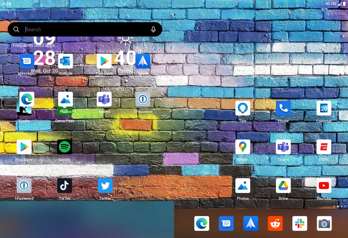
One of the random software quirks I’ve experienced so far.
Screenshot by Jason Cipriani/ZDNet
As you can see on the left side of the device, there are stacked app icons and the dock has a giant bar across it. I just noticed while adding the photo that the search bar is also present. So much going on in one screenshot. I remember seeing similar stuff like this on the Duo last year, but it happened a lot more frequently.
The review sample I received is running the same software version that Microsoft is shipping to customers, so I’d expect some customers to report similar issues. Granted, it’s not widespread, but this is something that shouldn’t really happen.
The camera bump took away my favorite part of the Duo’s design
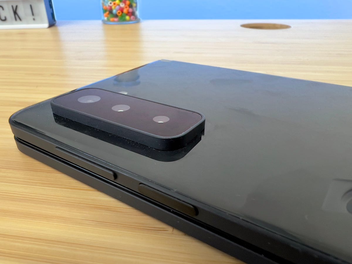
The bump is big. Too big.
Jason Cipriani/ZDNet
One of the many complaints about the original Duo was its lack of a high-quality camera. In fact, it only had a single camera that was above the display — there wasn’t one on the rear of the device at all. That meant the back of the device was completely flat on both sides, allowing you to lay it completely flat or fold it closed on itself.
This year, Microsoft added a triple camera array on the back of the right display. The cameras, so far, are an improvement, but the bump that Microsoft had to add to accommodate the modules takes away how surprisingly thin the original Duo was.
In addition to that, the Duo 2 no longer sits flat on a table, nor can you fold it over on itself without there being a gap. The latter complaint is admittedly a little nit-picky on my part, but not being able to lay the Duo 2 flat on my desk and use the Surface Slim Pen 2 to jot notes in One Note is what really irks me.
Because of the camera bump the entire device wobbles when you get near the edge or to a specific corner of the display, depending on how you place the Duo 2 on your desk.
The Slim Pen 2 is a meaningful upgrade
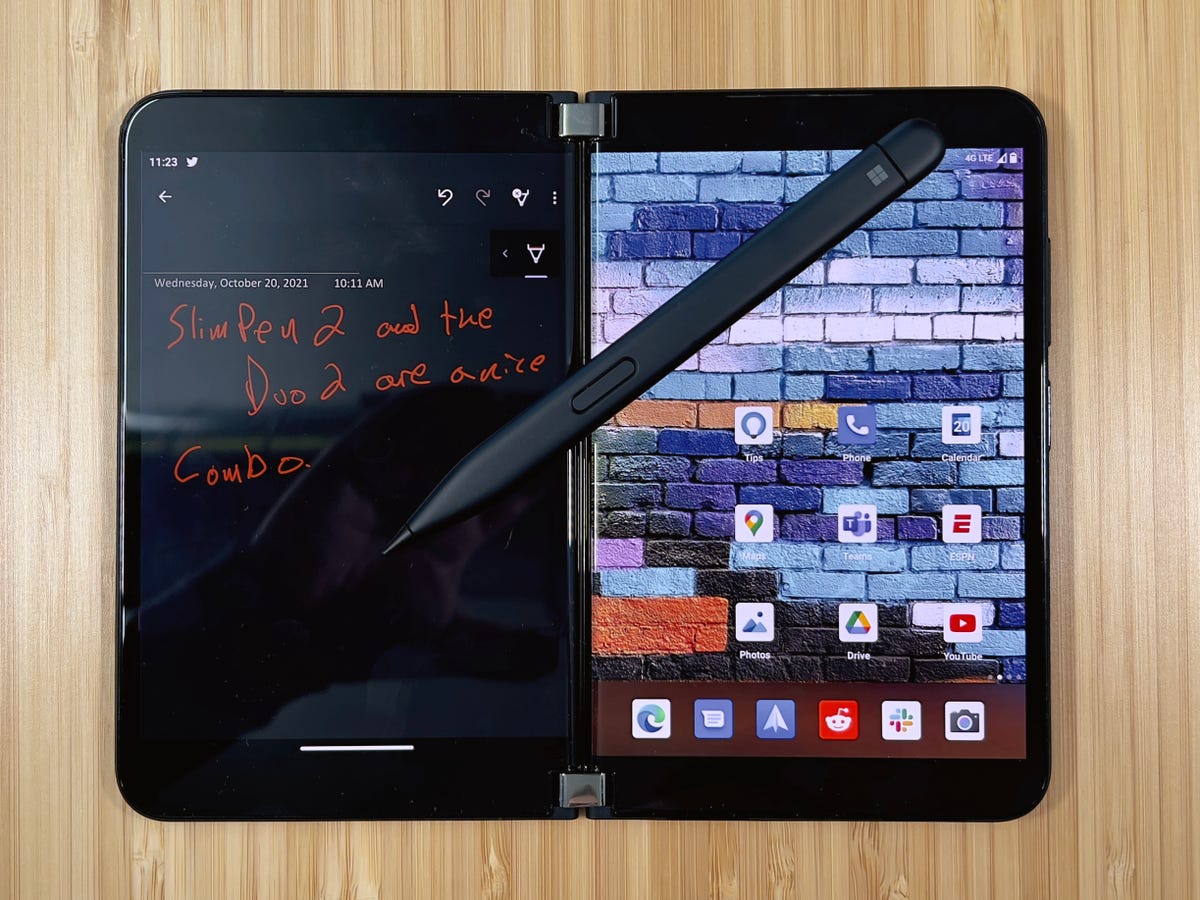
The Slim Pen 2 is the Apple Pencil the Surface line deserves.
Jason Cipriani/ZDNet
I have used a with several Surface products, including the and the , and it works, but the experience hasn’t been near as good as the on an .
Even with the wobbly issue I just talked about, the Slim Pen 2 and the Duo 2 is a marked improvement. I’ve been using the Duo 2 for all my meeting notes the last couple of days and have been impressed.
Microsoft isn’t taking orders for a Duo 2 case that magnetically attaches and wirelessly charges the , but it’s definitely something I want to check out when it launches. It’s odd that the case enables wireless charging for the pen, but the Duo 2 itself lacks wireless charging.
Microsoft needs more apps to adopt Duo support
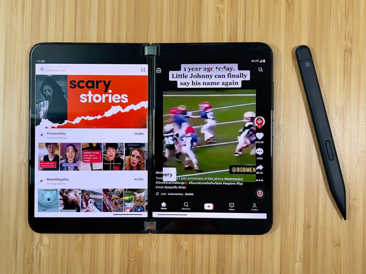
An example of TikTok running on the Duo 2. This is how all apps need to look and work on the novel phone.
Jason Cipriani/ZDNet
Outside of Microsoft’s own apps, there aren’t very many apps that fully support the Duo 2’s dual-screen approach. Amazon’s Kindle app is a good example of an app that had adopted the two-screen approach and makes it feel as if you’re really reading a book. TikTok is also optimized for the Duo 2, showing you trending items or a user’s profile information on one screen while you swipe through your account’s stream on the other.
But outside of the small handful of developers that Microsoft has convinced to build apps to maximize the experience, many apps struggle — especially when they’re spanned across both displays.
Slack, for example, would make sense to add Duo 2 support and adopt a similar look to the iPad app where your list of channels and conversations are on the left side, and the right side shows the content of each as you move between them.
Instead, the full-screen Slack app acts just like it does on a much slimmer, single display smartphone, forcing you to swipe back and forth to move between channels, conversations, and their contents.
I get it, the Duo and Duo 2 are very niche devices for a very small subset of users. Prioritizing developer resources to implement features that a small percentage of people will care about and use isn’t a top priority — and shouldn’t be for most developer teams — but, as if often the case with experimental and new devices like the Duo 2, without developer support it’s hard for a device to gain traction.
Plenty more left to explore
I haven’t really used the cameras outside of a couple of photos of random stuff on my desk. Even those boring pictures look much better than I remember the Duo’s camera being, but I need more time to fully test them.
I’m sure my experience and opinion of the Duo 2 will drastically change over the coming days and weeks. I’ll keep updating this review in progress as that happens.
In the meantime, do you have a Duo or plan on getting the Duo 2? Let me know your thoughts about Microsoft’s latest smartphone in the comments below.
For all the latest Technology News Click Here
For the latest news and updates, follow us on Google News.

