One of macOS Ventura’s key new features already needs a massive overhaul
The System Preferences app in macOS has been there since the very beginning, and it’s showing its age. A tiny, largely unchanging rectangle sized for the tiny displays of the early 2000s, it’s past time for Apple to create a new, modern settings app for the modern Mac.
And in theory, that’s what the new System Settings app in macOS Ventura is supposed to do. It’s a new app, clearly inspired by the Settings apps on iOS and iPadOS. That’s not a bad idea since so many Mac users also use those platforms, and it makes sense that Apple’s platforms harmonize with one another.
The problem is that, with a month or so to go before macOS Ventura goes final, the System Settings app in the beta is a bit of a disaster. Unless things change in a hurry, Apple is in danger of replacing one of the worst system apps in macOS with a new app that’s just as bad or worse.
Is there hope? Look, I’m an optimist by nature. The System Settings app can be saved. But it’s going to take a lot of work, and the first step must be Apple admitting that it has a problem.
It’s about results
It’s been widely reported that System Settings has been built by Apple using its latest software design framework, SwiftUI. SwiftUI, which Apple says is the future of building apps on Apple platforms, is very young and still experiencing some pretty massive growing pains.
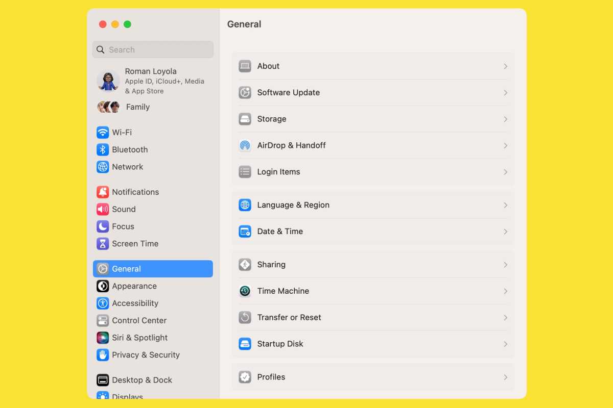
System Settings in macOS looks like the iPhone version, but that’s not actually a good thing.
Foundry
In many ways, it’s good that Apple has decided to build key macOS apps with its own tools. That’s the only way those tools will ever get better–with people inside Apple identifying their weak spots and demanding change. Outside developers can only do so much complaining. The biggest pressure comes from the inside.
But I’m not a developer, I’m just a Mac user. I could not care any less about the tools Apple uses to build its operating systems and apps. In the end, all that matters is how good the experience is. Any given development system or programming language will spawn a range of software, from good to bad. Is SwiftUI the reason that System Settings is a rambling wreck? I don’t know, and I don’t care. It just needs to be better. That’s all.
Hidden hierarchies
The System Preferences app is a strange beast, as you might expect for a relic from the prehistoric era of Mac OS X. At its top level, it’s got a couple dozen icons to choose from–way too many–organized either in alphabetical order or broken into inscrutable categories.
But the two-dozen-ish icons (the exact number varies based on what kind of Mac you’re using and the peripherals attached) aren’t the only organizational problem: Click on one, and you’re frequently led to a preference pane that’s got its own navigational sidebar, tab groups, and buttons that bring up modal preference windows. It’s settings boxes all the way down.
In theory, System Settings should solve this problem. It’s using the iOS/iPadOS approach of a large scrolling list of setting types, which is less intimidating but no less confusing–on my Mac Studio, there are no less than 30 different items at the top level! That’s a lot, and in truth, the best way to approach either app is probably to use the Search box to find what you’re looking for.

Foundry
While System Settings has reorganized the Big Wall of Buttons into a Very Long Scrolling List, it hasn’t avoided the boxes-within-boxes approach of its predecessor. Click on General, and you’ll get… another scrolling list with a dozen more options! Each of those options will lead to its own settings pane. (That’s one extreme. On the other end, click on Internet Accounts or Game Center, and you’ll find extremely sparse, simple interfaces.)
The box-within-a-box approach makes things look organized, but in truth, all it does is hide disorganization. It’s unclear why the items in General are there and not at the top level, other than that they were deemed unimportant enough to hide away. (And you can’t drag out items you use all the time, or mark them as favorites.)
What’s worse, the System Settings app hides its hierarchies. If you end up in one of those General sections, it can be easy to misunderstand what you’re seeing. In the right side of the window, there’s only a back button next to the name of the setting to let you know that you’re actually one level down from the main list of General items. If you find an item by search, the left-hand sidebar won’t tell you which section you’re in. If you click away to another category and then return to General, the app displays the same item (like Sharing) you were looking at when you last visited, rather than the entire General listing, making it easy to miss that you’re not seeing all the General settings items, but a subcategory.
It’s a lot.
Widen your perceptions
The most mystifying design decision about the new System Settings app might be the fact that it’s still more or less square. Pretty much every Mac comes with a widescreen display and has for ages. Why isn’t the Settings app resizable? Why doesn’t it display its deep hierarchy by showing multiple columns, so if you click on General, you can see all its sub-items, and the contents of the sub-item you’ve selected?
Some sections also feature very long scrolling lists. Click on Privacy & Security, and you’ll find more than 20 sections you can click on for more settings, and below that are the controls to set App Store security levels and turn FileVault and Lockdown Mode on and off. Imagine if we could make the interface a little taller, so we could see more content on a giant desktop display or even on a 16-inch MacBook Pro.

A lot of interface confusion and frustration could have been alleviated by letting the app spread its wings a bit, both horizontally and vertically.
Instead, once macOS Ventura ships, be prepared to click around…a lot. System Preferences is an app that requires an awful lot of clicks itself, but System Settings doesn’t really fix the problem. The sidebar means you don’t need to click back up to the top level, which is an improvement. But the hierarchy underneath requires a lot of clicking back and forth, using up a lot of those saved clicks.
I found the devil
These are some of the big-picture issues with System Settings. There are also dozens, if not hundreds, of little quirks throughout the app. Each one is an example of Apple getting the details wrong, and the details matter. (See Niki Tonsky’s Twitter thread for some amazing examples, which feature inconsistencies in interface elements, in text layouts, in misaligned buttons, and more.)
I’m a writer and editor, so I frequently notice inconsistencies in the text of interfaces, and they’re very easy to find in System Settings. Items are capitalized in one pop-up menu and not capitalized in the next menu down, for instance.
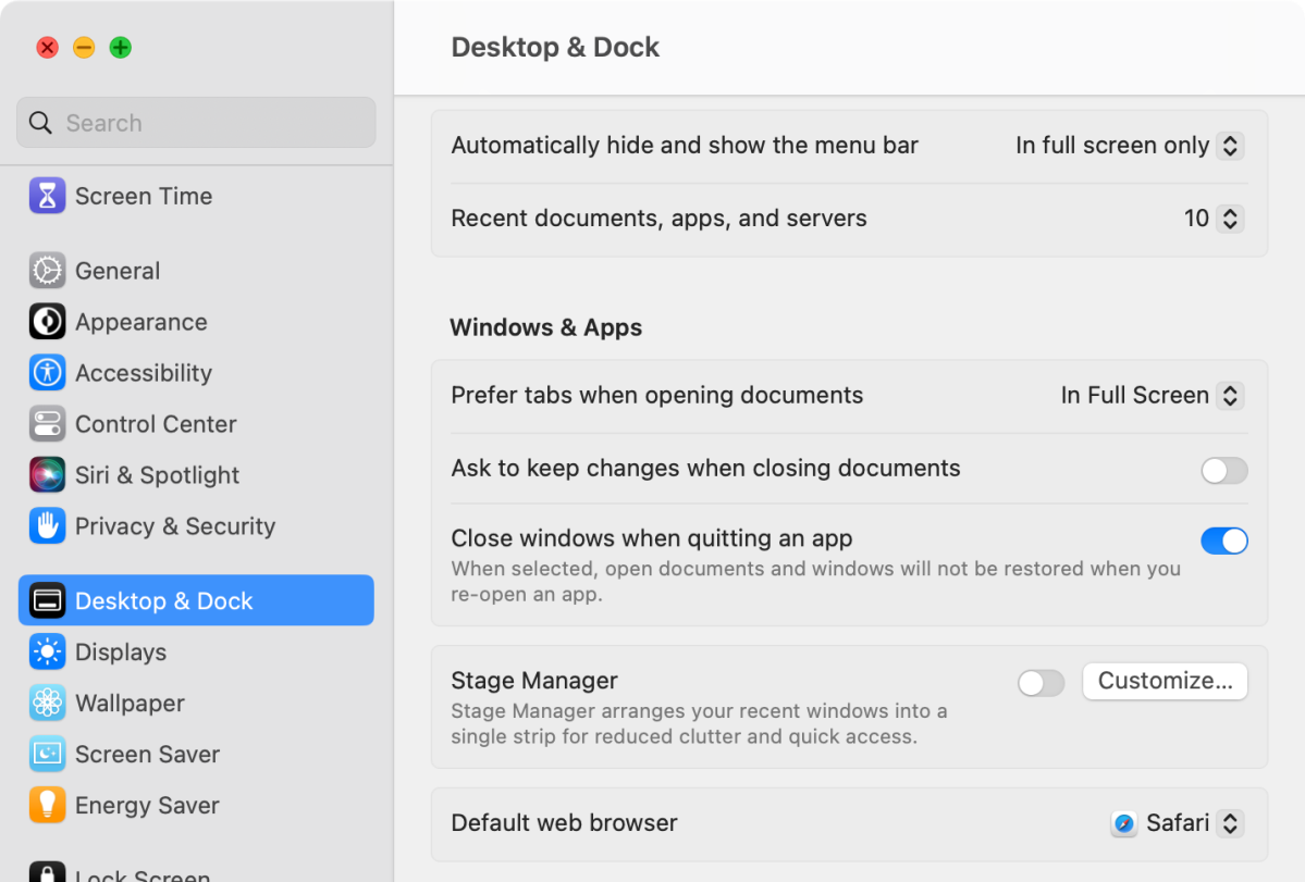
And perhaps most disappointing of all? Nobody seems to have organized anything. Why is the default web browser setting located toward the bottom of the Desktop & Dock settings list, right between Stage Manager and Mission Control? Why do Mission Control’s settings appear as individual switches in the Desktop & Dock preferences list, while the two Stage Manager settings checkboxes are hidden behind a Customize button?

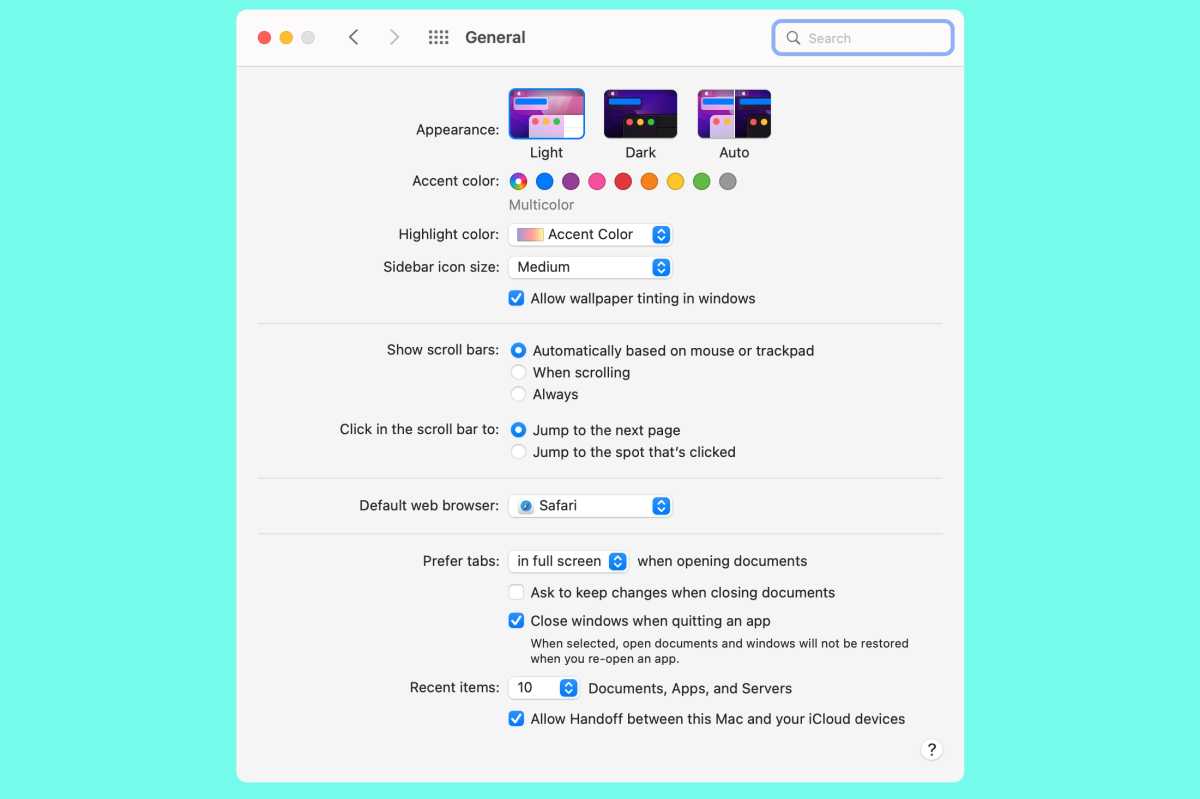
The current System Preferences in Monterey looks outdated, but at least it’s familiar.
Foundry
So now what?
The list goes on and on and on and on. I want to believe that the System Settings team at Apple is working hard on fixing all of this for a fall release, but the list of things that are wrong with this app is so long that I don’t see how even an all-hands-on-deck situation could get it in good enough shape to ship with pride in macOS Ventura 13.0.
This is a problem. Apple can’t just slap a “Beta” label onto the System Settings app of its operating system! It’s got to ship it and stand by it, or it needs to get out of the way.
There aren’t a lot of good options here. Either Apple ships an embarrassing app, or it rushes back to the old System Preferences app and tries to prop it up for another year, which would require integrating all the new settings added in macOS Ventura.
My guess is that Apple will go ahead and ship whatever it has with 13.0, and users will have to deal with the replacement of an old and outmoded Preferences app with a buggy and frustrating Settings app. That will be bad. What would be worse is if Apple then abandoned the project and walked away.
Shipping a broken Settings app is embarrassing. But acting as if it’s not broken would be unconscionable.
For all the latest Technology News Click Here
For the latest news and updates, follow us on Google News.
