
Years. Some of us in the industry have been waiting close to ten years for the long-rumored Pixel Watch. Now that it’s here, expectations are naturally high. After all, Google had all that time to finetune its first smartwatch, and everyone’s been anxious to see if this could be the product that rivals the Apple Watch. The Pixel Watch doesn’t just have an eye-catching design, but the software also seems promising. Wear OS has been a mess, but by collaborating with Samsung and finally integrating Fitbit’s health-tracking features, Google may have finally addressed its greatest weaknesses.
Design
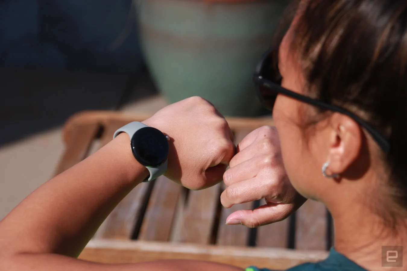
Of all the things about the Pixel Watch, Google was most eager to show off its design. And rightly so. The Pixel Watch’s case is a thing of beauty. In pictures, it’s almost nondescript — just a plain round face with what appear to be thick bezels. In person, though, the Pixel Watch catches light at some angles in a way that makes it look elegant and, pardon the cliché, like jewelry.
Pros
- Beautiful design
- Excellent health and fitness tracking
- Useful new faces
Cons
- Battery life lags the competition
- Fitbit Premium paywalls some data
- Only one size
More importantly, for a person who’s into tactile sensations like me, the Pixel Watch just feels so good. I love flipping it over and over in my palm like it’s a smooth, shiny pebble, but I also just enjoy stroking the screen. There’s something about the domed shape and glossy finish of the screen that makes swiping across the interface feel luxurious.
On the right edge sits a dial that almost twinkles in the sun, along with a button above it that pulls up recent apps. In my few days with the Pixel Watch, I’ve used this latter button exactly once. I don’t know if it’s the placement or that I haven’t needed to pull up recent apps much, but the one time I pressed this was to confirm it was there when I was writing this part of the review. It requires more force to depress than its counterpart on the Apple Watch, which sits below the Digital Crown and is more obvious. I rarely used Apple’s button, too, so this is not a ding on Google.
Unlike most other Android watches, the Pixel Watch doesn’t have lugs. Instead, straps attach directly to the case via a mechanism that Google describes as similar to the lens locking system on DSLR cameras. To connect a band, you push one end of it into a button at the bottom to the groove and slide it in.
To remove, you push the catch on the side and twist it off. It took a bit of getting used to and I still can’t say I’ve nailed the process, but I also haven’t swapped bands yet. I’m sure whenever I receive different straps, like the gorgeous metal mesh or the comfy stretch option, that I’ll be performing this change a lot.
I’m pretty impressed by the bands that Google has made. Sure, they’re basically adaptations of options that Apple offers, like the Milanese loop or solo loop. But paired with Google’s round case, these look like conventional watches and wouldn’t seem out of place at formal, fashion-forward events.
Cherlynn Low / Engadget
The basic sport strap that I received with my review unit uses a peg-and-hole closure system that doesn’t offer a good fit for me, unfortunately. I either felt like the watch was too loose or that the case was strapped too oppressively on my wrist. This is an easy problem to fix, at least, by getting a different strap. But I’d have to buy one of Google’s own options because of the proprietary attachment system, and they start at $50 for the Active band. The stretch band that I like costs $60, and everything else is at least $80.
While the 41mm case sits nicely on my relatively petite wrist, I wish Google had made a larger version. I think the Pixel Watch looks good on most arms, but there are people who prefer a bigger screen. When it comes to something as personal as a wearable, one size does not fit all.
Wear OS 3.5
While it seems like Google may have pretty much nailed the hardware, one of the biggest problems plaguing Wear OS watches in the past was their namesake — Wear OS. Google’s software was criticized for everything from its overly swipe-heavy navigation to being too basic. It also was very power-hungry, despite not running a lot of background health tracking. Wear OS watches notoriously delivered day-long battery life at best, while the competition pushed well past 24 hours and into multi-day runtimes.
Cherlynn Low / Engadget
When the company teamed up with Samsung to co-engineer Wear OS 3 last year, it was able to bring performance and power consumption improvements. That laid the groundwork for it to add a more robust health and activity tracking system with Fitbit, which it completed its purchase of in January last year.
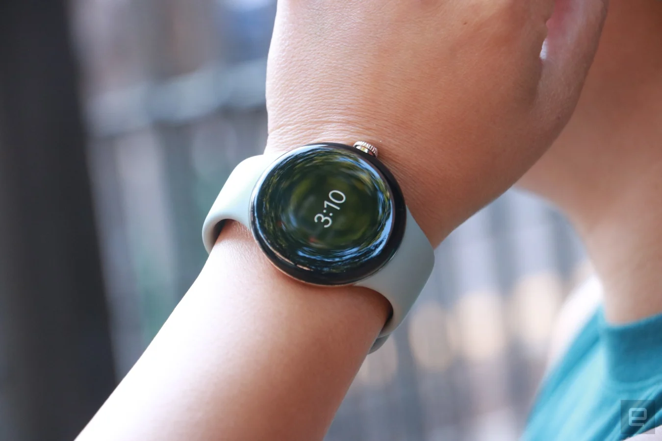
The result is Wear OS 3.5 — Google’s own expression of its smartwatch software. This interface is very familiar in many ways. It’s not a huge departure from the Tizen-esque platform that we saw on the Galaxy Watch 5. You can download music to stream offline from the Pixel Watch, get turn by turn Maps directions, remotely control your camera and ask the Assistant to set timers or tell you the weather. You can also control your Google Home devices from your wrist. The main differences are Google’s new watch faces and the Fitbit integrations.
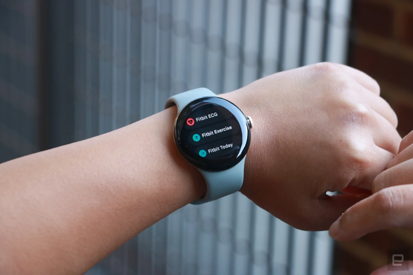
I wish the Fitbit features were better meshed into Wear OS. It feels like a missed opportunity, or some sort of reluctance to give up the Fitbit logo and branding. The process of launching a workout session on the Pixel Watch isn’t that different from Samsung and Apple watches. You still have to go into their respective apps to start the activity, though on the Pixel Watch this is called “Fitbit Exercise”. If you want to see your progress, you can go into Fitness on Apple’s watches or Samsung Health. On the Pixel Watch, it’s “Fitbit Today.” The distinction is in your face — for Fitbit fans this might be familiar and welcome. For those expecting a pure Google experience, it can be jarring.
Cherlynn Low / Engadget
While the constant presence of Fitbit branding throughout the system makes the fitness and health tracking features feel disjointed, it was nice to see Wear OS finally deliver stand reminders. As of December 2020, Wear OS fans on Reddit still had to look for third-party apps to deliver the alerts that came baked into watchOS and Tizen. During my testing, the Pixel Watch and the Apple Watch Ultra generally reminded me at the exact same time that I needed to get off my butt and walk around to meet my movement goals.
It was also nice to see things that Fitbit devices never had, like notifications for messages from basically any app on your phone, as well as the ability to reply to messages using a keyboard, dictation, emojis or suggested responses.
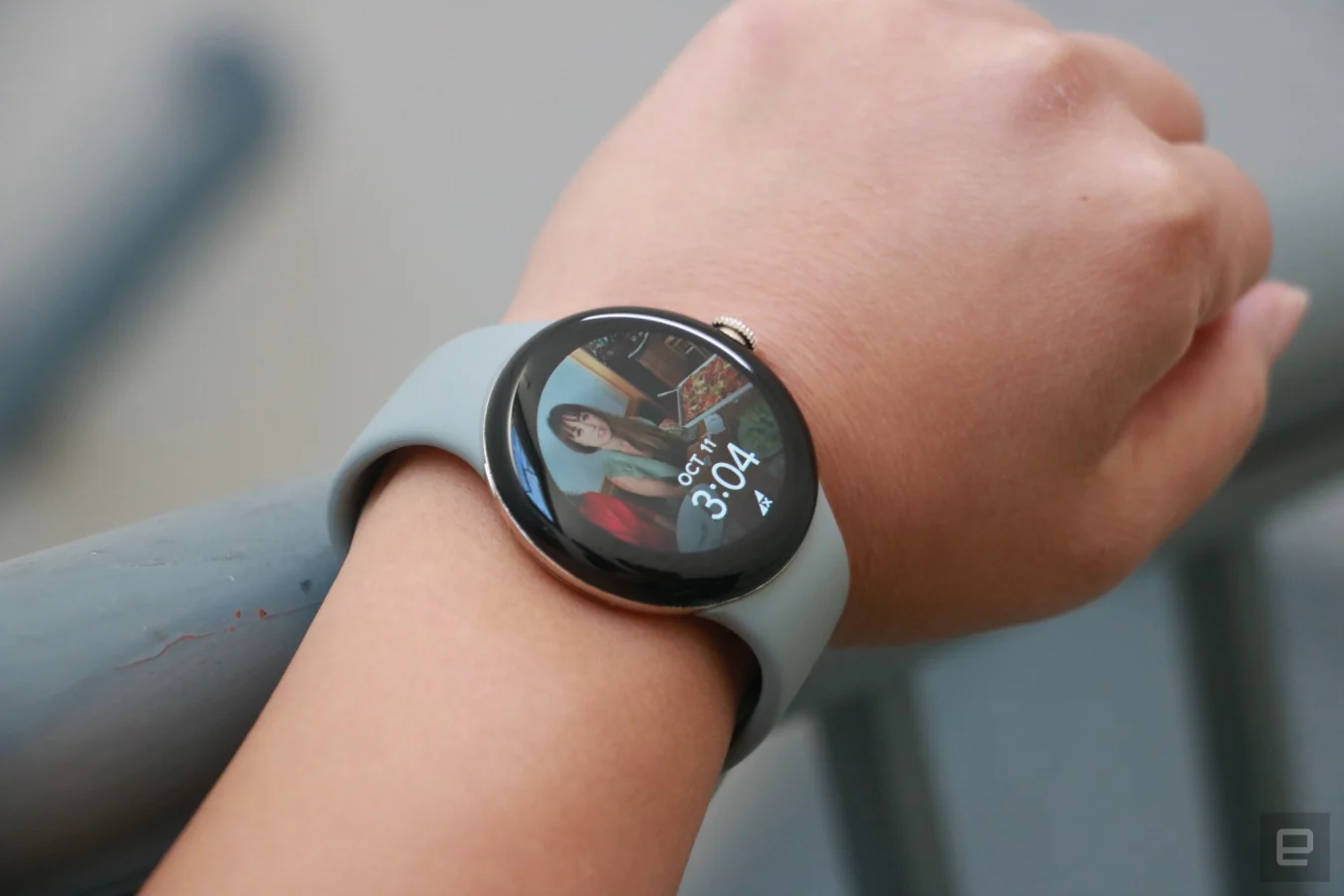
Google didn’t just embed Fitbit features into Wear OS, it also added new watch faces, some of which are familiar because they’re quite similar to Apple’s. As a narcissist, my favorite is the Photos option, which lets you pick up to 30 pictures from Google Photos to set as your background. You can then choose a clock style and set a single complication. Just as you’d have to on watchOS, you’ll need to use your phone to select the images for your wallpaper.
I also enjoy the complication-heavy faces, like Utility and Index, which let you basically surround the clock with up to five fields. Because most of these use a black background, they tend to blend nicely into the bezel, making the borders seem invisible. But the Photos face makes the thick edges painfully obvious. One of the pictures I picked is so cramped that the top of my friends’ faces are cut off and we look extra squished together. Unlike the Apple Watch, the Pixel doesn’t let you move and scale your pictures.
Cherlynn Low / Engadget
Since I mostly use a non-Photos face, the thick bezels don’t bother me too much. Every bit of information I want to see is easy to read, and the colorful text on black background is great for readability. I sometimes wish fonts were bigger or thicker, but by and large I didn’t have trouble.
Google likes to take potshots at Apple for copying its ideas like crash detection and always-on display, but is happy to mimic watchOS features itself. The new watch faces with complications on them are ripped right off an Apple Watch, while the side-swiping navigation is basically Samsung’s Tizen interface. There’s nothing wrong with incorporating great ideas into your product — just don’t be a pot calling the kettle black.
That said, setting up your Pixel Watch and monitoring your data through your phone is very similar to the experience on Samsung and Apple devices. On all three, you have a separate app to do things like customize watch faces, organize the order of your tiles and choose which apps can send notifications to your wrist. To view your exercise or sleep data, you’d have to go into each company’s respective Health app (or in the Pixel Watch’s case, Fitbit). These are all pretty typical, other than Google’s app not being named Google Health.
For all the latest Technology News Click Here
For the latest news and updates, follow us on Google News.