Purple iPhones, Blue MacBooks, Pink iPads: A look at Apple’s use of color
For a long time, Apple limited the choices of users to 2, at max 3, color options – black/gray, white/silver and sometimes gold. This was the extent of external customization that Apple users had to play with. There was the occasional outlier (like the rose gold iPhone 6s), but it was never a given.
This, however, started changing with the introduction of the iPhone 5c. The latter was, for all intents and purposes, a very unremarkable phone. Nevertheless, it was the smartphone that marked Apple’s extensive introduction of color to the iPhone product lineup.
The iPhone 5c established not one, but two important precedents. Colors were no longer reserved for the less prominent (at the time) Apple devices, like the iPod. Now, even a product as central to Apple’s minimalistic identity could come in color.
More importantly, however, another pattern was set. The iPhone 5c was indeed colorful, but it was ultimately a more budget-friendly alternative to the classic iPhone. Continuously, Apple has demonstrated that color has a special place in its product lineup – and it is not in the high-end segment.
It is almost comical to consider a “budget Apple product lineup”, so I will refer to these devices as simply “less premium”. By this I mean the standard iPhone, cheaper series like the XR/SE ones, the Mini, the standard iPad and its Air version.
Pros don’t like color
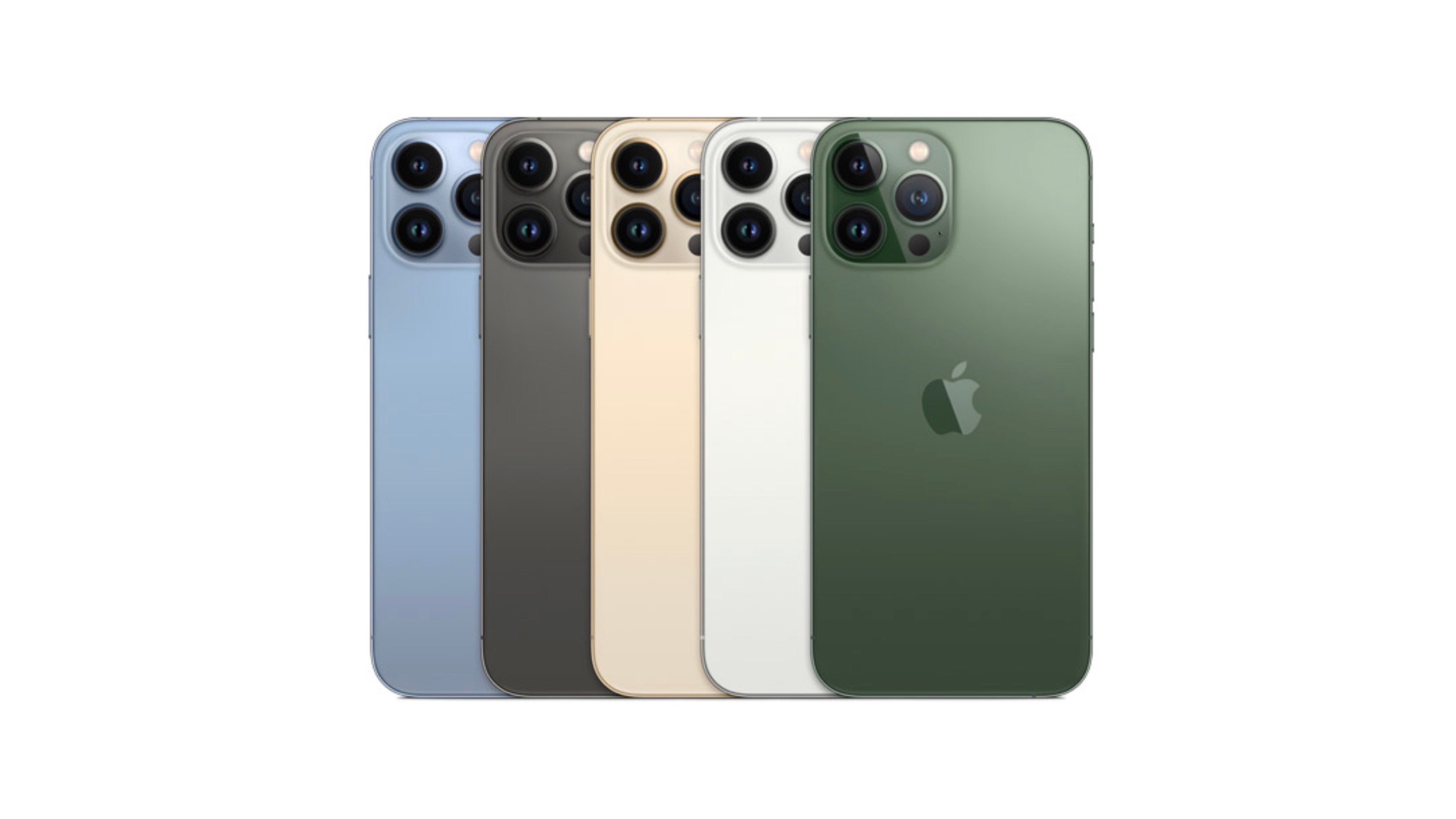
The Pro versions of Apple’s devices are significantly less colorful in comparison to their cheaper counterparts. The matrix is rather straightforward. Users get the classic trinity – black/gray, silver/white and gold, in addition to a fourth exclusive option that Apple plays around with every generation.
It should be noted that just because the first three options look straightforward does not mean that this is necessarily the case – not all (iPhones) that glitter are gold. The shades are very refined and present a sophisticated take on the respective colors, with a fancy name to match.
For example, Apple’s “black” option for years was dubbed “Space Grey”. I have yet to hear someone refer to an iPhone as being “space grey”, but this is beside the point. What is, however, interesting is Apple’s way of consistently elevating something mundane and making it minimalistic, yet premium, at the same time.
This is a huge achievement on Apple’s part, especially when it comes to the more “exclusive” colors. The iPhone 13 Pro Alpine Green and Sierra Blue versions are two unique shades, which are also markedly understated, allowing them to co-exist with Apple’s minimalistic design philosophy.
The only issue is that Apple never seems to fully embrace these more interesting and distinctive iPhone color options. We are always limited to one at a time (which, from my experience, is almost always sold out), with the color being all but forgotten once the new iPhone comes around.

More Pro colors
It is my personal view that the Pro approach to color is the one that needs to be built upon. Instead of opting for purely flashy, almost plastic-like colors, Apple should expand on its existing model of “refined color shades” and play around with finishes and materials.
Creating additional “Pro” colors that do not look out of place in an Apple store will subsequently allow Apple to freely offer their products in a number of interesting shades.
Making color subtle has another benefit. It enables one to express their individuality, without the commitment of necessarily having to stand out. Midnight Blue, the color that made its debut with the new MacBook Air, is the perfect example. The shade is very dark, which coupled with the elegant finish, precludes the user from standing out like a sore thumb in a sea of computers.
Individuality has more to do with how users feel than how they actually look. Everyone can believe you have a normal, dark iPhone, but the point is that you were allowed to have some faculty when making your choice. After all, everyone and their mother has an iPhone these days, and when you are spending more than a thousand dollars on a device, you should be allowed to feel at least somewhat special
Color and individuality
Smartphones are one of the few items that rarely leave our sights. They are quite literally always within arm’s reach. Hence, smartphones increasingly serve a purpose similar to that of fashion accessories.
And while many users care little for the aesthetic merits of their headsets, some do. The Galaxy Flip is the most successful foldable on the market for a number of reasons, one being that it has become something of a fashion statement.
While many people will put a case on their iPhone as soon as they buy it, what ultimately matters is the owner’s knowledge of what their device says about them. It is almost like wearing a fake item of clothing – all the world might fail to notice, but the owner will never forget.
Apple has already developed a way of being colorful and minimalistic, of allowing room for individual expression, while simultaneously maintaining brand conformity. Apple does not have to necessarily do more, it simply has to do it more often.
For all the latest Technology News Click Here
For the latest news and updates, follow us on Google News.
