Seven wishes for iOS 17 that I want to see for my iPhone
The end of the year is usually a time when people reflect on what came before in the previous year, and the same applies to Apple’s software, iOS especially.
Since 2007 with the debut of the iPhone and iOS, there’s been a yearly turnaround of new software updates that would bring big changes or small improvements, such as a redesign in iOS 7, or widgets on the home screen in iOS 14.
However, with iOS 16 bringing widgets to the lock screen, users seem to want an expansion of existing features, rather than new ones for iOS 17.
With this in mind, we’ve racked our brains and come up with seven iPhone platform features that could benefit a lot of users.
Start-up screen showcasing the new features
This is something I hear a lot: ‘I didn’t know my iPhone could do that.’ As I work in an open office, I’ll spot iPhones that are updated to iOS 16, but still on the old lock screen or others that are still running iOS 13 on an iPhone 11 Pro.
Apple believes that design should be invisible, that you should intuitively know a feature will be there, ready to use, but it doesn’t play out that way for everyone. A friend had no idea you could answer calls on a Mac through an iPhone for example – a feature that’s been around since 2014.
This is why an extra start-up screen should appear once you update to iOS 17. Similar to when you launch one of Apple’s apps and a screen appears showing what’s new. Instead, have this show when you go to the home screen, and make it clear that the Tips app can help you try these features out.
The Tips app is a lesser-known app from Apple, but for a new user it’s great – it’s just not talked about much by the company, and you most likely don’t know that you can go to the app and, as the above image shows, look at an overview of all the new features.
Let’s see it be more ubiquitous – perhaps a random tip appears within the Dynamic Island during the first day you update to iOS 17, or even an email showcasing what you can do.
Redesigned Control Center
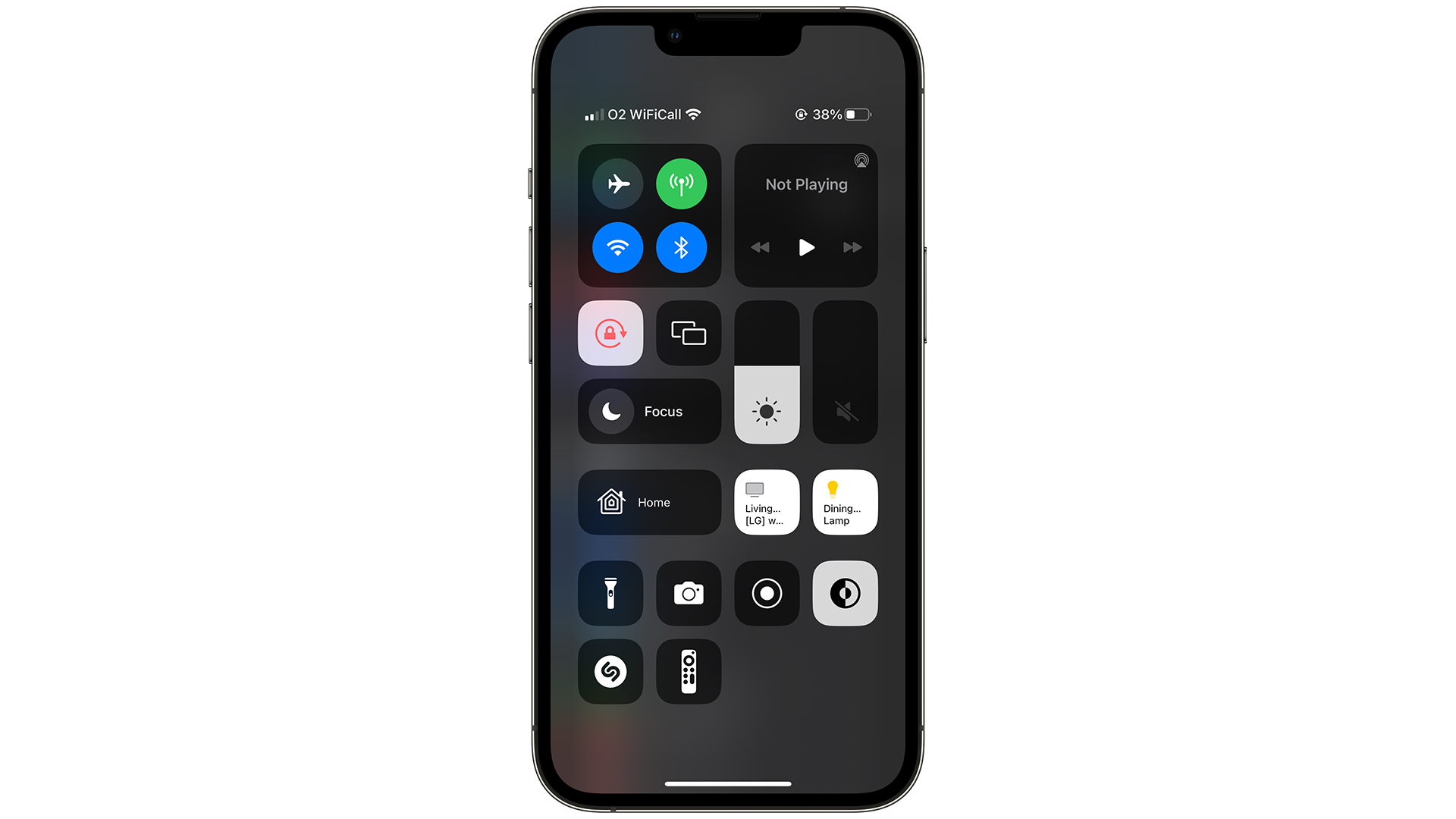
This is something long overdue, but it’s a difficult challenge to overcome. First appearing in iOS 7 with the big redesign to a flat methodology, you would swipe up from the bottom of your iPhone to access some settings. It was later moved to the top-right corner as the iPhone X and beyond use the swipe-up gesture to go back to the home screen.
Almost ten years later and Control Center has gotten worse, mainly due to the number of new features that have appeared, and in turn, filled up the menu so much that it can be difficult to exit the screen when you try to swipe up.
Let’s see a redesign where we can resize the options, similar to widgets on the home screen, and have third-party apps be given access to Control Center.
And as an aside, let’s also see Control Center be part of the multitasking menu on iPad, instead of having its own section.
Stream games more easily from iOS to Twitch
Apple made a big push on gaming at WWDC 2022, where it announced Resident Evil Village coming to the Mac, and No Man’s Sky coming to both the Mac and iPad, but if you wanted to stream games on your iPhone through Twitch, you’re out of luck.
Granted, SharePlay allows users to stream what they’re doing in certain apps, but that’s within a FaceTime call. Instead, let’s see a feature where you can press a button to load up your Twitch account and stream your Apple Arcade game.
Let’s also make it possible to look at the chat window of those watching your stream, and keep track of your subscriptions through notifications on another Apple device you may have.
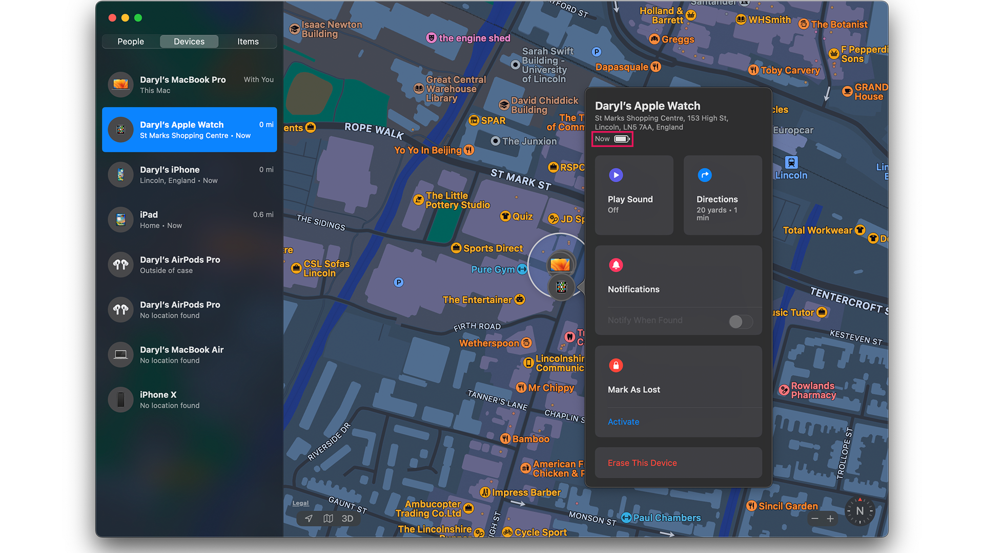
We’re in an age where many users own multiple products from Apple, and while iCloud helps you to manage files across these devices, some details such as fitness and battery life can only be found on some Apple products.
For example, if you want to glance at your Move goal on a Fitness widget from your iPad, you can’t.
If you want to check the battery of all your devices, you’re out of luck. The only way to check if they’re running low on power is to load up the Find My app, go to the Devices tab, and select each of your Apple products to check how full the battery icon is for each one.
If one app can do this, surely a battery widget in iOS, and also macOS, and iPadOS is possible.
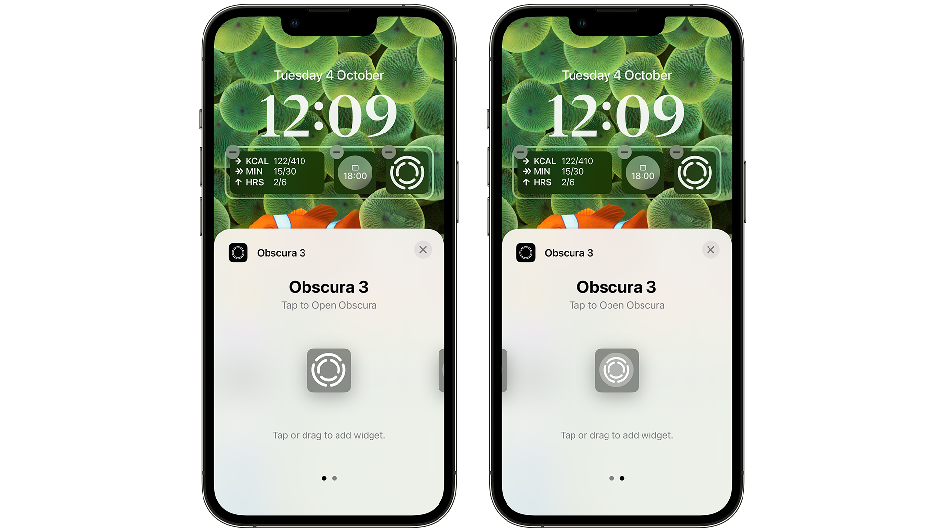
The home screen on iOS had barely changed since 2007, so when a redesign finally arrived in iOS 16 with widgets, it was great to see. However, let’s see this effort expand even more in iOS 17.
Six widgets and a Live Activities widget on the lock screen aren’t enough for some – there’s plenty of opportunity to see more widgets in more sizes and more places.
For example, the time should be allowed to be replaced by another widget, alongside another row of widgets below the three we can choose already.
More widgets are always a good thing, so let’s see more of them, and in more sizes.
Better picture-in-picture controls
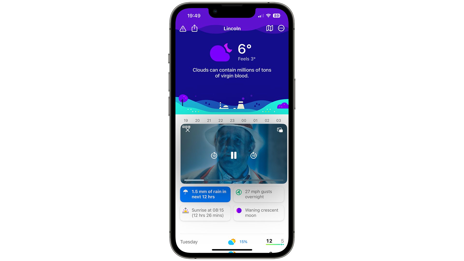
While the ability to watch a video anywhere on your device debuted on the iPad only in iOS 9, there’s barely been improvements since, except for it appearing on iOS 14 in 2019.
However, the ability to better control the video, such as timeline scrubbing and selecting other videos still hasn’t arrived, which is why these should appear in iOS 17.
There’s also a hidden feature when using this in macOS – if you hold Option while dragging a video, you can place it anywhere on the screen. Let’s see this appear in iOS 17 as well, so we have more control of its size and position.
Bring back landscape mode
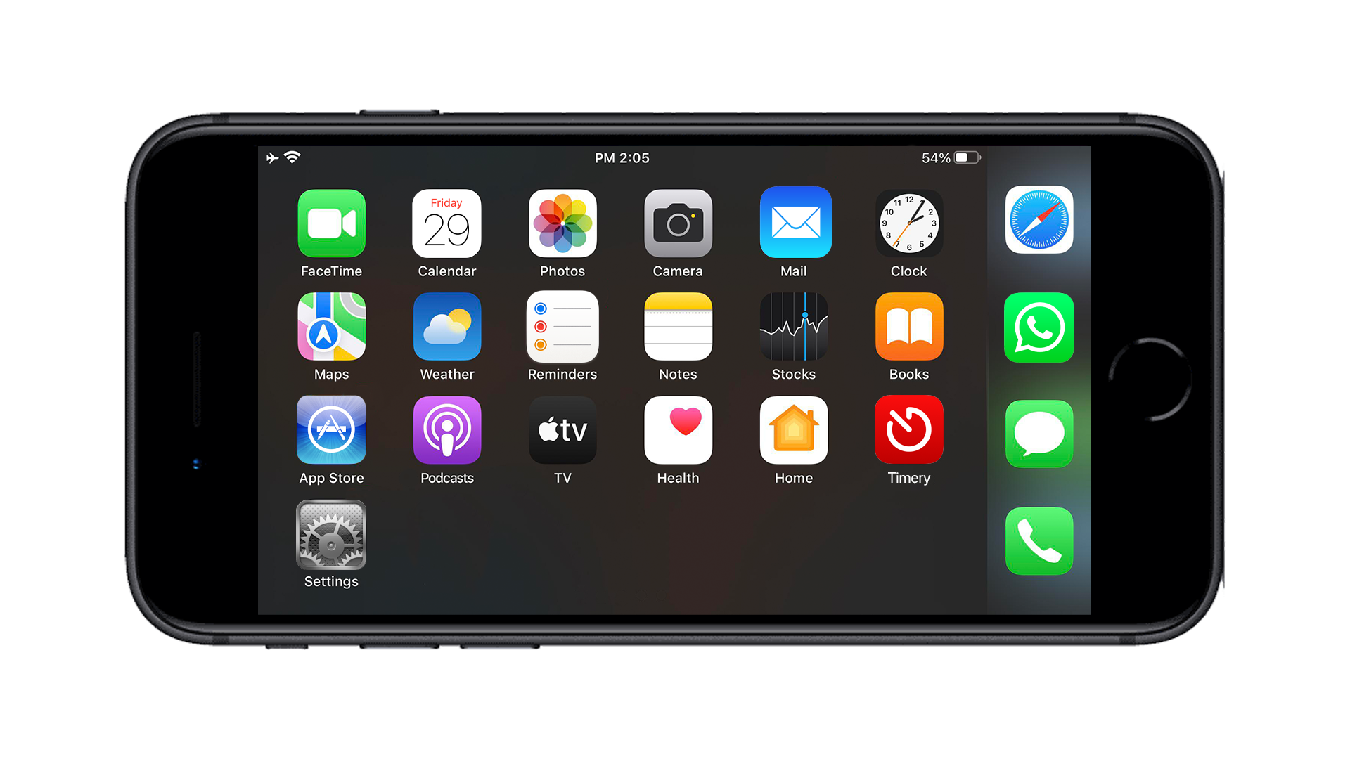
Back when I had an iPhone 8 Plus, I loved having the ability to turn the phone in landscape, and the home screen would rotate, alongside everything else.
The keyboard would have added functions such as punctuation keys and shortcuts such as copying and pasting text, as well as taking advantage of the added length so some keys were wider, but this was removed in future models by the time the iPhone XS launched in 2018.
Almost every iPhone currently available, from the iPhone 13 to the iPhone 14 Pro Max, all have the same or bigger displays than the regular iPhone 8 Plus, thanks to the different all-screen design. So let’s see iOS 17 take advantage of that, and expand it to other apps too, such as Apple Music and even the Lock Screen with its useful widgets.
Is your wish missing?

We’re at a point with iOS where the high-hanging fruit of features has been fulfilled by Apple over the years – from custom keyboards to redesigned widgets on the home screen.
The seven here are what could enhance someone’s use of an iPhone, but individuality is something that Apple knows is important, which is why we can customize our redesigned lock screens in iOS 16 to make them our own.
Is there something you think we’ve missed for iOS 17? Get in touch with us (opens in new tab) to tell us what you’d like to see in a future release from Apple.
For all the latest Technology News Click Here
For the latest news and updates, follow us on Google News.
