The thought process behind the small changes made to the icon for the Chrome Browser
The Googlers behind the redesign of the Chrome icon talk about what they did
One of the original icon designs for the Chrome Browser
Messenger said that the original design was going to be a rocket ship with a red lightning bolt. This was created to represent how fast Chrome could take users from website to website. However, the rocket ship design was dropped and Messenger explained that “…our team decided to move away from a literal rocket ship in the end, and came to a design that looked approachable and clickable that still captured the spirit of Google.”
Google stress-tested color changes to the Chrome icon to make sure it wouldn’t get lost among other icons
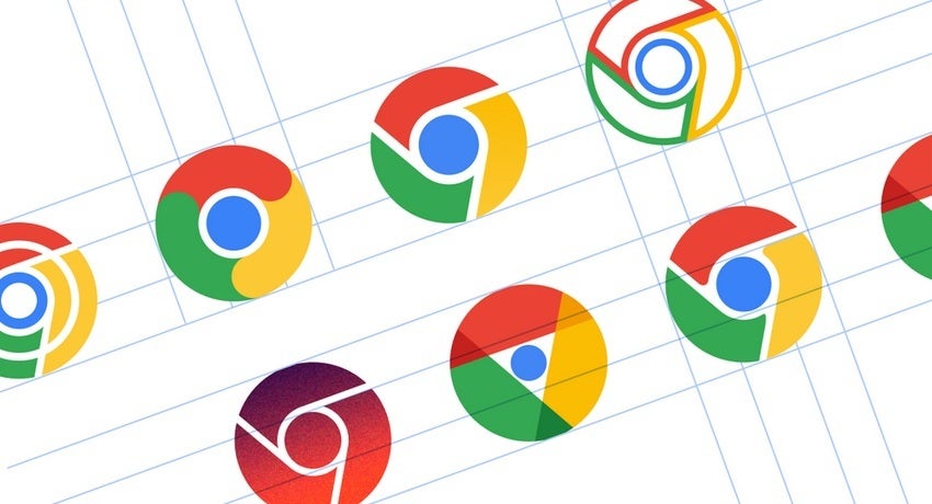
While the changes made by Google to the Chrome icon wouldn’t stand out to the average user, Messenger noted that Google considered a more complex change to the Chrome icon. “In the exploratory phase, we tried all kinds of ideas; softening corners, different geometries, whether or not to separate the colors with white. We also tried options that further departed from the overall shape we’ve been using for the past 12 years. But we knew how well the four Google colors and circular composition are recognized, so we decided not to deviate too much from that.”

Some changes to the Chrome icon considered by Hu and Messenger
The process was “fun” according to Hu and he noted that the brainstorming sessions led to multiple possibilities for a new Chrome icon. Google stress tested many of the colors to make sure that any changes wouldn’t result in the Chrome icon getting lost. The change also allowed the icon to be more easily viewed even when small.
For all the latest Technology News Click Here
For the latest news and updates, follow us on Google News.
