Which company has the most polite battery popup message? (Apple is blunt!)
Have you ever noticed how different manufacturers address you – the user – differently in popup messages or other text you may see in their software?
From iPhone popups letting you know that your battery is low, to Windows 10 popups, let’s check out how various companies choose to address us – nicely or not!
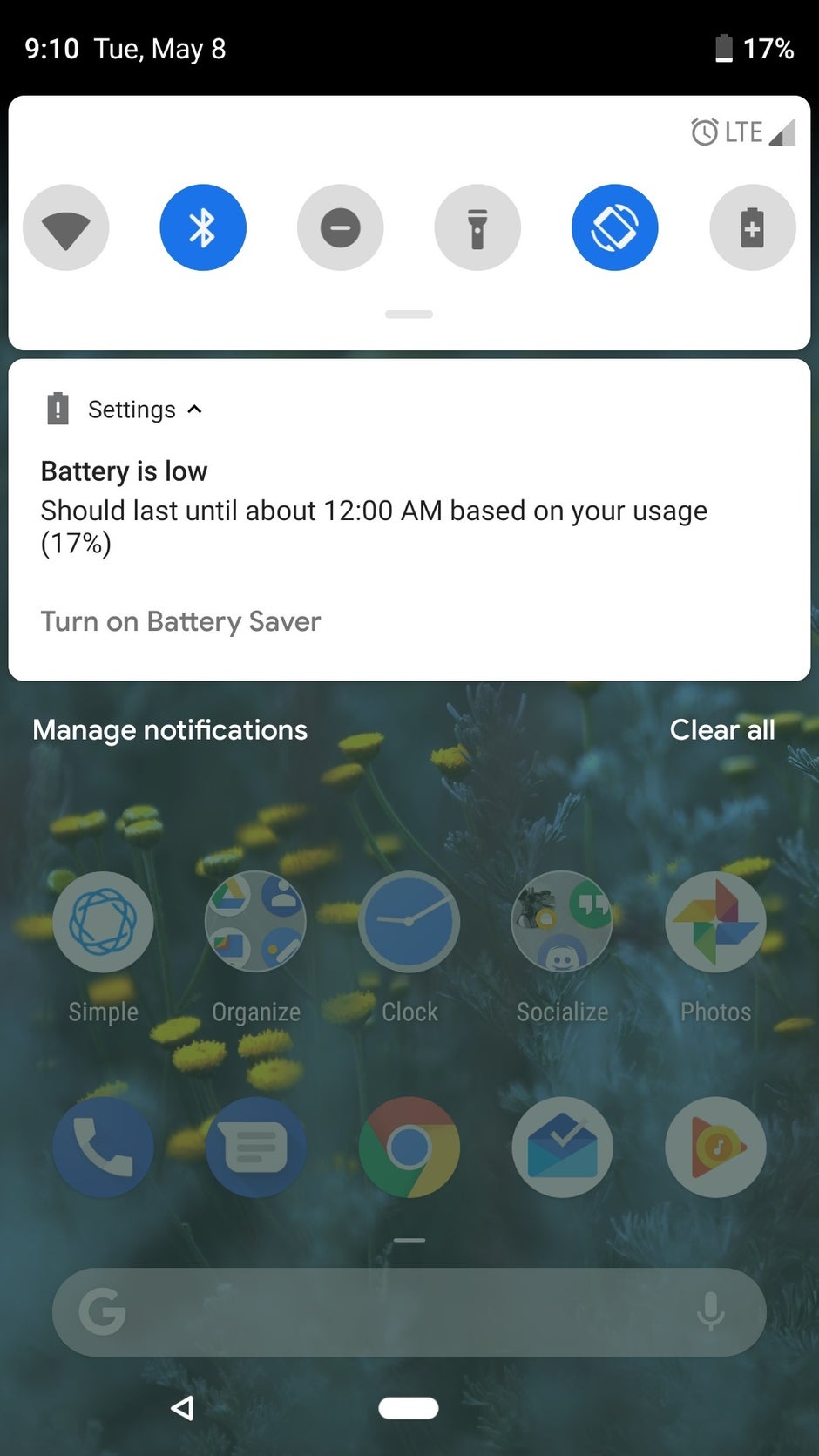
Android 11 is informative
Image credit: Android Police
Google’s newest Android iteration – Android 11 – has an extensive and informative low battery message, that actually tells you roughly for how much longer you’ll be able to use your smartphone until it runs out.
Normally you’d just expect a prompt to go ahead and plug in your smartphone into an outlet, so this approach is pretty refreshing. Because not everyone will be near an outlet every time their battery is low. Most people will likely find the information about how much longer they have way more useful than a simple “go charge it” message. And Android 11 delivers!
Microsoft is considerate
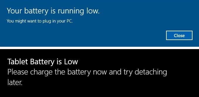
This is the only Windows 10 popup message that I actually like – “You might want to plug in your PC.” It’s almost sweet, oddly considerate.
Yes, I might want to indeed, thank you for letting me know, Microsoft. You sure deliver the news that my laptop is about to shut down in a calm and collected manner.
On Microsoft’s Surface tablets you may also get the latter message, which is similarly pleasant and polite, using the word “please”. Much appreciated!
Apple is pretty boring
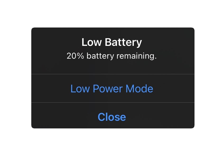
When your battery is low, Apple basically just tells you that, along with your current percentage (20% is low?), with no further details or instructions. No “charge your phone” or “you have this much time left”, but you do get a prompt to enable Low Power Mode.
For a company that strives to create meaningful emotional connections between its products and users, you’d think it would try addressing those users in a less of a boring, almost corporately straightforward way. But, to be fair, Apple is all about simplicity, and this popup is indeed pretty simple.
Nokia 3310 was straightforward too
I’m sure you’re all thinking “Who cares about Androids and iPhones, show us what the legendary Nokia 3310’s low battery message looked like!”
Well, that indestructible phone from the year 2000 did a short beep, told the user – “Battery low” (a phone of few words!) and played a neat little animation that oddly featured some sort of a liquid stirring inside of a dry cell battery.
So I picked up an AAA battery and shook it just to test if this animation was accurate, but heard no liquid inside. Odd. But cool! If early 2000s Nokia was a boring company, it wouldn’t even show an animation, just text. But it wasn’t! Speaking of Nokia…
Windows Phone on the Nokia Lumia had a lot to say
Image credit: Steven Luong
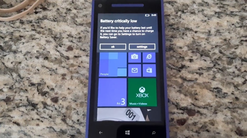
When your Nokia Lumia phone’s battery was low, you’d get the following message:
“Battery critically low. If you’d like to help your battery last until the next time you have a chance to charge it, you can go to Settings to turn on Battery Saver.”
Like Windows 10, Windows Phone 8 was similarly considerate and oddly pleasant about letting you know your battery is low.
You could argue that this is a long-winded way to tell you to turn on Battery Saver, but it definitely sounds sweet, like it’s a message from a friend. Not like Apple’s characterless “Battery low” popup with just a “Low Power Mode” button.
“Does it matter?”
You may be the type of person to say “Who cares how those messages are written?” but be honest with yourself – there’s a good chance that you do, even if you haven’t thought about it.Little things like popup messages you may be seeing on a daily basis can have an effect on you, depending on how they’re written and the way you perceive them addressing you.
Sure, robotic and blunt messages are efficient, and arguably don’t need to be anything beyond that. Yet some companies seem to disagree, and I’m personally totally cool with it, because like I said, in a sea of Windows 10 popup messages that I hate, that one about the low battery is so nicely written that I genuinely like seeing it.
Can you say that about any other normally mundane popups your phone or computer show you? It is nice when the devices many people use for most of their days can trigger some sort of a positive emotional response, even if on such a small level.
For all the latest Technology News Click Here
For the latest news and updates, follow us on Google News.


