Why Google must lead by example for it to succeed
Rita El Khoury / Android Authority
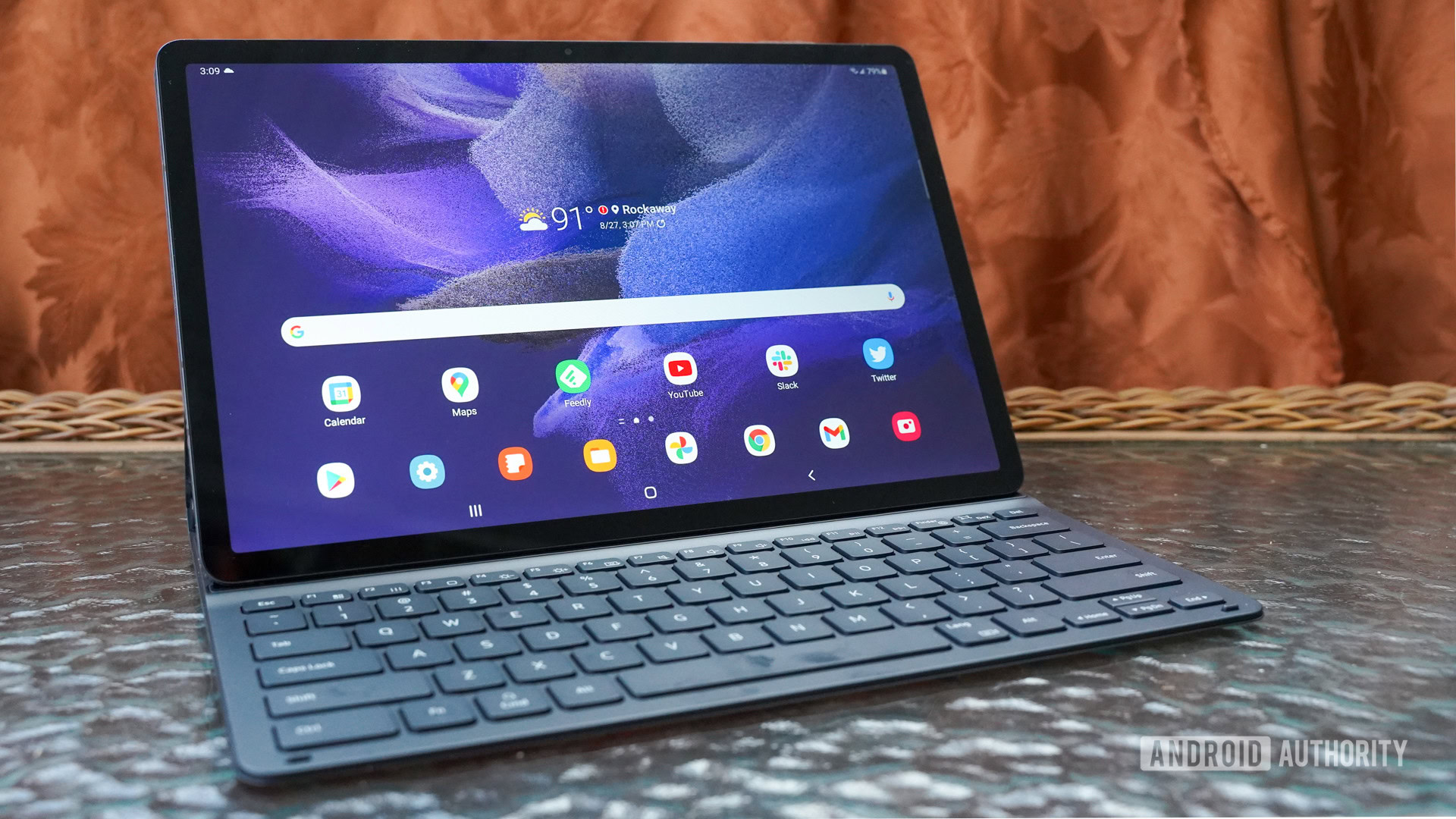
The announcement of Android 12L came as a bit of a surprise for many of us. While we were expecting a minor upgrade to Android 12, we were instead presented with a bigger feature drop that’s targeted at devices with larger screens. In fact, this update is important enough that it got its own name, 12L, and will be the subject of a developer preview program, similar to major Android releases.
It was about time Google dedicated some resources to larger devices. The company already sells millions of Chromebooks per year, and while Android tablets aren’t the hottest ones around, they still take up nearly half of the global market (via Statcounter). That’s not to mention the rise of foldables and all the excitement around that form factor.
But this isn’t Google’s first rodeo. It’s attempted a dedicated tablet OS once and got almost nowhere with it, with one of the reasons being the apparent lack of enthusiasm towards the form factor. Tellingly, many of Google’s own apps were never updated to make use of the larger screen estate, so why should third-party developers care? If Google wants to make Android 12L a success, it needs to learn from its history and its mistakes.
Google and tablets, take one

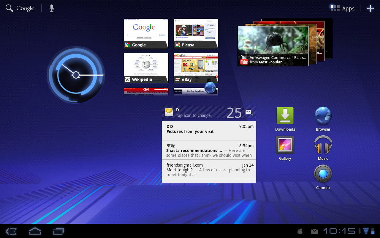
Honeycomb, otherwise known as Android 3.0, was released nearly a decade ago. It represented Google’s ambitions for the tablet form factor in 2012: an OS that was supposed to usher a new era of apps and software that made use of bigger screens. Instead, only a few of Google’s own apps were optimized for the experience — Gmail, Contacts, Calendar — but the rest were simply stretched versions of their mobile counterpart.
The excitement was palpable for a while, and some third-party developers jumped on the hype train, adapting their apps and using “fragments” like Google recommended to divide the larger screen into different areas. But things never progressed further. The company went back to phones with Android 4.0 a.k.a. Ice Cream Sandwich and left many of its apps — Maps, the Android Market, the web browser, to name a few — in a state of limbo on tablets.
See also: Apple, Amazon, Samsung – what’s the best tablet to buy?
Some of us, me included, tried to hold on for far too many years. We repeated to anyone who wanted to hear us that Android apps just stretch dynamically to fill bigger screens — unlike another tablet OS — which meant we didn’t need dedicated apps. But after a few years, it was clear that Google had no plan and no vision for the form factor. On the other side, Apple was pushing and developing iOS on iPads so much that it would eventually split it into its own ecosystem. The difference between the two approaches couldn’t be more obvious.
Take two, or the Chrome OS experiment

Google’s second tablet attempt came a couple of years ago, when it launched the Pixel Slate. With Chrome OS supporting Android apps, it thought it would offer a semblance of a tablet experience, while still providing the full setup for those who wanted a keyboard and trackpad.
Chrome OS tablets showed great promise… until Google’s own tablet hit the scene.
Unfortunately, the Slate’s reception wasn’t very enthusiastic mainly because Google had once again failed to properly adapt the interface. Between Chrome’s small icons that weren’t touch-friendly and Android apps’ poor integration with the rest of the operating system, the experience was far from ideal. It’s fair to say that developers didn’t rush to adapt their apps to this new chimera. While there are some great Chrome OS tablets available, the software experience is still profoundly lacking.
Android 12L’s the charm?

Example of how Android 12L handles dragging and dropping apps into split-screen mode
Android 12L marks Google’s third venture into the tablet ecosystem, though this time, it’s not limiting itself to a particular device type. It wants to bridge the gap between phones, foldables, tablets, and computers. The whole point is to create a cohesive software experience, no matter the screen size. Both system and apps would adapt to the canvas given to them, stretching to fill a desktop’s large screen when connected to a Chromebox, then slimming down to fit on a small phone.
See also: The best foldable phones you can get
What we’re seeing so far is encouraging. There’s proper multiwindow and multitasking support, plus a full redesign of the notifications and settings to allow for dual panes. Showing more content in a smarter way is the whole point of larger screens, and Android 12L seems to take that challenge to heart.
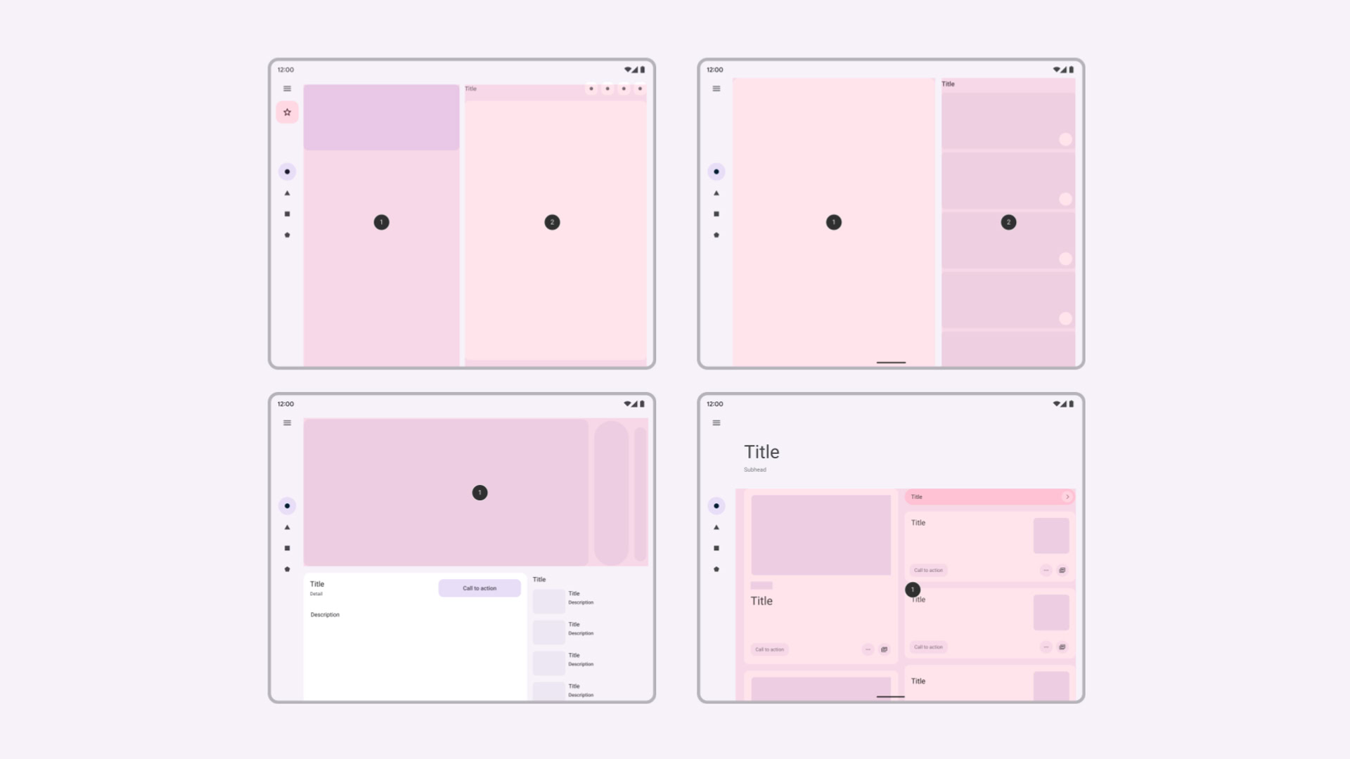
That’s not enough, though, far from it. The system is only one part of the equation. Apps need to follow, and for that, Google has already released extensive documentation and design guidance to help developers adapt their apps. But there’s a far more important factor: consistency.
Google must lead or it’s game over

Examples of adaptive UI patterns in the Material Design guidelines
By consistency, I mean that Google needs to have a consistent message with Android 12L. Even the most devoted third-party app developers have probably read the new version’s announcement and shrugged. “Fool me once,” as one says. There’s a long road before many devs jump on the bandwagon again, and the only way to shorten it is if Google takes it upon itself to show the way.
All of Google’s built-in apps must be adapted to larger screens for Android 12L’s release. No exceptions.
By the time Android 12L is officially released next year, all of Google’s built-in apps must be adapted to larger screens. No exceptions; there’s no wiggle room this time. Developers need to see that the company is serious about this endeavor and one of the best ways to show that is by making sure all of its internal teams have adopted the new APIs and design recommendations. Stretchy built-in apps cannot ruin the experience, because if Google is phoning it in, other developers will.
Consistency also means that Google can’t roll out Android 12L, pat itself on the back, and leave it at that. Come Android 13, 14, 15, and more, there need to be further improvements to the experience. More features, additional APIs, and different interactions, all of it to send a clear message about commitment to larger screens. Developers that won’t be swayed this year will have more reasons to be the next one, or the one after. And if Google were to make its own foldable, as has been rumored, that would certainly go a long way too.
A glimmer of hope

Eric Zeman / Android Authority
I think Google could really pull it off this time. The only reason I say this with a bit of confidence is that things have been different over the last year. When Material You was introduced in May of 2021, I was certain it would take years to make its way across Google’s various apps. Like Holo and the two iterations of Material Design, I had expected the updates to be slow and the dozens of disparate Google teams to lack any kind of internal communication. A synchronized rollout has never been the company’s forte.
To my surprise, nearly every app — or at least the built-in and most important ones — has received a Material You overhaul already. There was an obvious concerted effort to get this project to the finish line before the Pixel 6‘s launch. If a similar dedication is given to Android 12L, great things could be coming.
Foldables also offer a bigger incentive to everyone involved — Google, device manufacturers, and software developers. If the form factor slowly starts taking over the smartphone market, then everyone will want to offer the best possible experience on these devices. From there to tablets, it’s a small leap. As for Chrome OS laptops and desktops? Well, I wouldn’t dare extrapolate that far.
For all the latest Technology News Click Here
For the latest news and updates, follow us on Google News.
