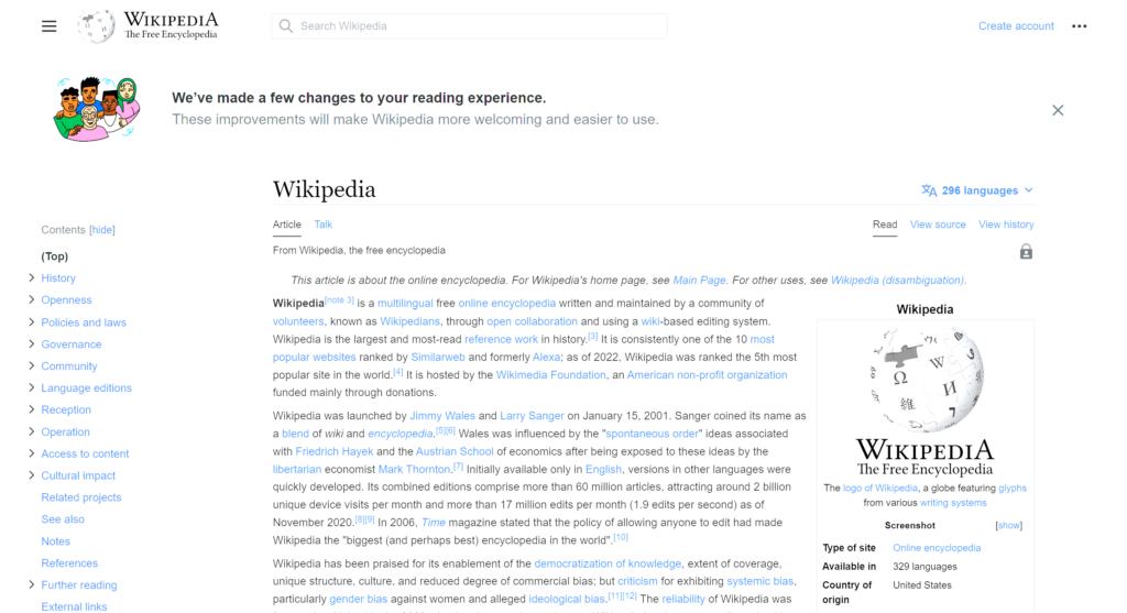
Wikipedia redesign: desktop site gets a new look after over 10 years
Wikipedia, the world’s most popular encyclopedia, has received a major facelift for the first time in 10 years. The Wikimedia Foundation, the organisation behind Wikipedia said the new look improves the usability of the website for both readers and contributors alike. The desktop UI overhaul of Wikipedia comes at a time when English Wikipedia recently celebrated its 22nd birthday. Wikipedia says the new interface helps the next generation of users who are coming online for the first time. The update was made possible with close collaboration with Wikipedia readers and volunteer editors, the organisation said in a blog post. The changes are part of a series of efforts to improve the overall reading and editing experience of Wikipedia for both mobile and desktop users.
Wikipedia desktop gets a redesign
The desktop version of Wikipedia has received a major revamp of the UI in more than a decade, which changes the way readers and editors interact with the website. The improvements to Wikipedia are intended to aid users in easily accessing Wikipedia’s treasure trove of knowledge. The major facelift of Wikipedia’s desktop interface includes a new table of contents, a prominently placed language-switching tool, new line width, and font size controls, a collapsible sidebar, and more. Further, the website includes an improved search experience, which now leverages images and documents, leading to a 30 percent increase in user searches while testing.

Credit: Wikipedia
It is worth noting the new update does not remove any previous functionality and instead adds new tools to improve the overall website experience for users. The new update has started rolling to all Engish language desktop Wikipedia users and is already live on 94 percent of the 318 active language versions of the desktop Wikipedia user base.
The organisation further notes the changes are made in collaboration with more than 30 volunteer groups around the world, including India, Indonesia, Ghana, and Argentina. The improvements are also made possible by global research insights and user feedback through a collaborative approach which is unique to Wikimedia projects, noted the company.
“The changes make it easier for people to find and learn from the work of our incredible volunteers. These features were created with feedback from readers and volunteers from all over the world, aiming to meet the needs of our increasingly diverse audience, while keeping the simple and straightforward feel that millions of people have come to trust over the last 22 years,” said Selena Deckelmann, Chief Product and Technology Officer at the Wikimedia Foundation.
Here is a quick summary of the improvements the Wikipmeda foundation is bringing to the desktop Wikipedia experience:
- Wikipedia now has a new and improved search experience that makes use of images and descriptions to make it easier to find articles. The organisation says these changes brought a 30 increase in traffic by users while testing.
- There is now a more prominently-placed language-switching tool to allow multilingual readers to access articles in their language and contribute to the website. Users can now quickly and easily switch between 300+ languages
- The updated sticky header now includes the most commonly used tools such as Search, Page name, and Sections that move with logged-in users as they scroll, which allows users to focus on reading and editing, and reduces scrolling fatigue. Tests show a more than 15 percent decrease in scroll rates.
- The revamped interface also gets a new table of contents that provides context on the article and helps users navigate throughout the reading experience.
To recap, the non-profit organisation made similar changes to its mobile website in recent years to improve readability on the mobile website and offer a better experience to contributing users.
For all the latest Technology News Click Here
For the latest news and updates, follow us on Google News.
