YouTube Music’s Library redesign is rolling out now
YouTube Music is now widely rolling out a significant redesign for the ‘Library’ tab, after it appeared temporarily for some users back in August, first reported by 9to5Google.
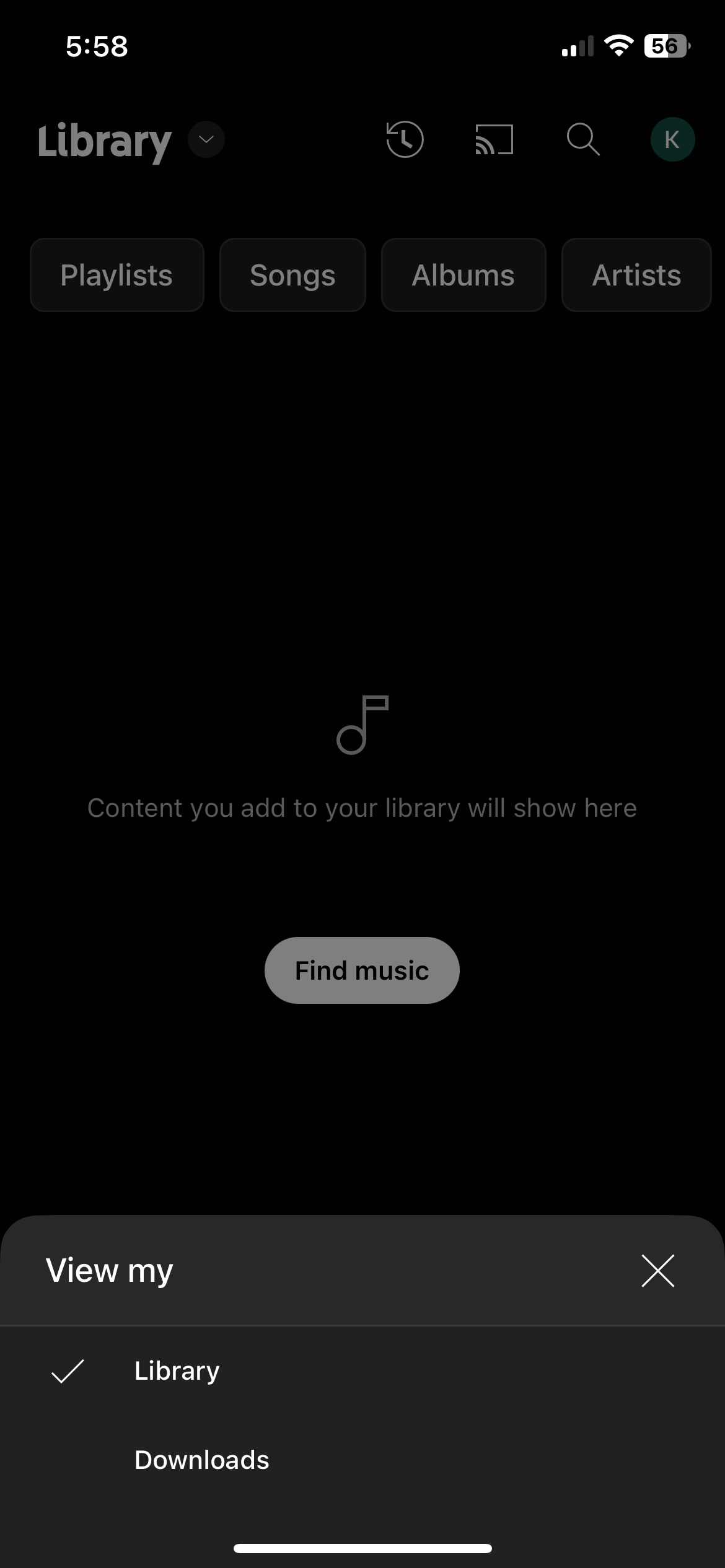
Users have been waiting for a major redesign of the Library page since the platform’s relaunch in 2018. Users will first notice that the Library tab now offers more options for accessing and organizing content. The “View my” option at the top of the tab allows users to switch between the ‘Library,’ ‘Downloads,’ ‘Uploads,’ and ‘Device’ files.
The change is a welcome one that will make it much easier to navigate through the different sections of the Library and locate the content you’re looking for. Further, the ‘History’ clock icon has been moved to the top right, next to the cast button, allowing you to see a list of recently-heard tracks without having to go to your account menu. Note, the ‘History’ icon only appears in the library, and not on the app’s Home Screen.
Users can also filter their Library by Playlists, Songs, Albums, and Artists using chips at the top of the screen. Selecting any of the first three options also provides a new Downloaded filter, while a filter accompanies the Artists filter for Subscriptions. Furthermore, a dropdown menu lets users sort their Library by Recently added, Recently played and other options, making it easier to find and play specific songs on the go.
The change is currently rolling out widely. Ensure you’re running the latest YouTube Music application to check out the redesign.
Source: 9to5Google
For all the latest Technology News Click Here
For the latest news and updates, follow us on Google News.

